COMMERCIAL PROJECTS
MUSEUM REACH LOFTS
PROJECT: APARTMENT LEASING OFFICE
LOCATION: SAN ANTONIO, TX
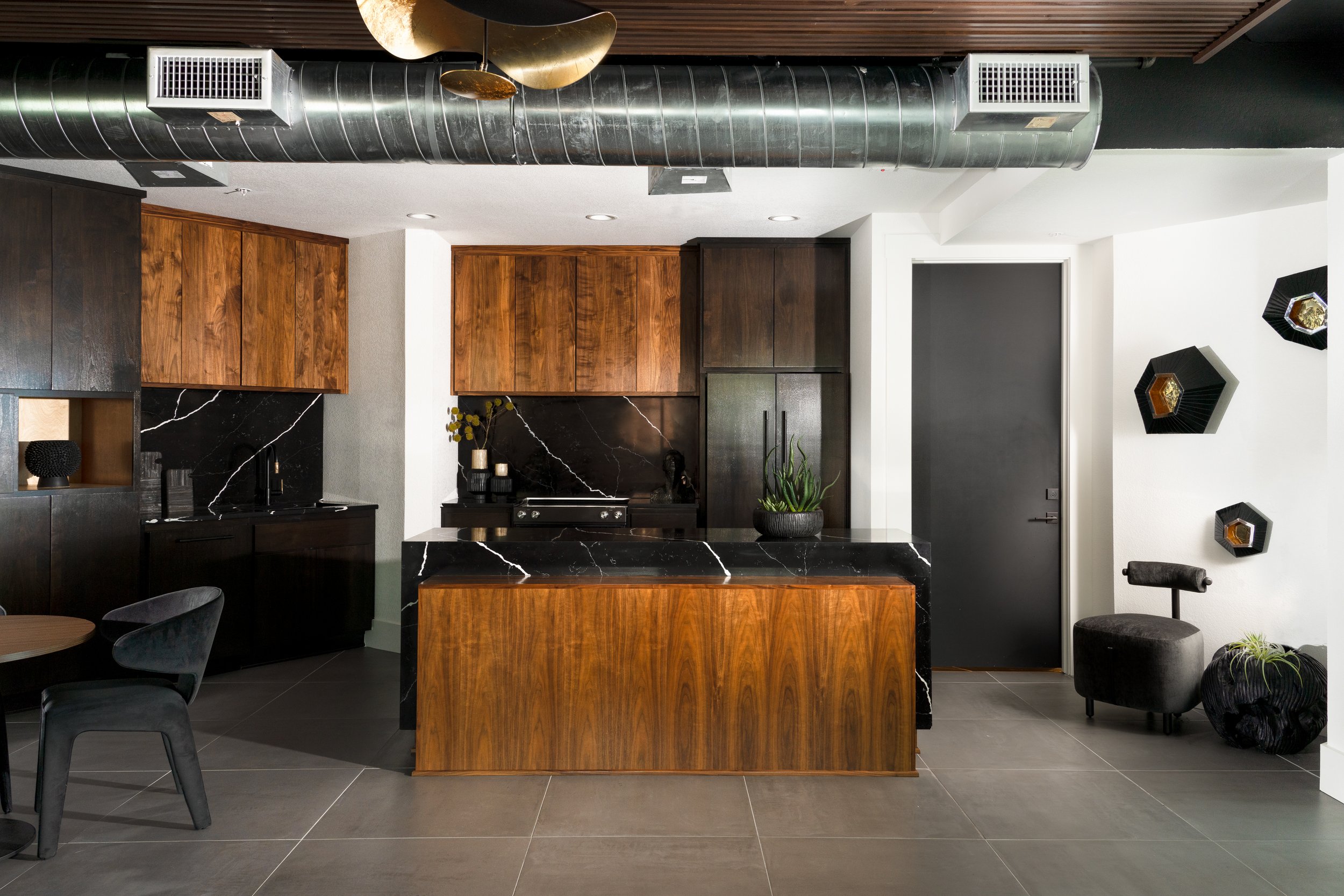
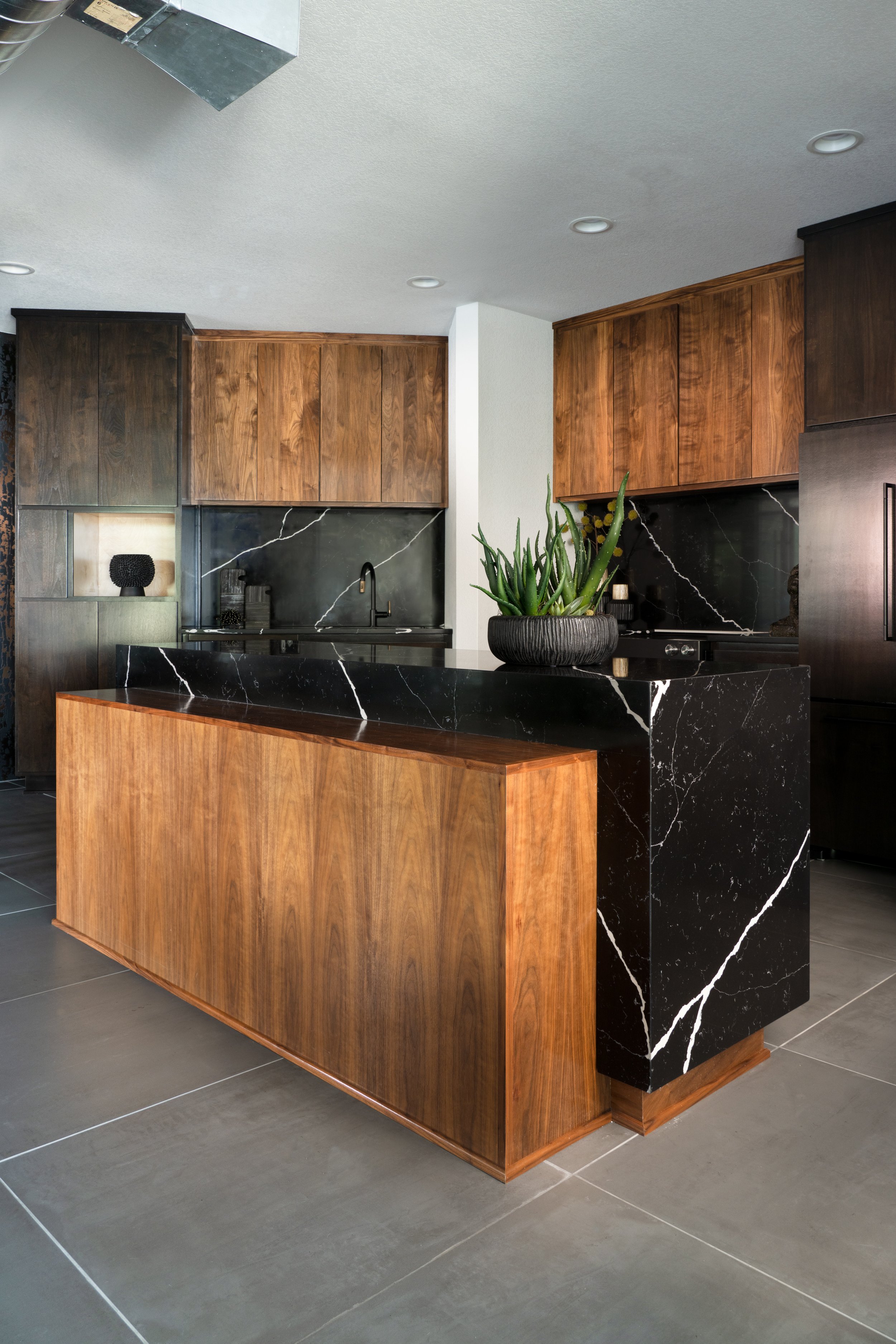
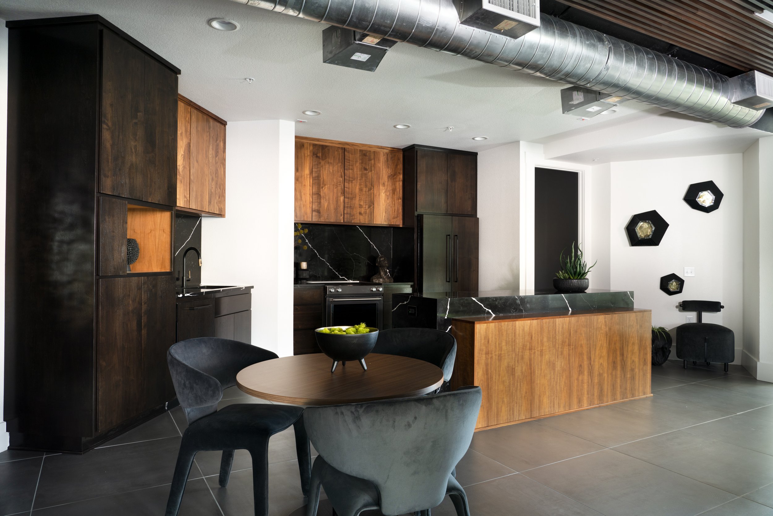
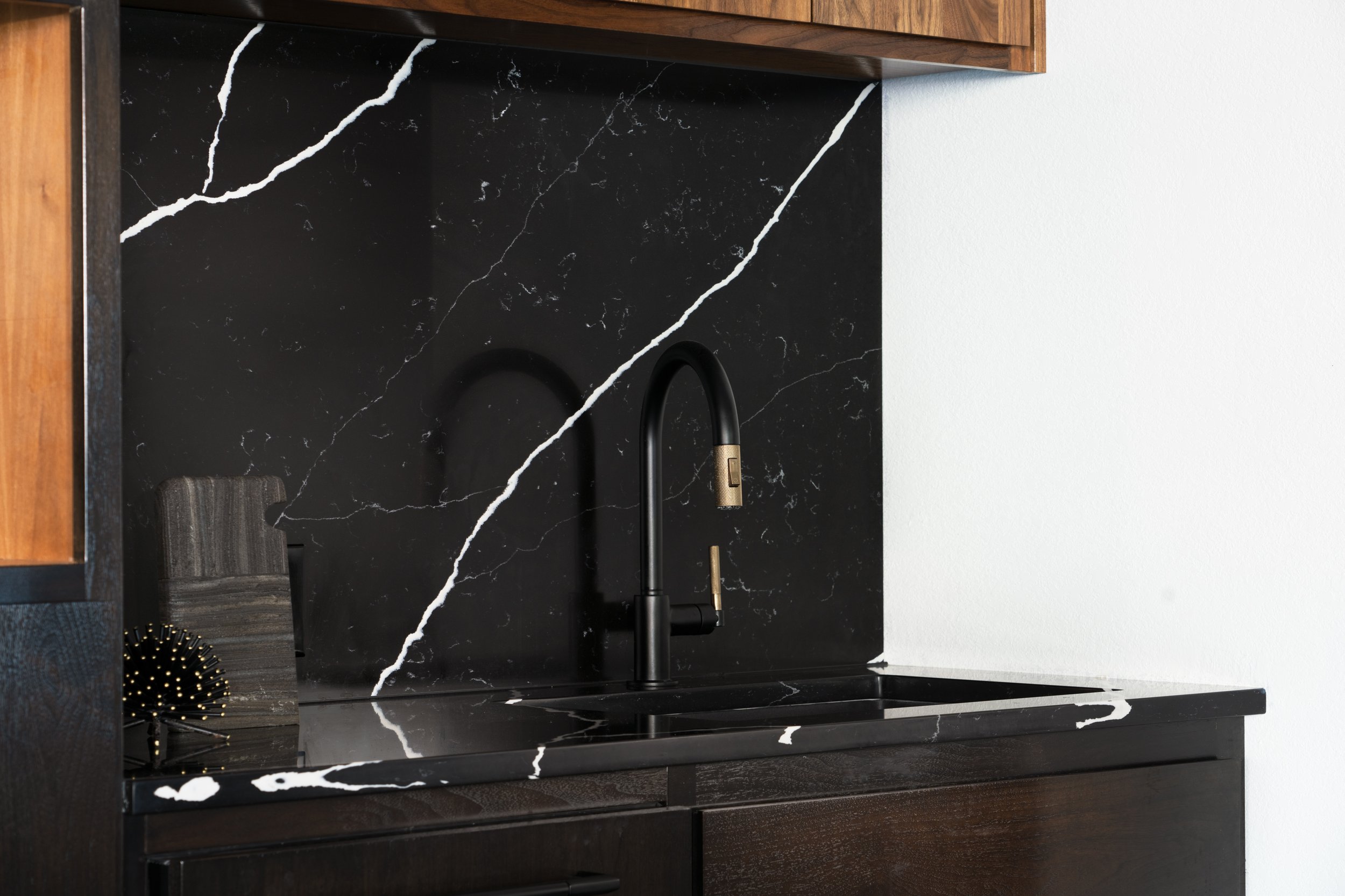
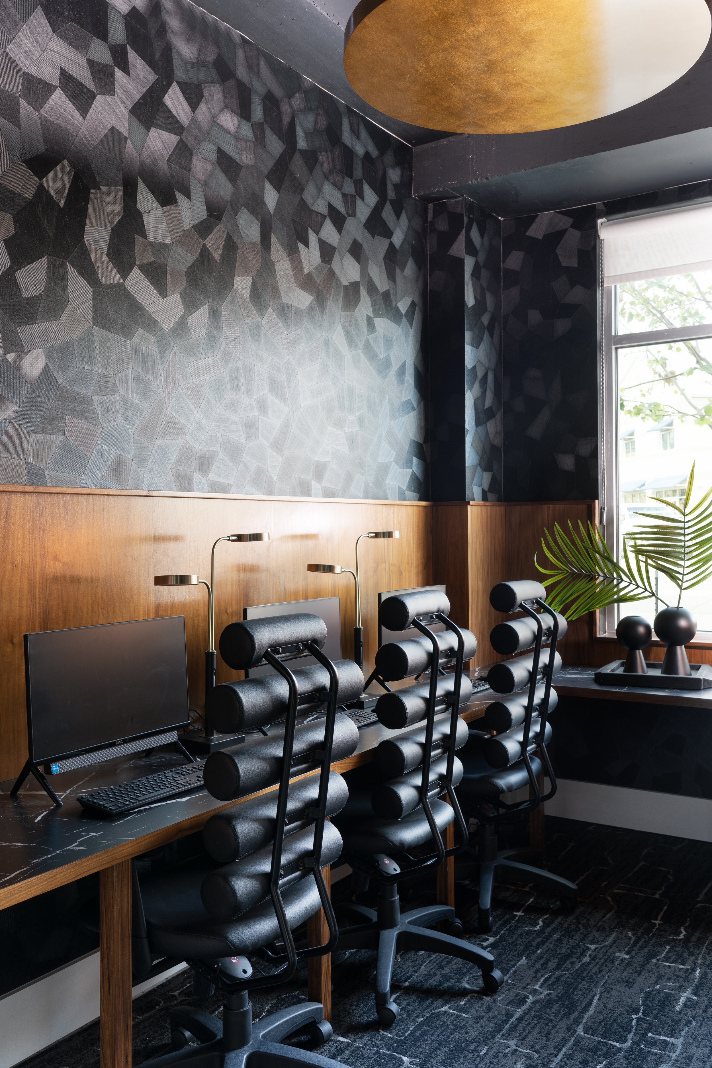
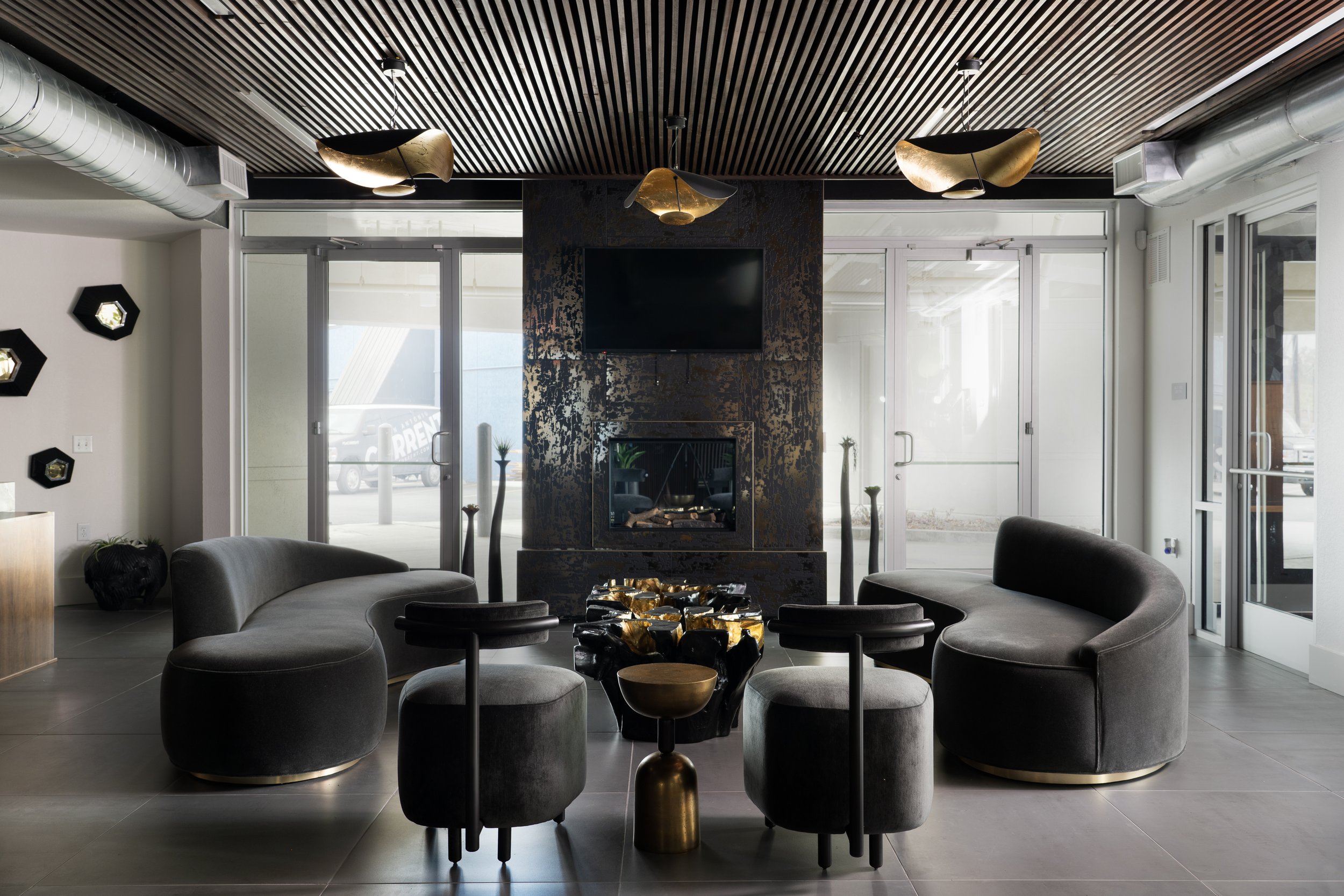
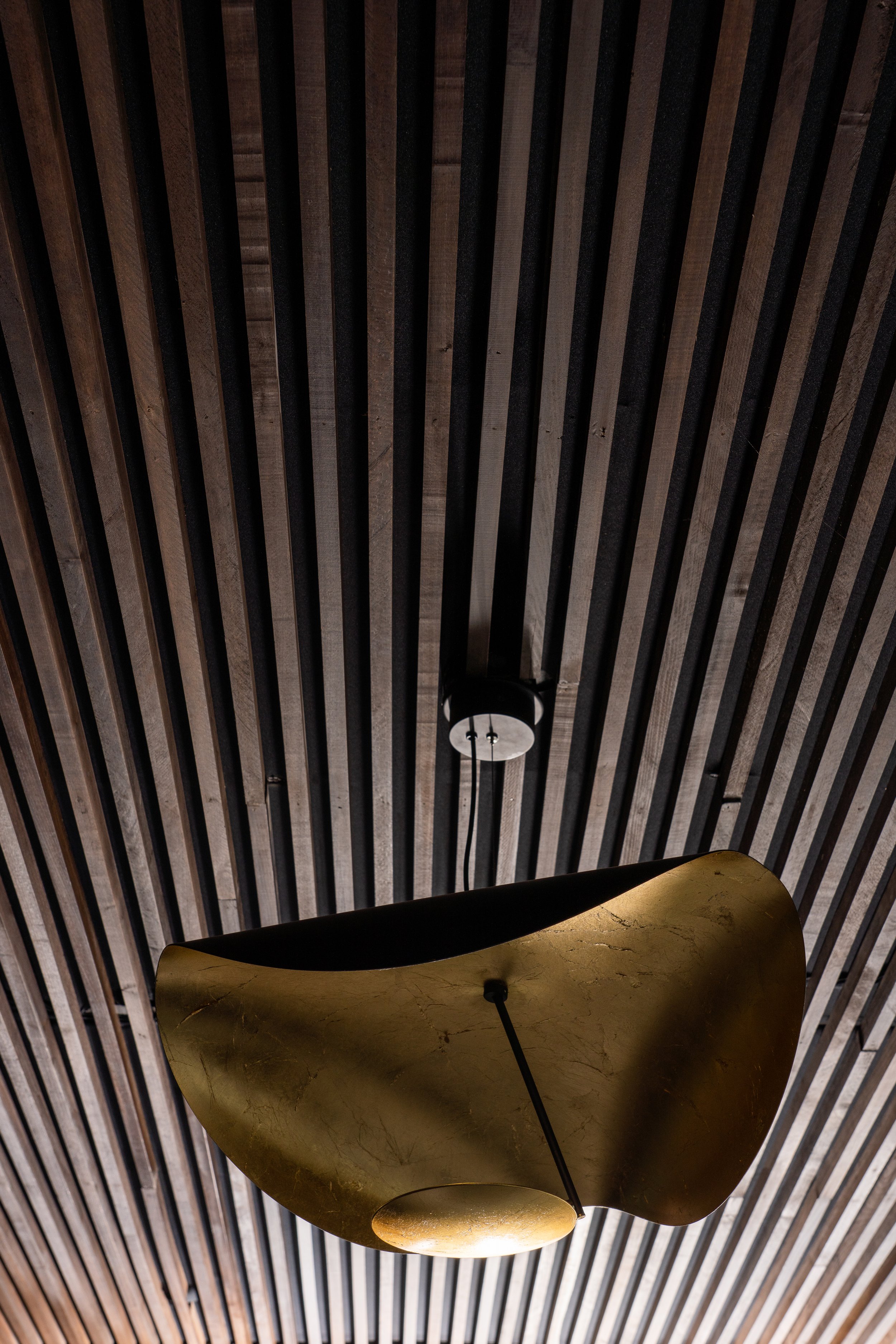
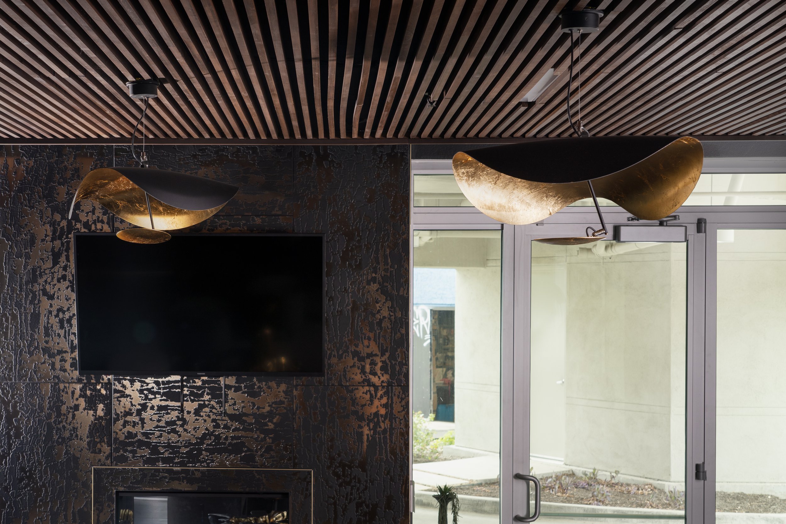
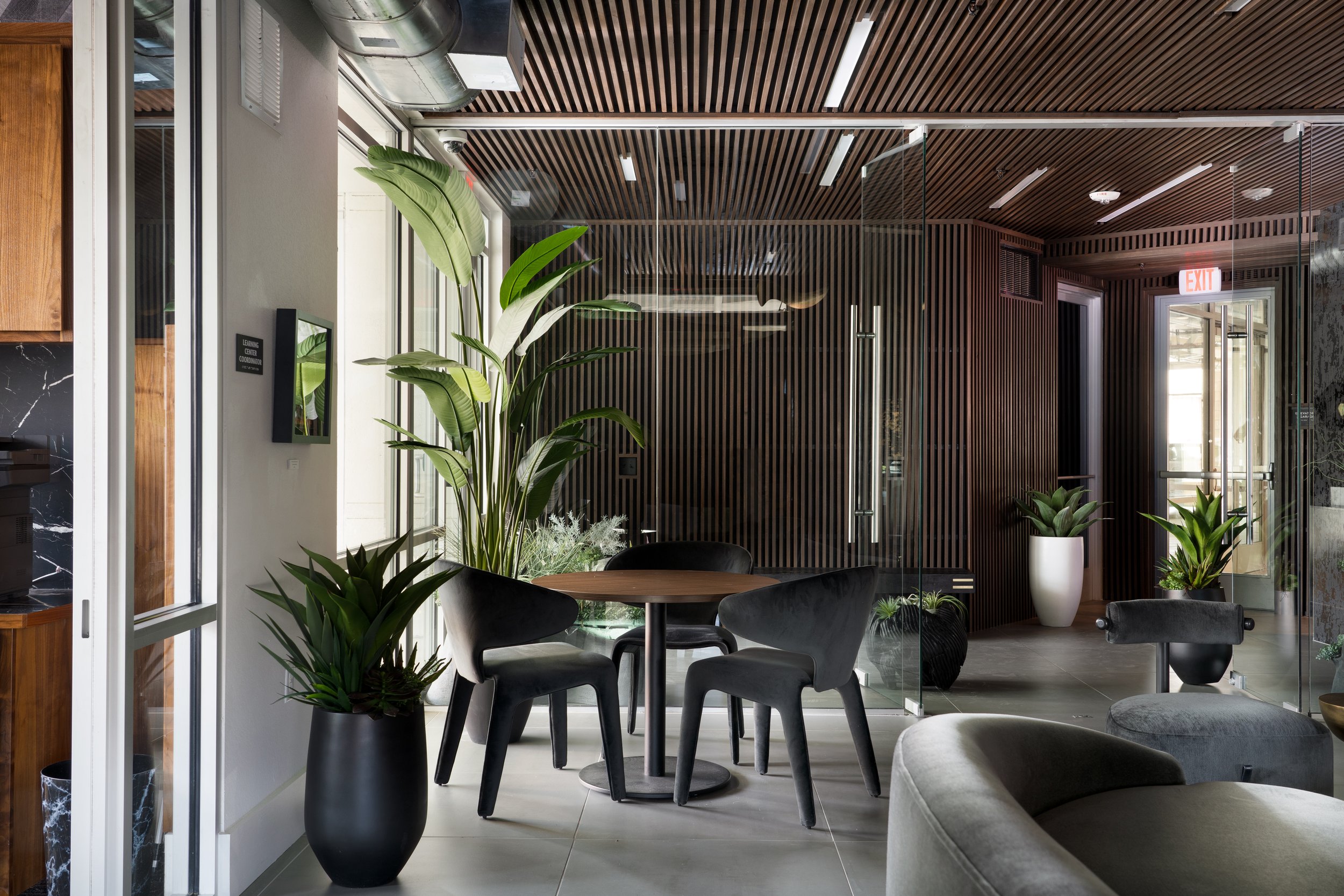
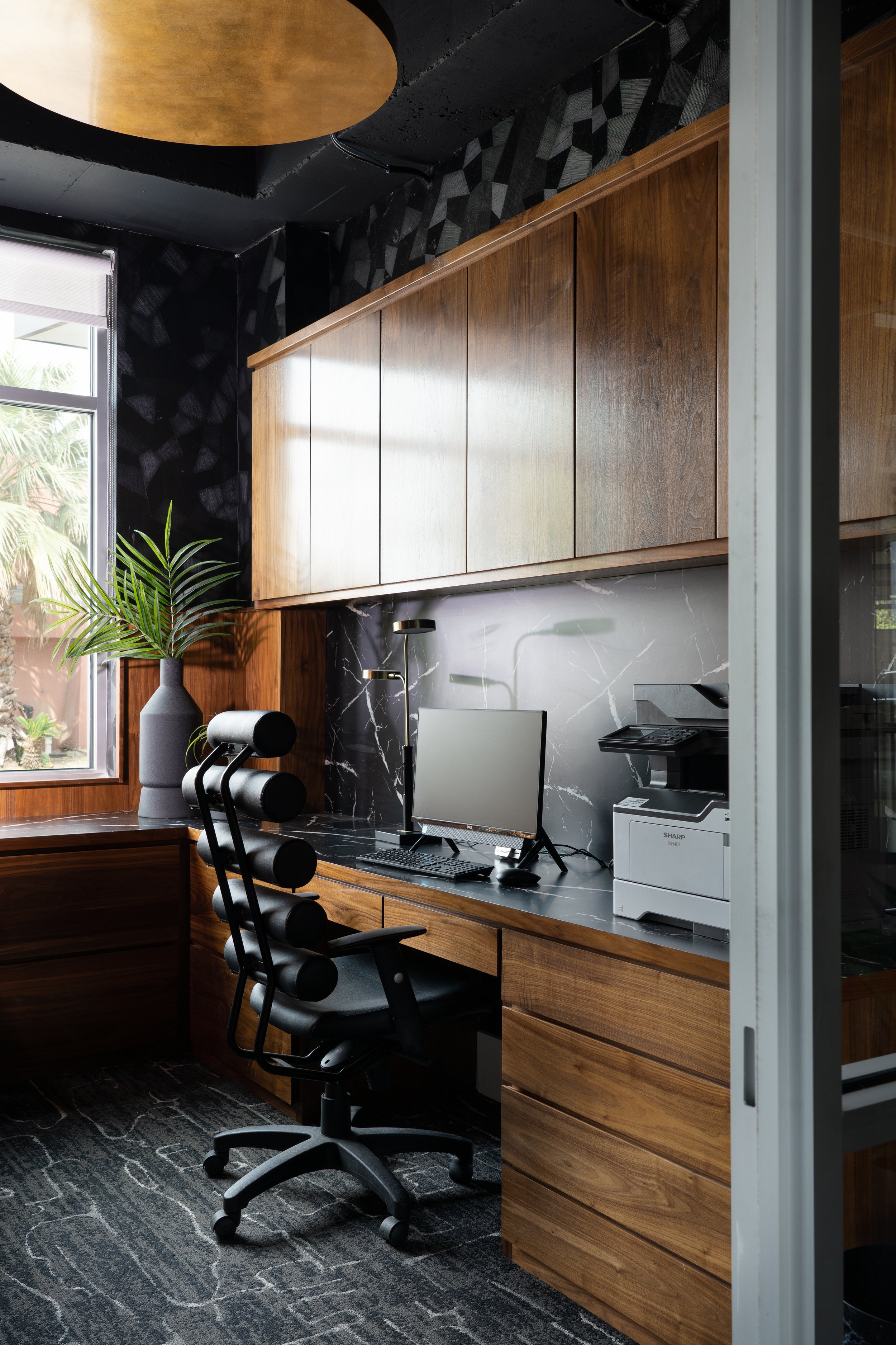
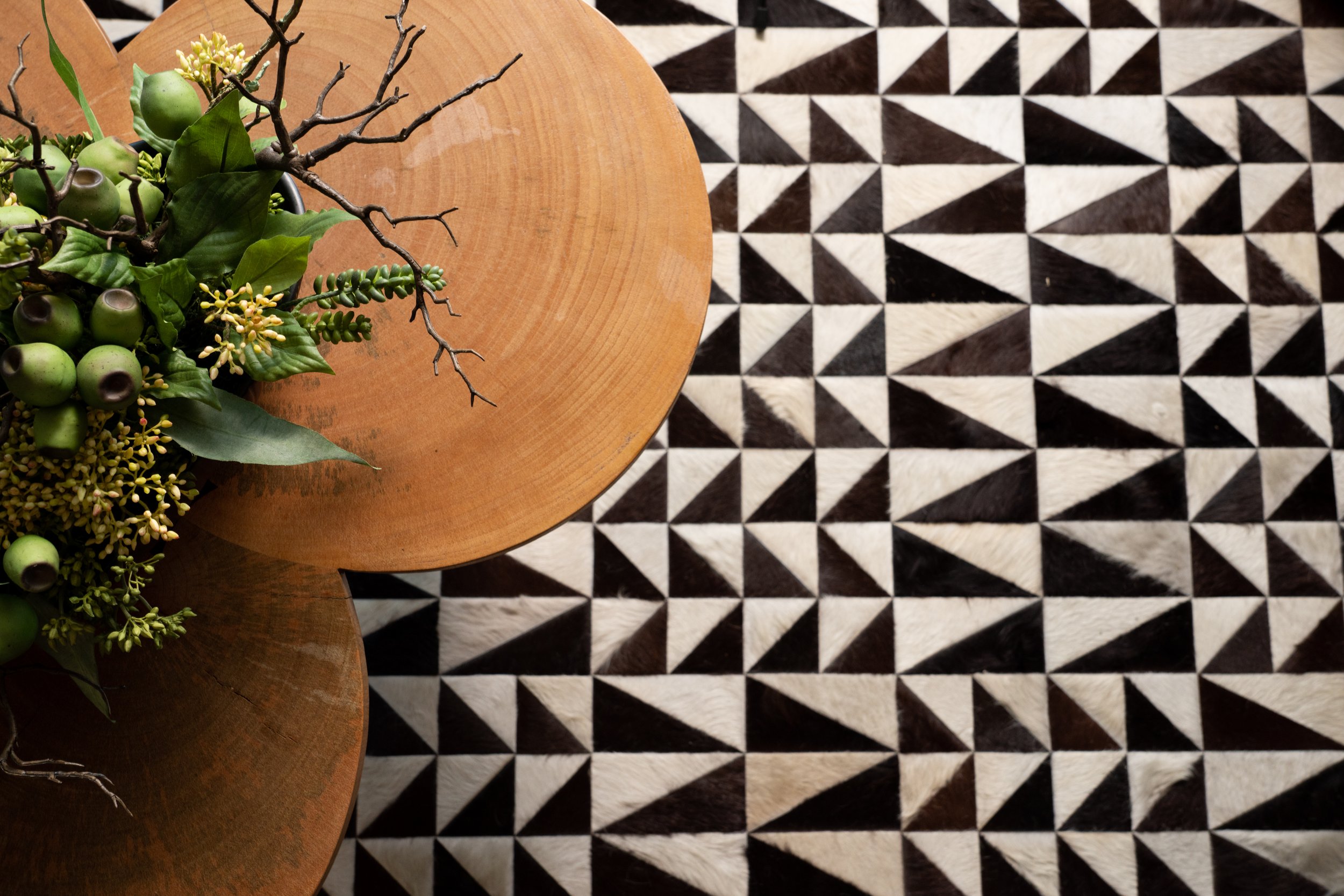
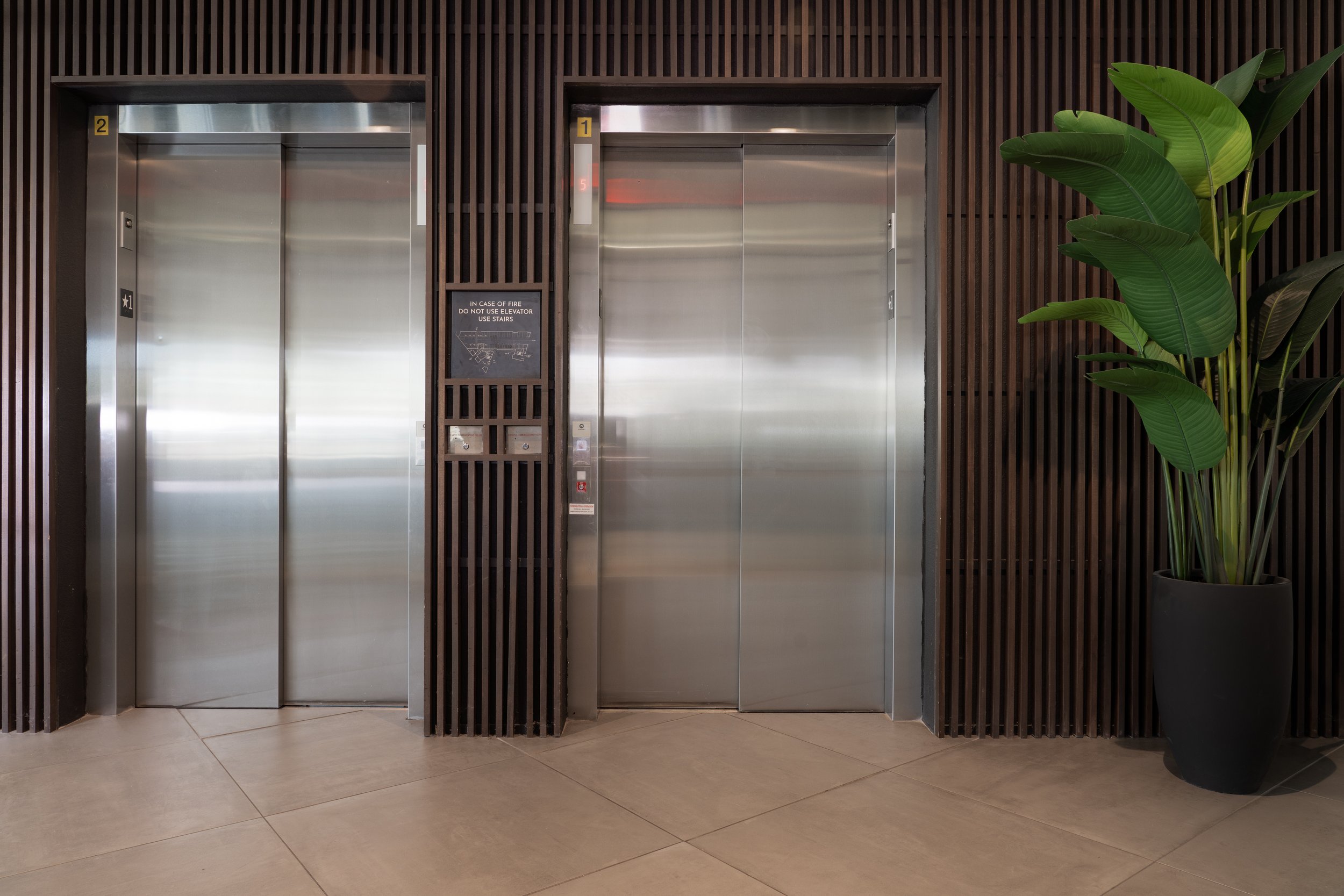
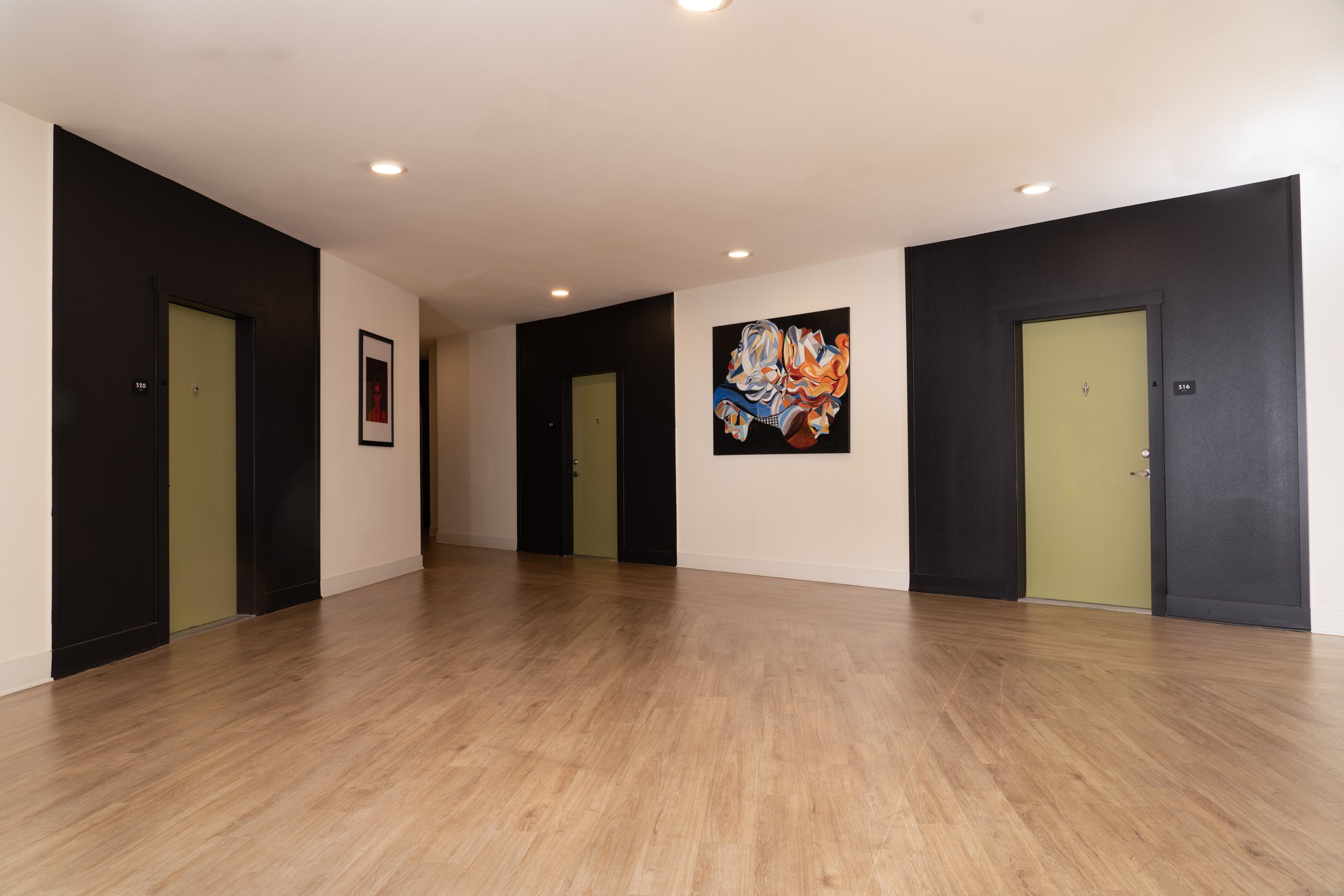
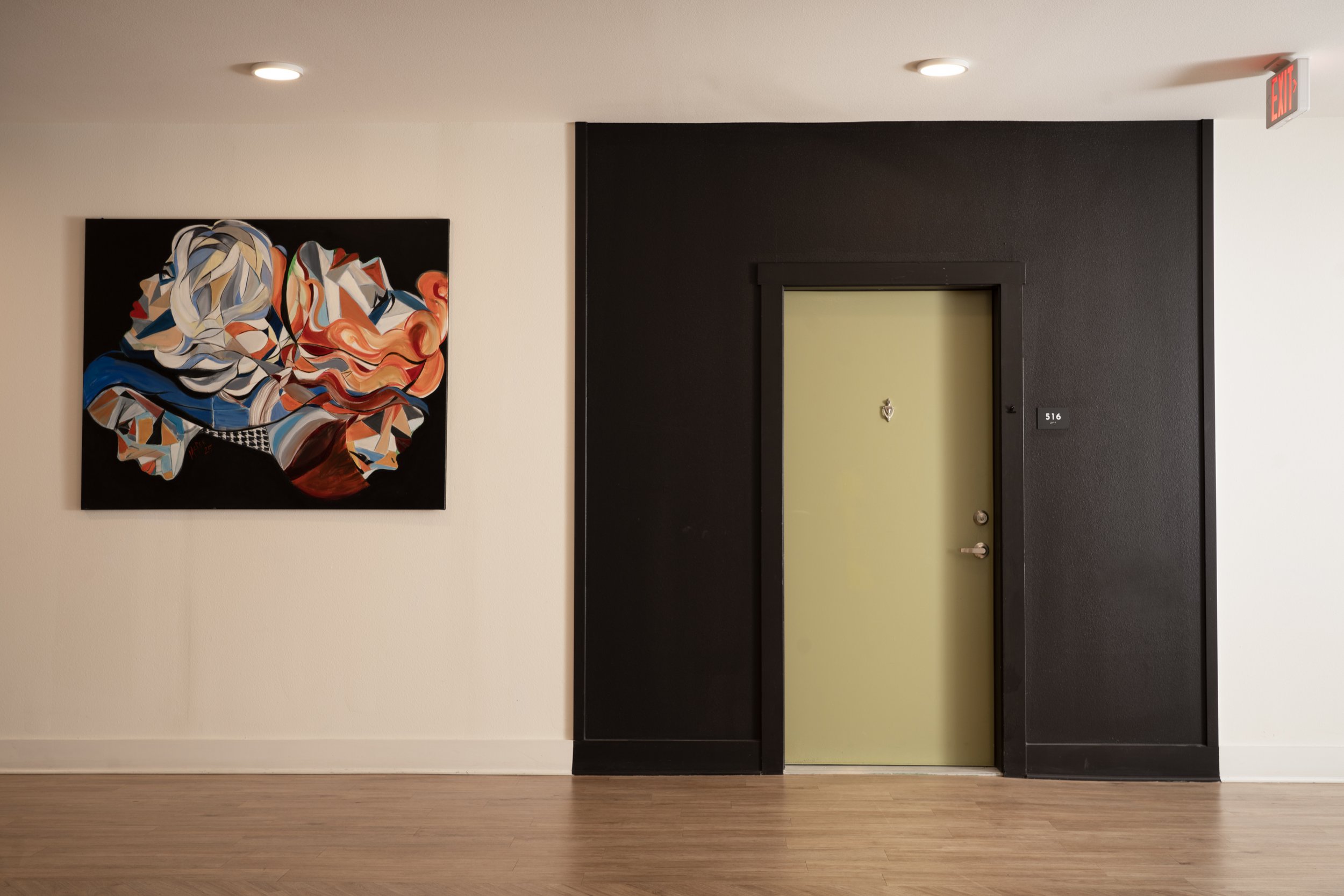
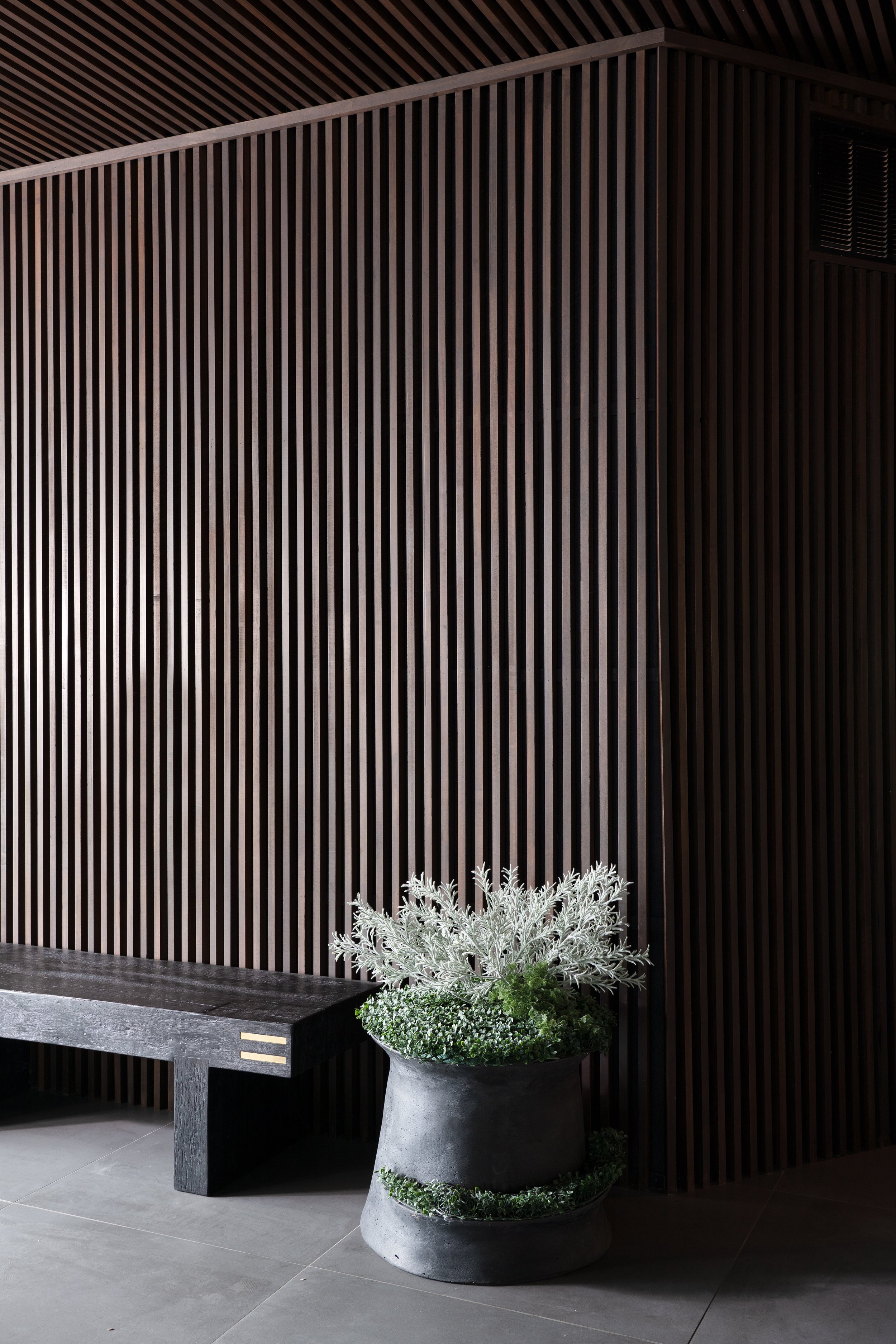
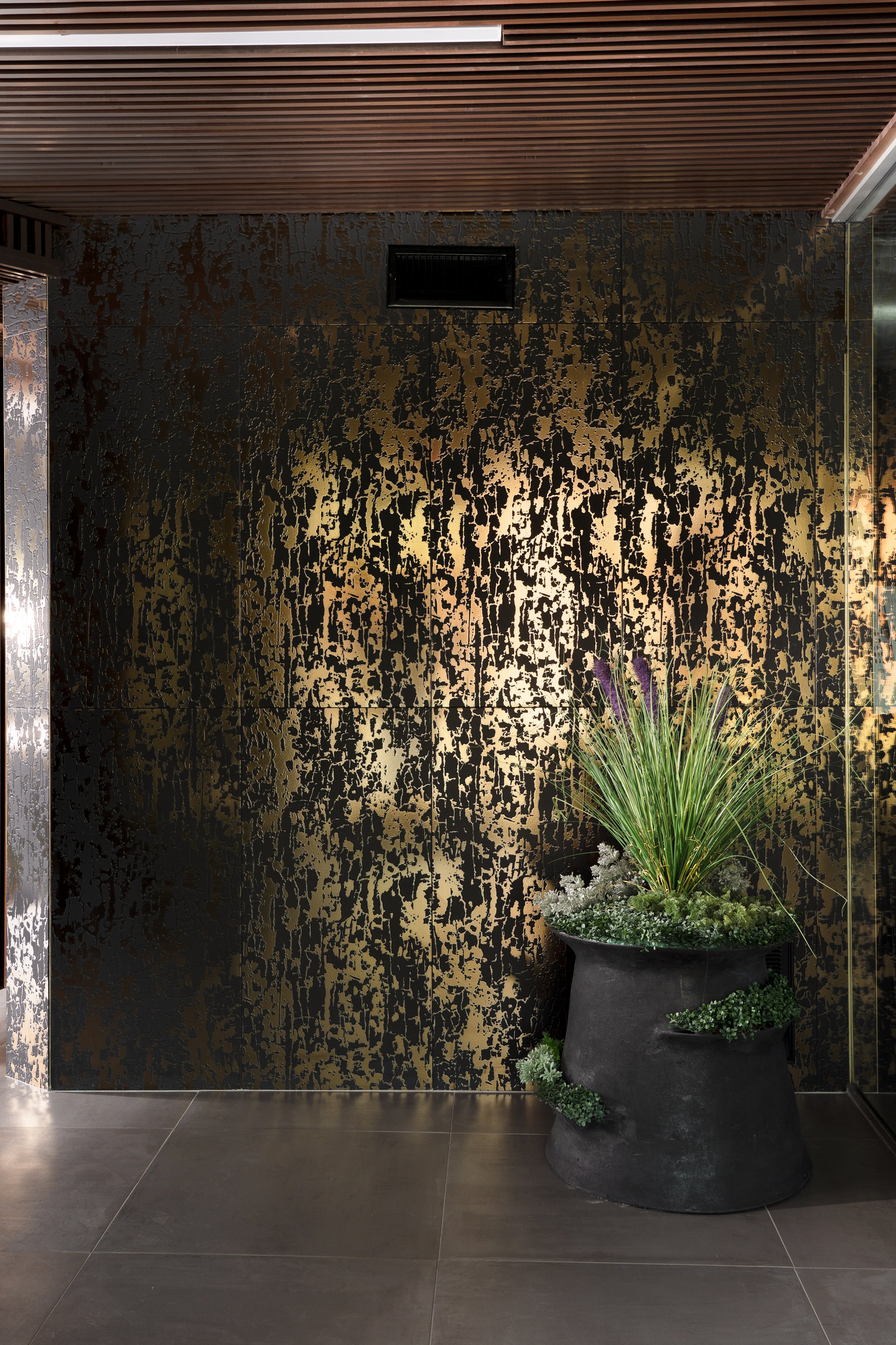
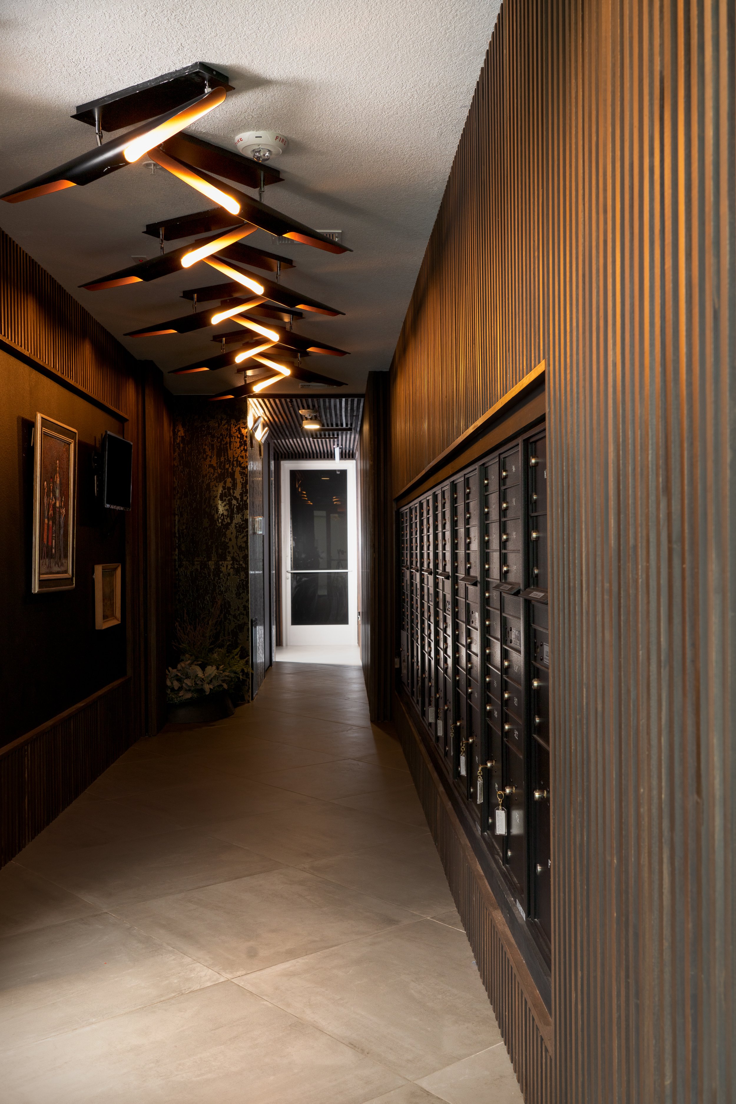
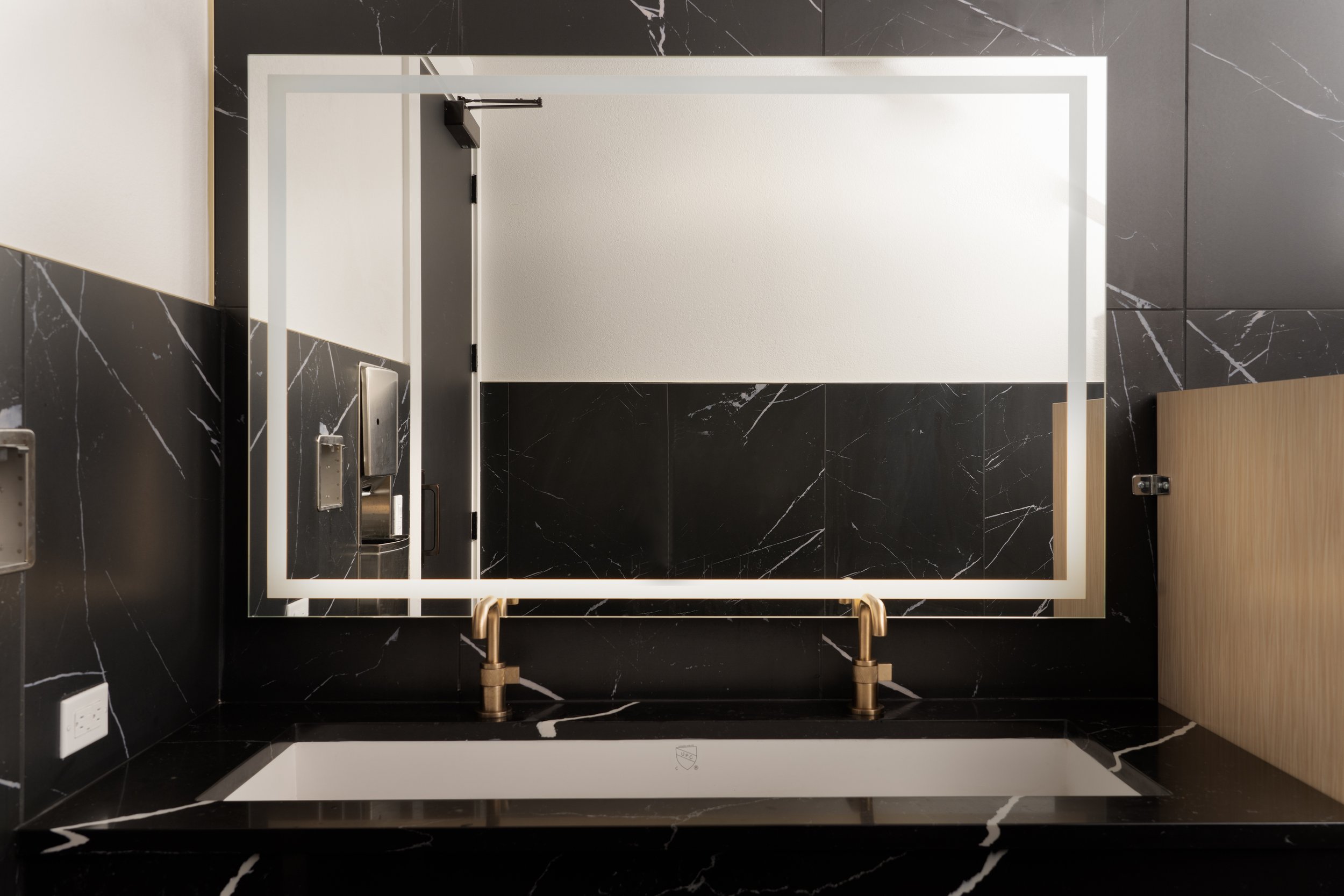
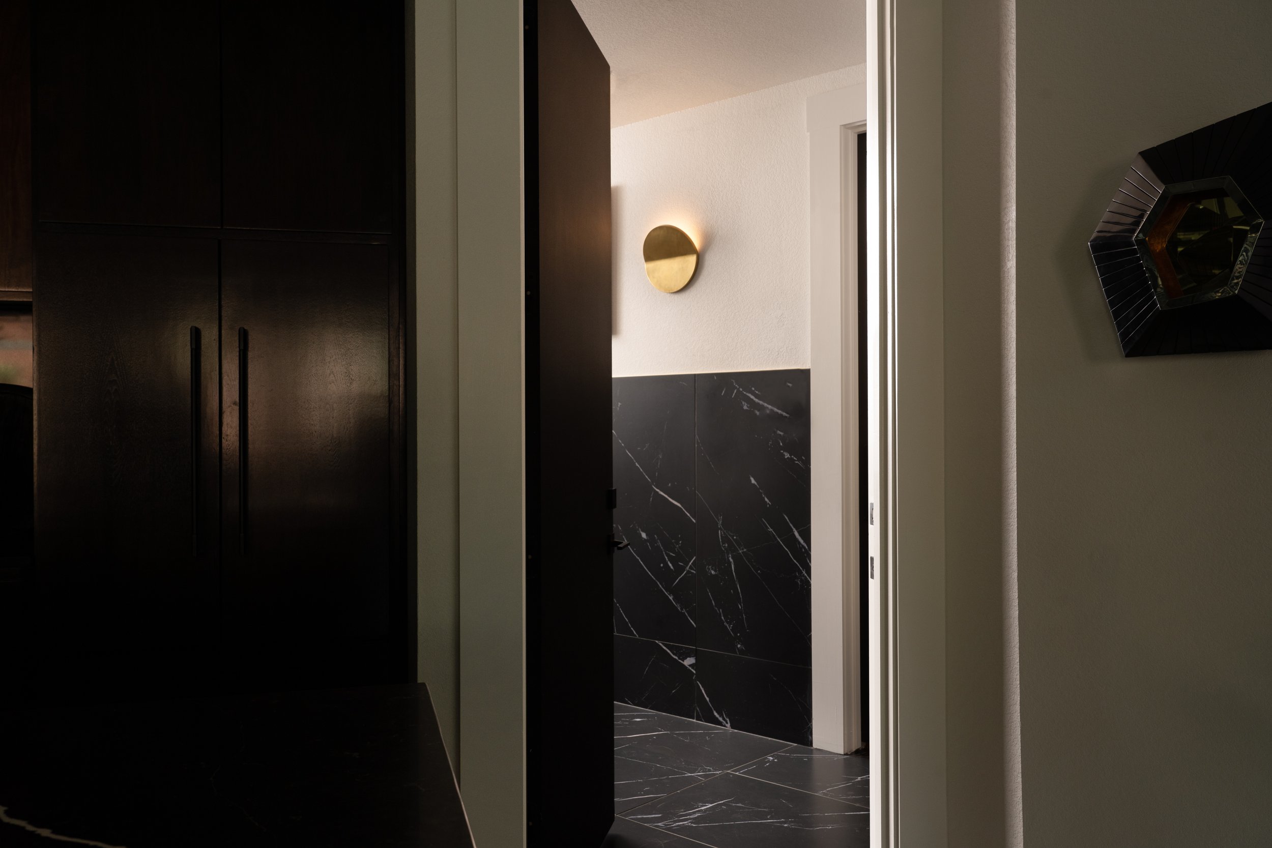
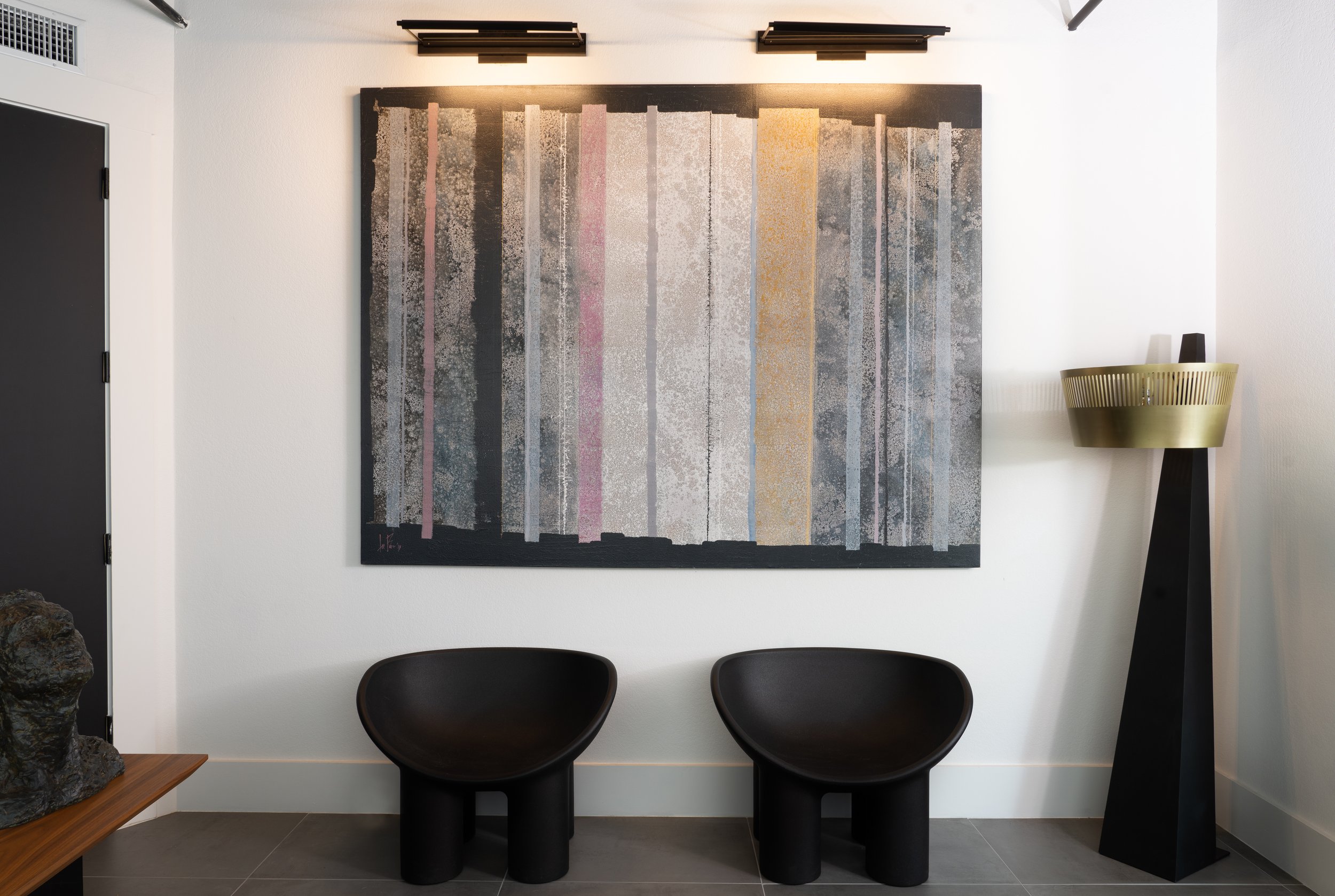
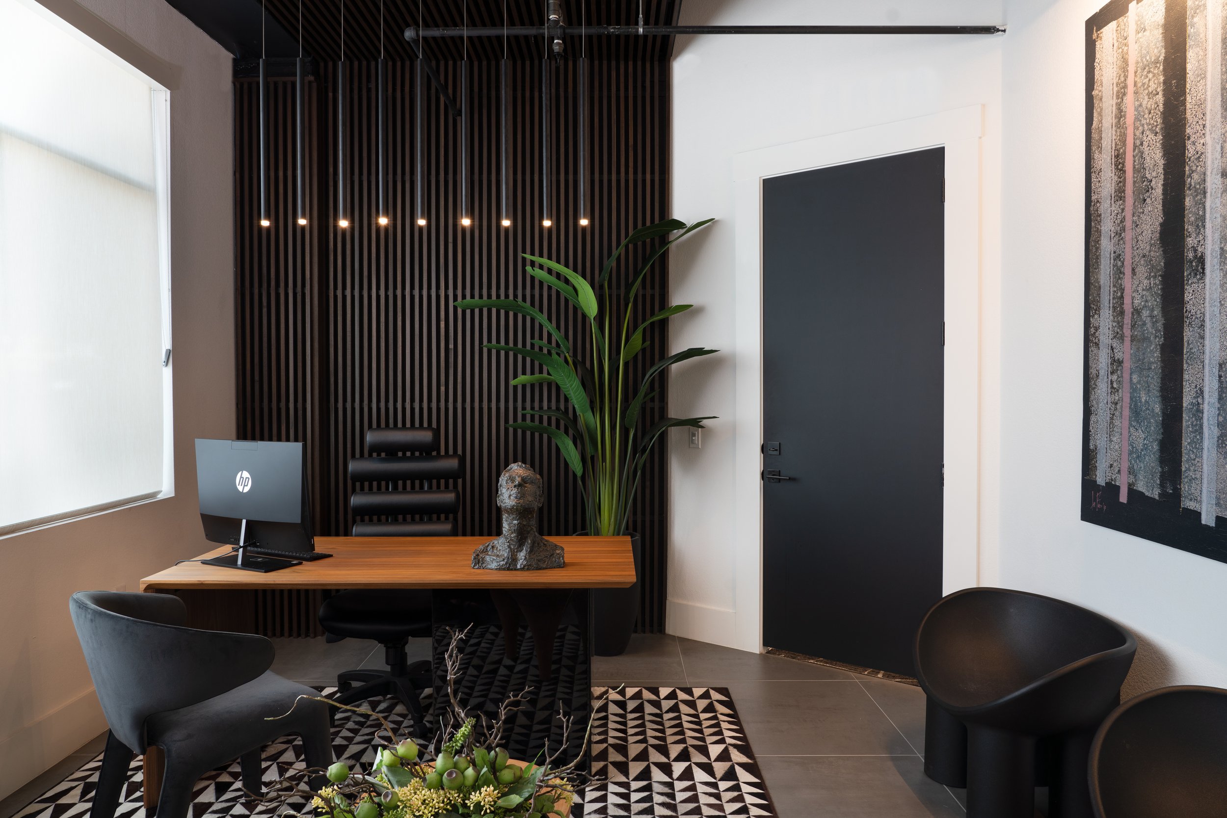
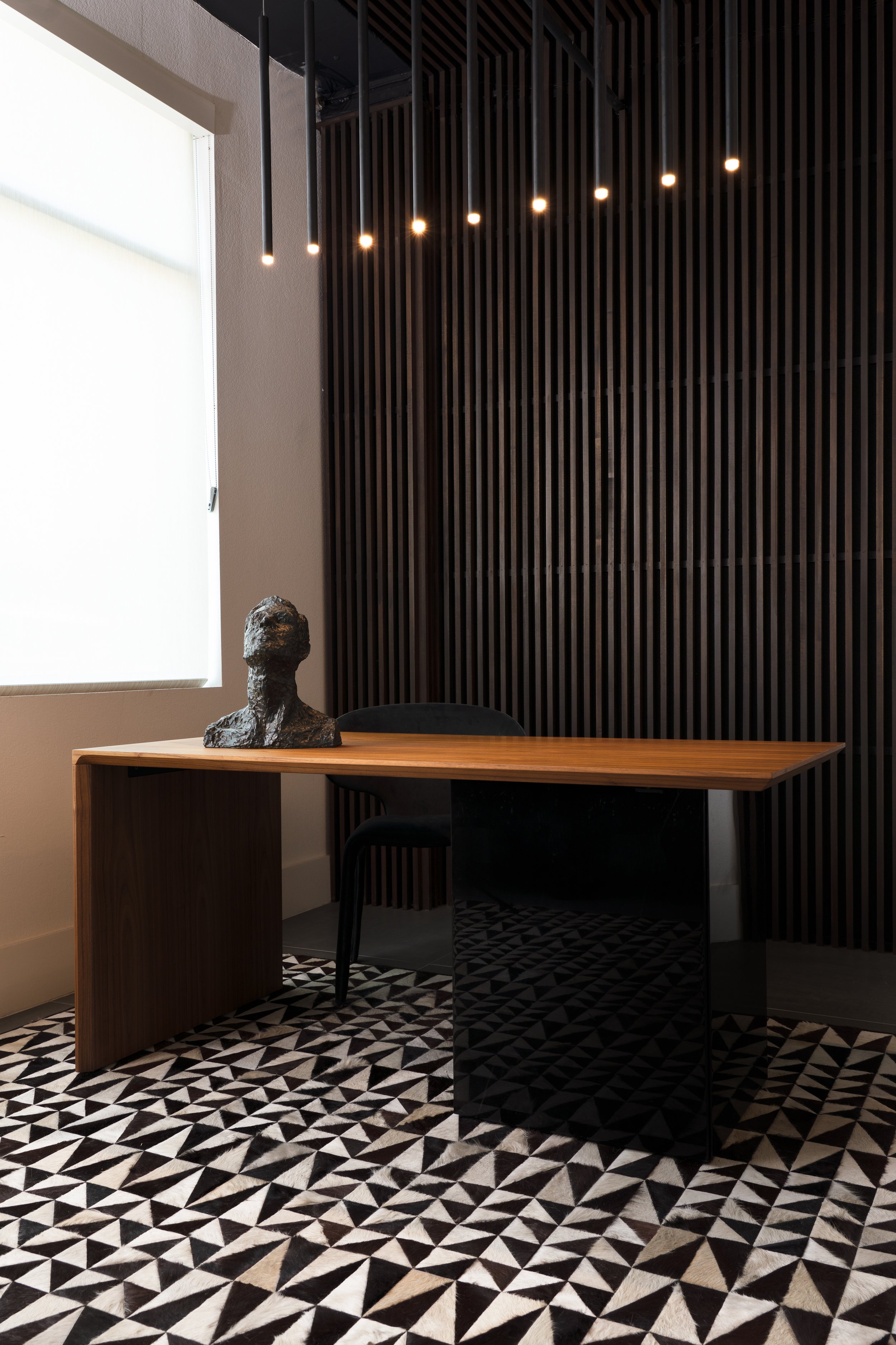
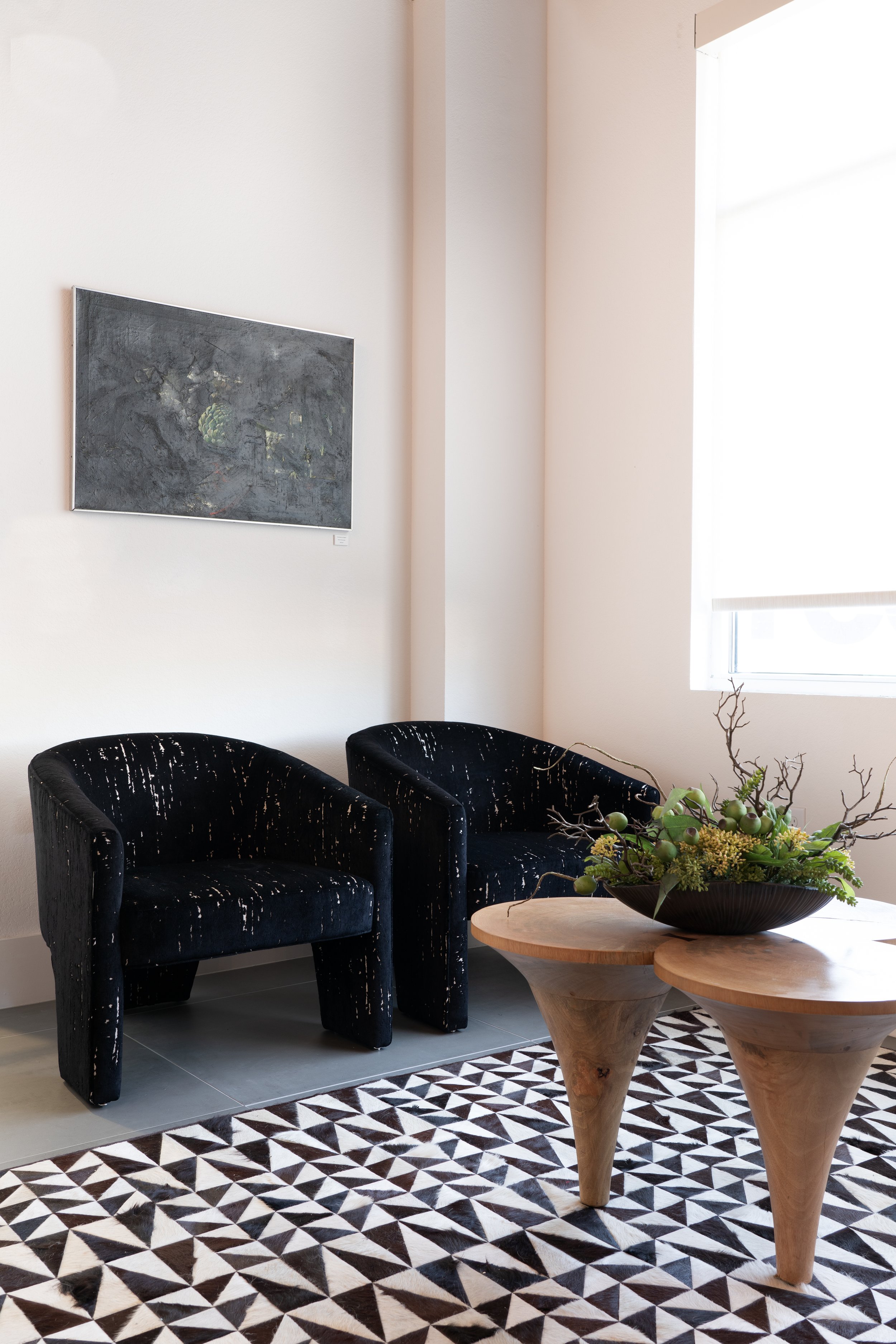
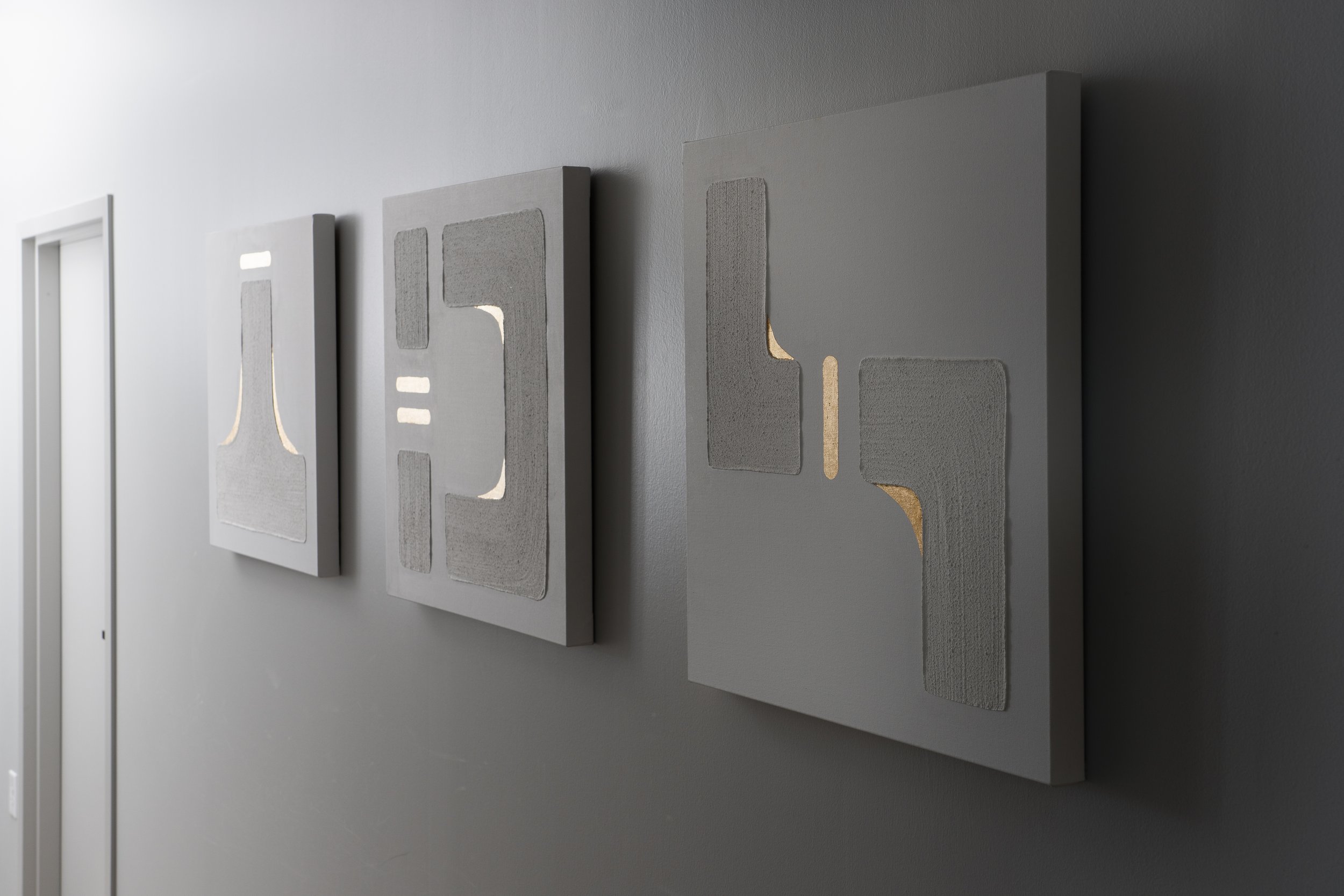
The Museum Reach Lofts sit between the San Antonio River and the San Antonio Museum of Art, both of which inspired this signature Y Interiors design. The central common areas take natural cues from the landscape and feature organic-inspired accents. Black marble waterfall edge countertops define the kitchen, while a metallic gold and black lava rock tile fireplace, tree trunk coffee tables, and manta ray pendant lights accent the conversation area. Likewise, staggered light fixtures in the mail room mimic the river's flow. Each piece of this design was artfully curated, from the gallery canvases lining the halls to the dimensional wood paneling mirroring the building’s unique angles. These moody yet welcoming common spaces make for a luxurious first impression and provide a cozy spot for residents to unwind.

HEIDGEN HOUSE
PROJECT: Boutique Venue / Historic Renovation
LOCATION: SAN ANTONIO, TX
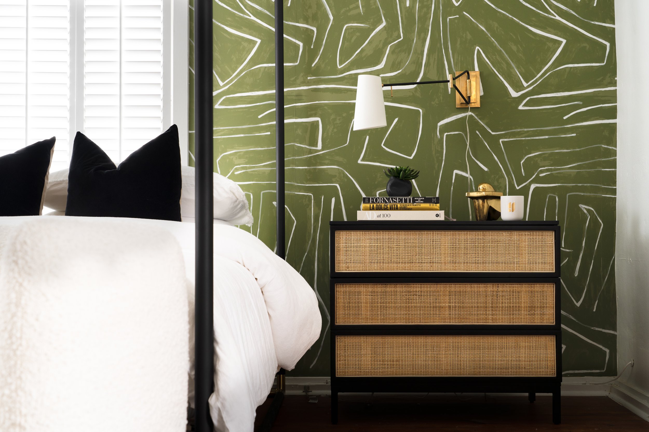
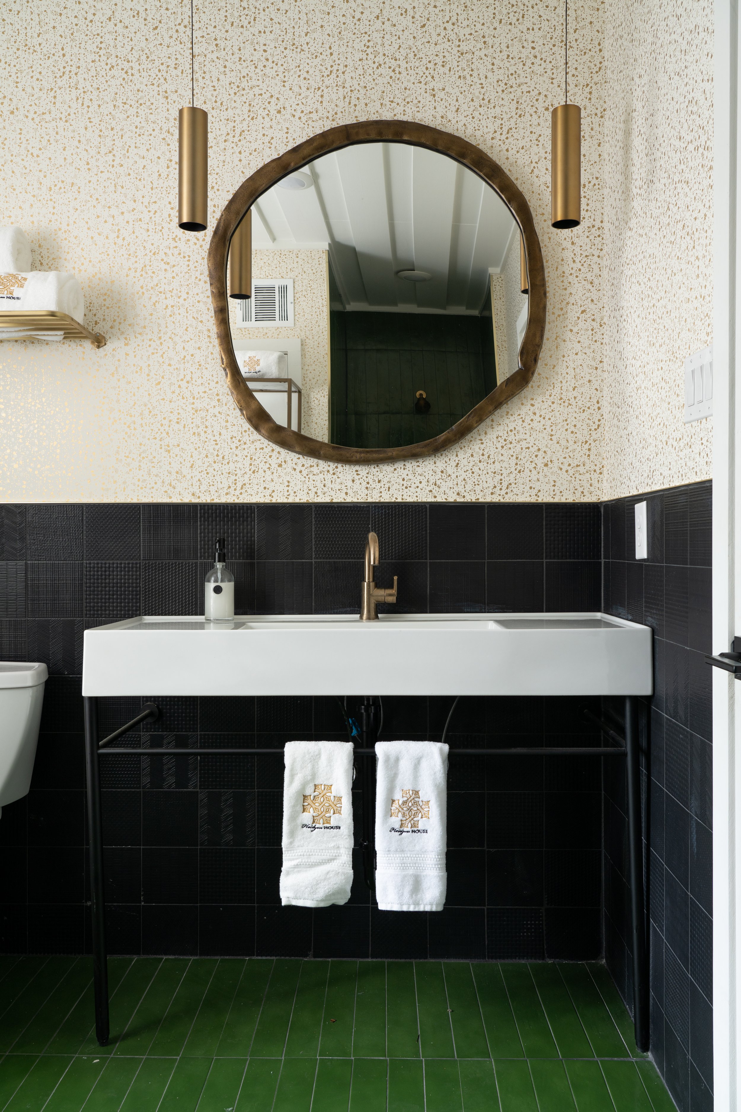
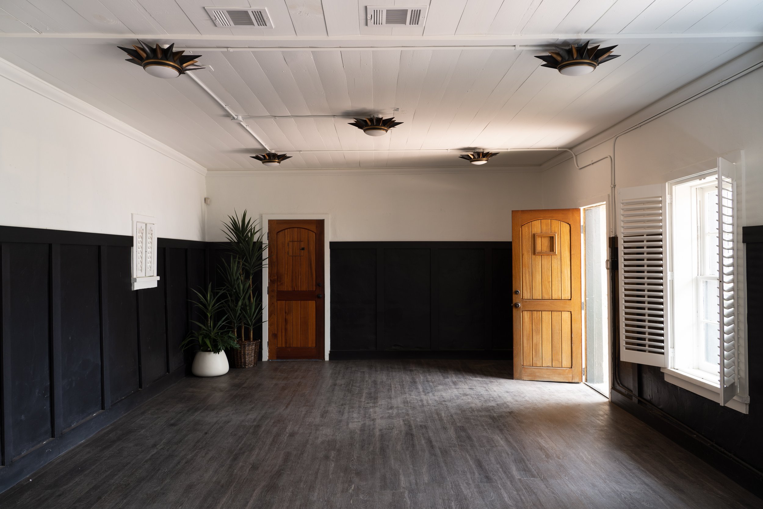
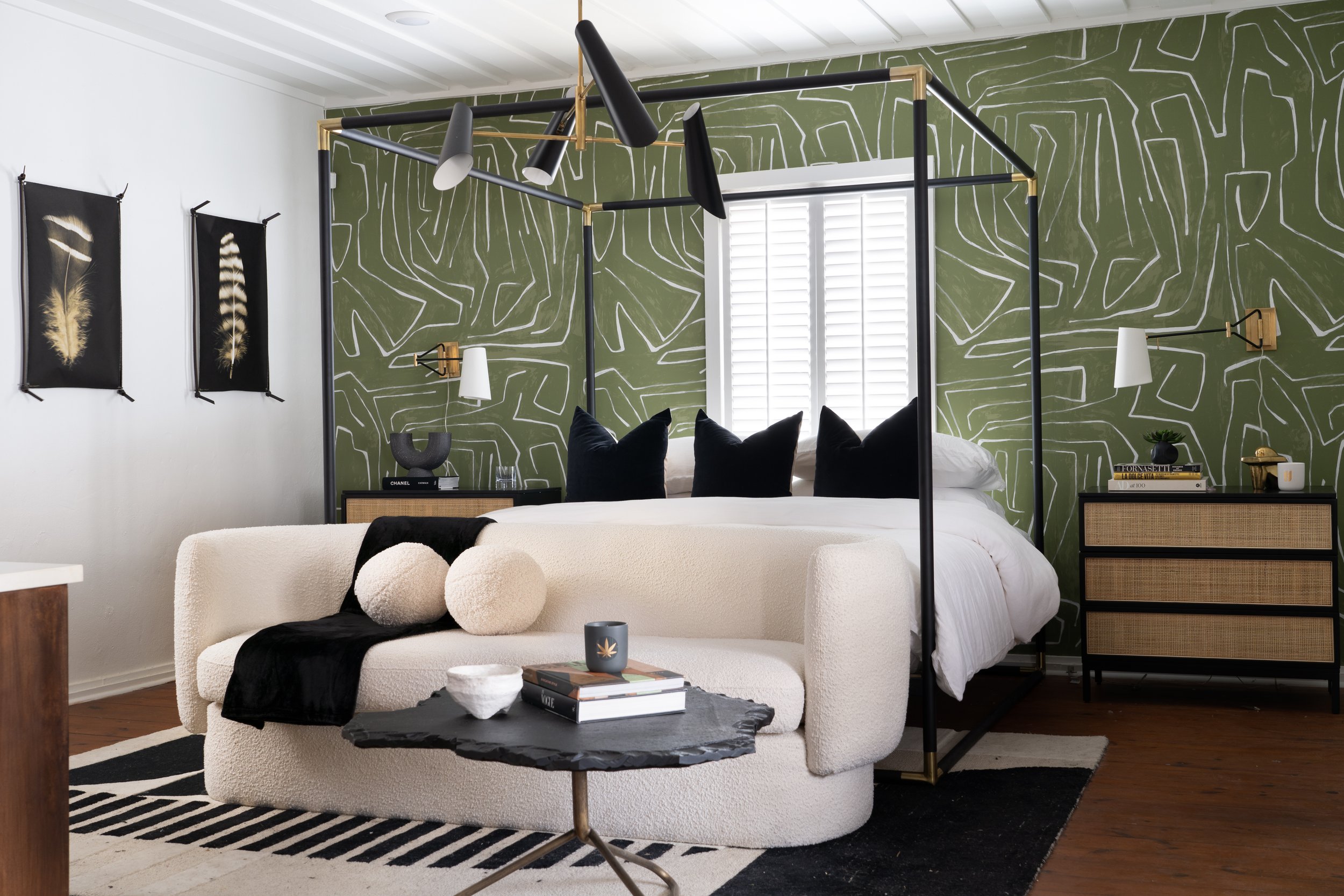
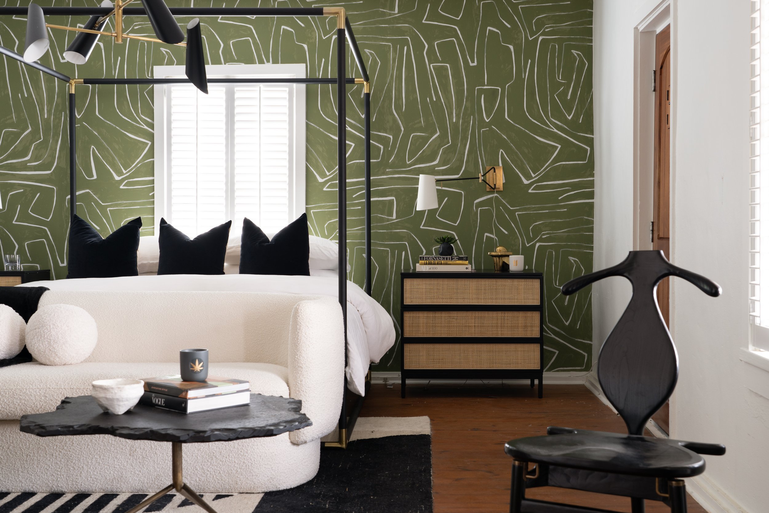
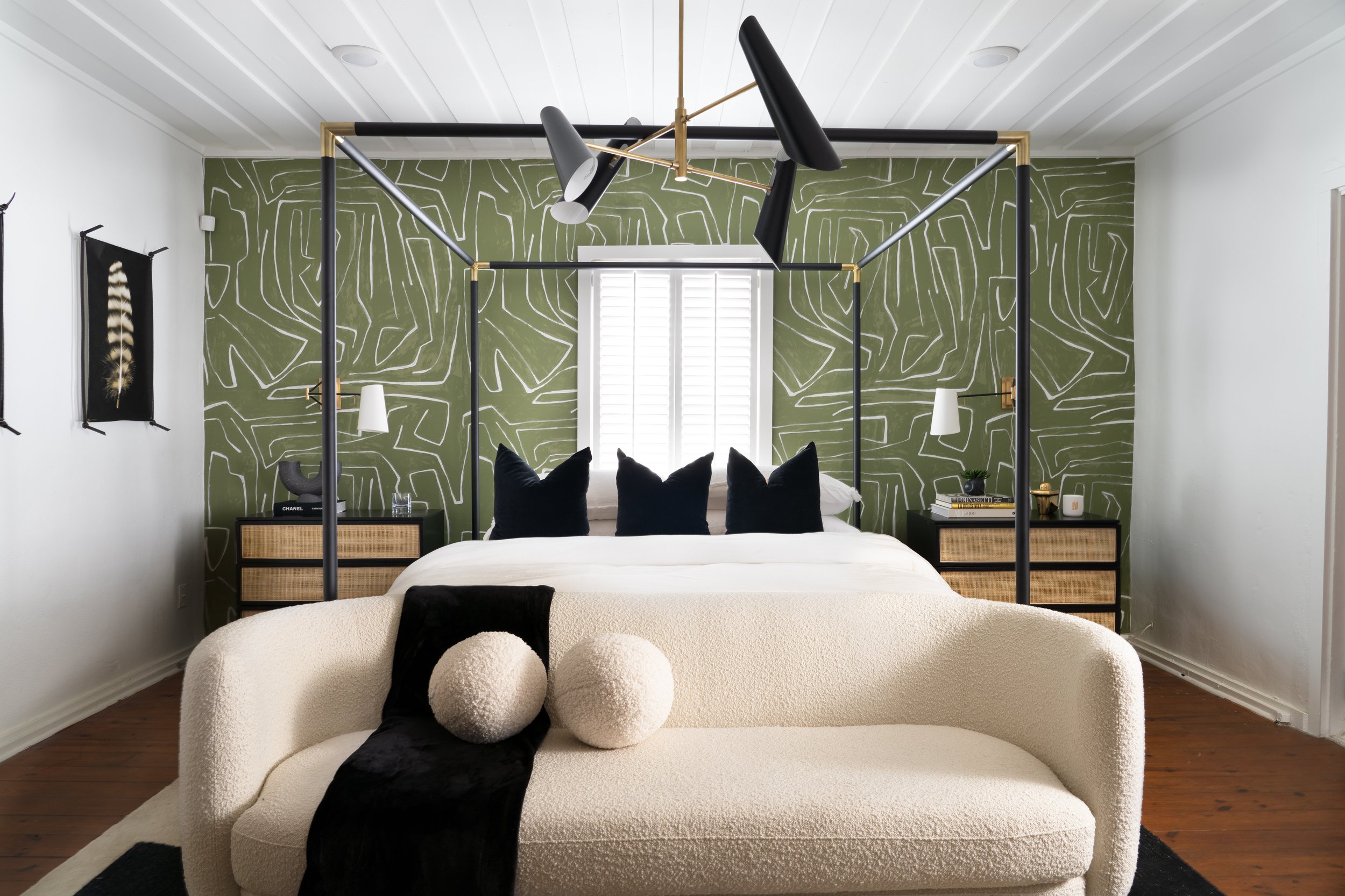
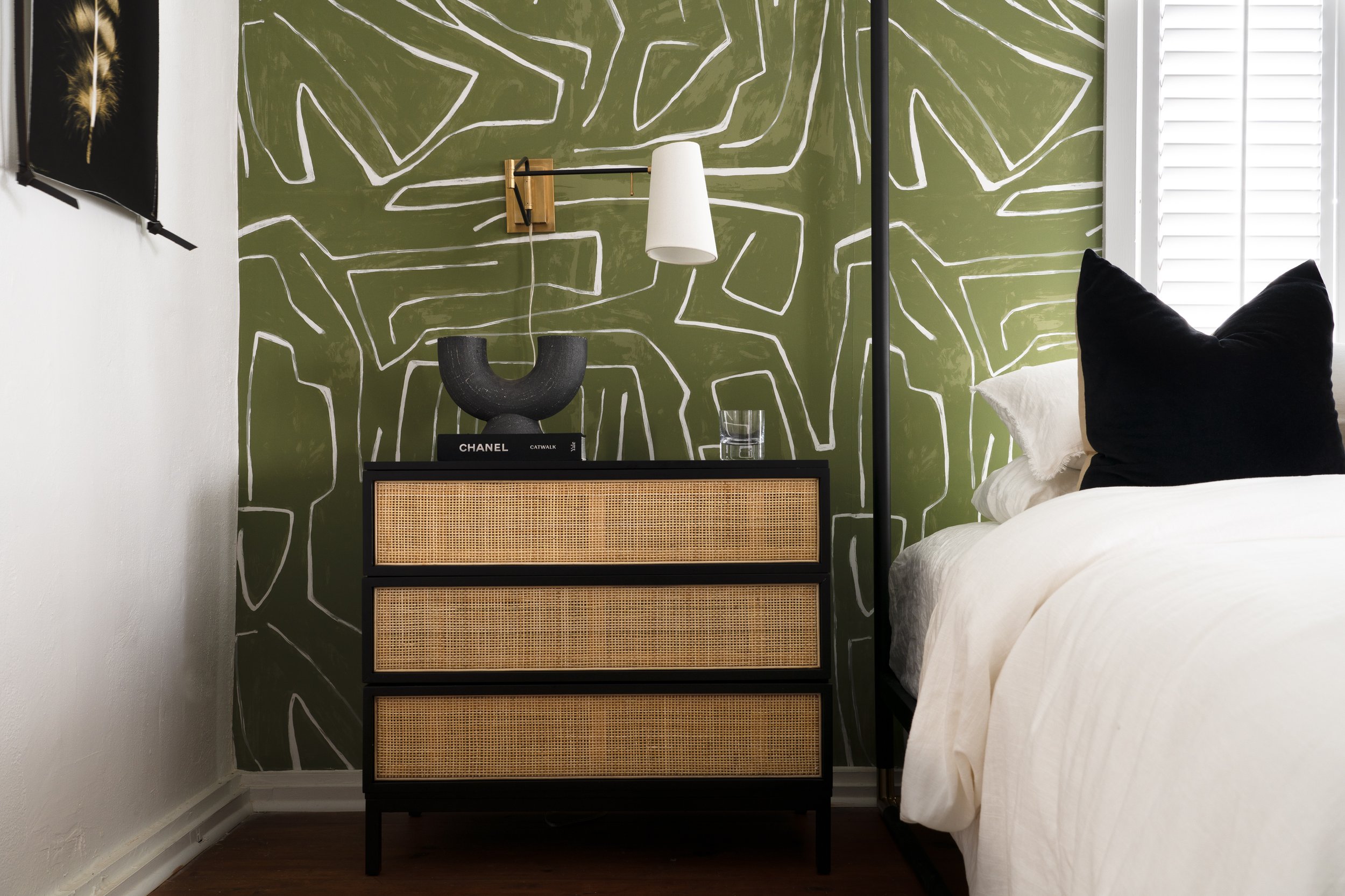
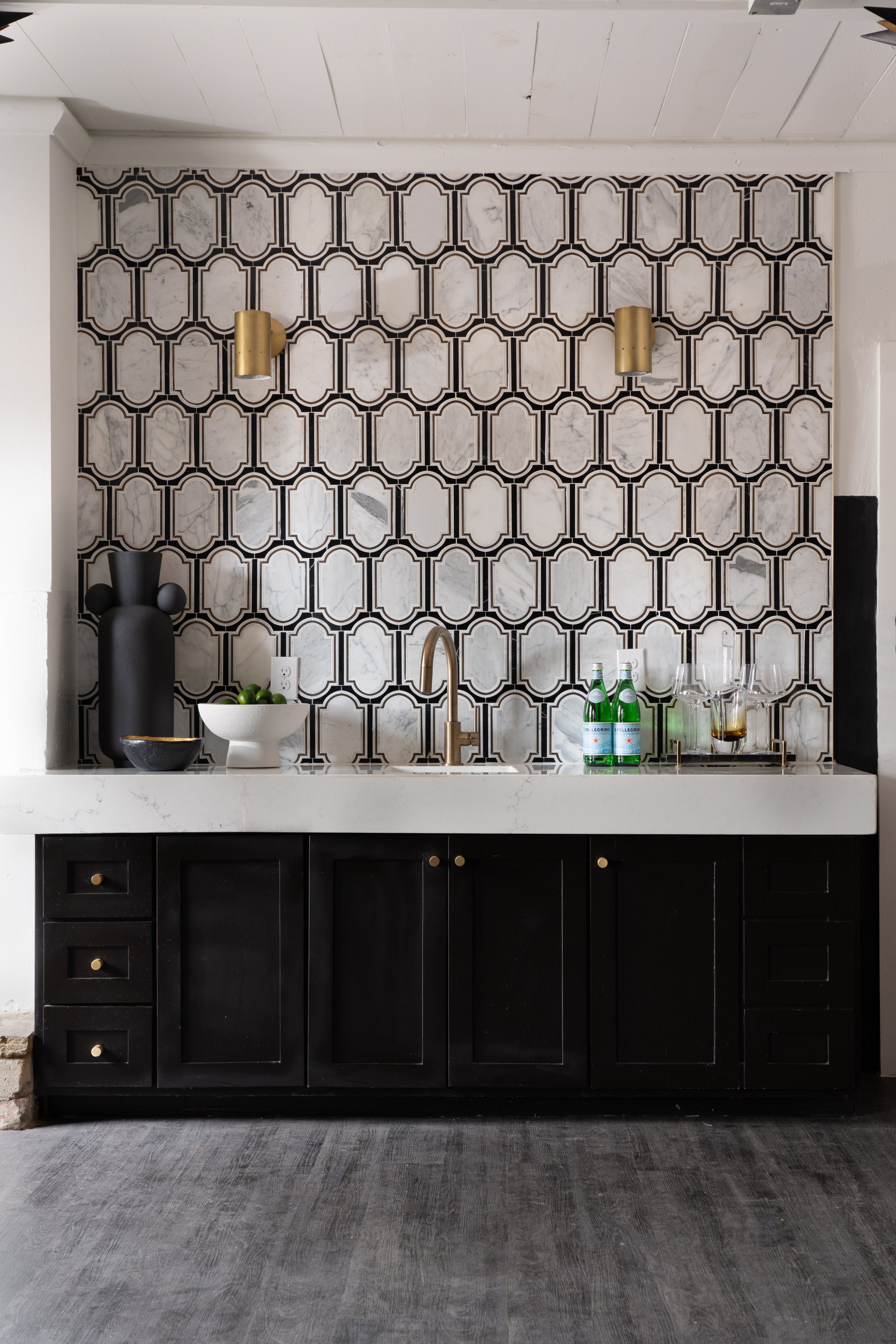
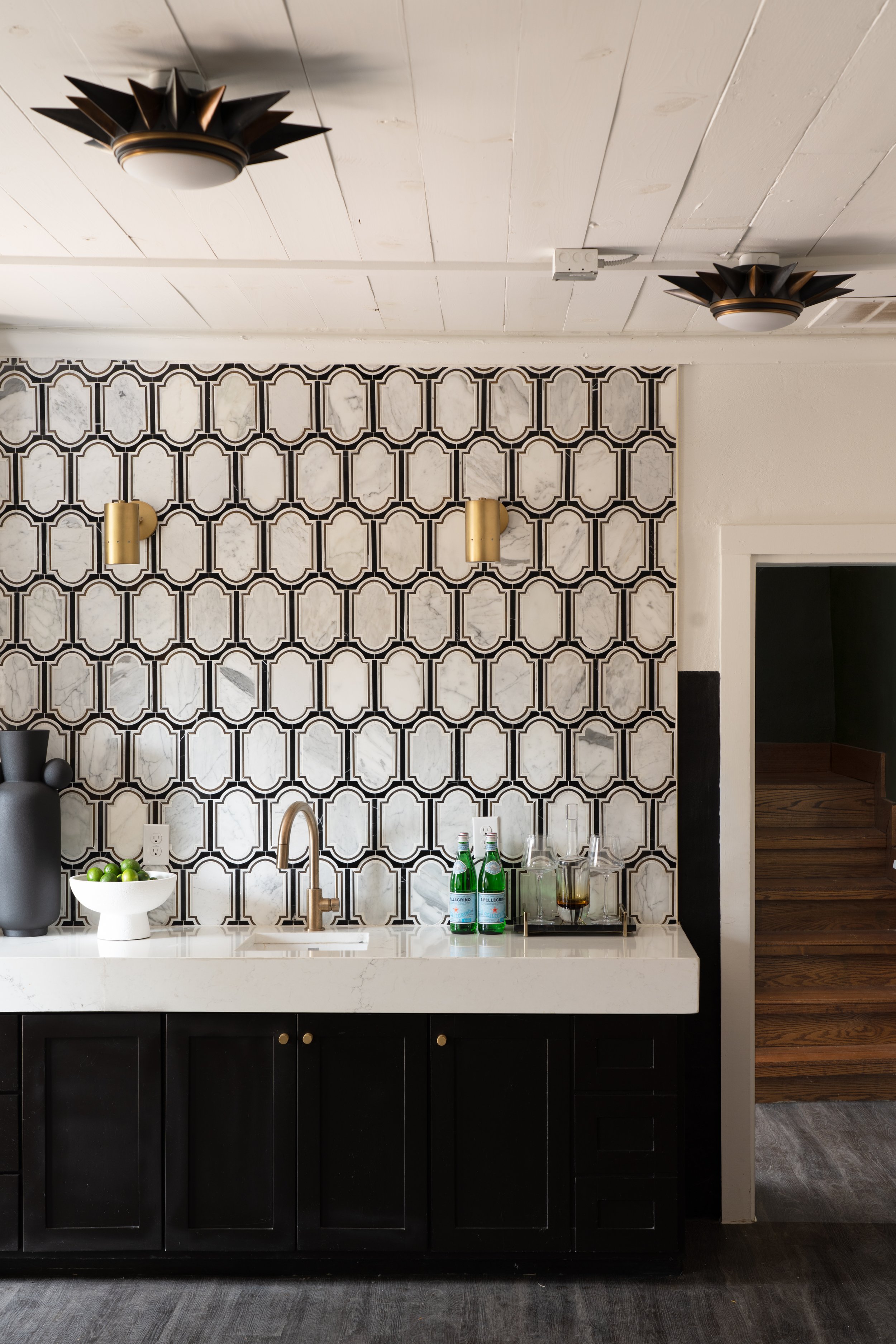
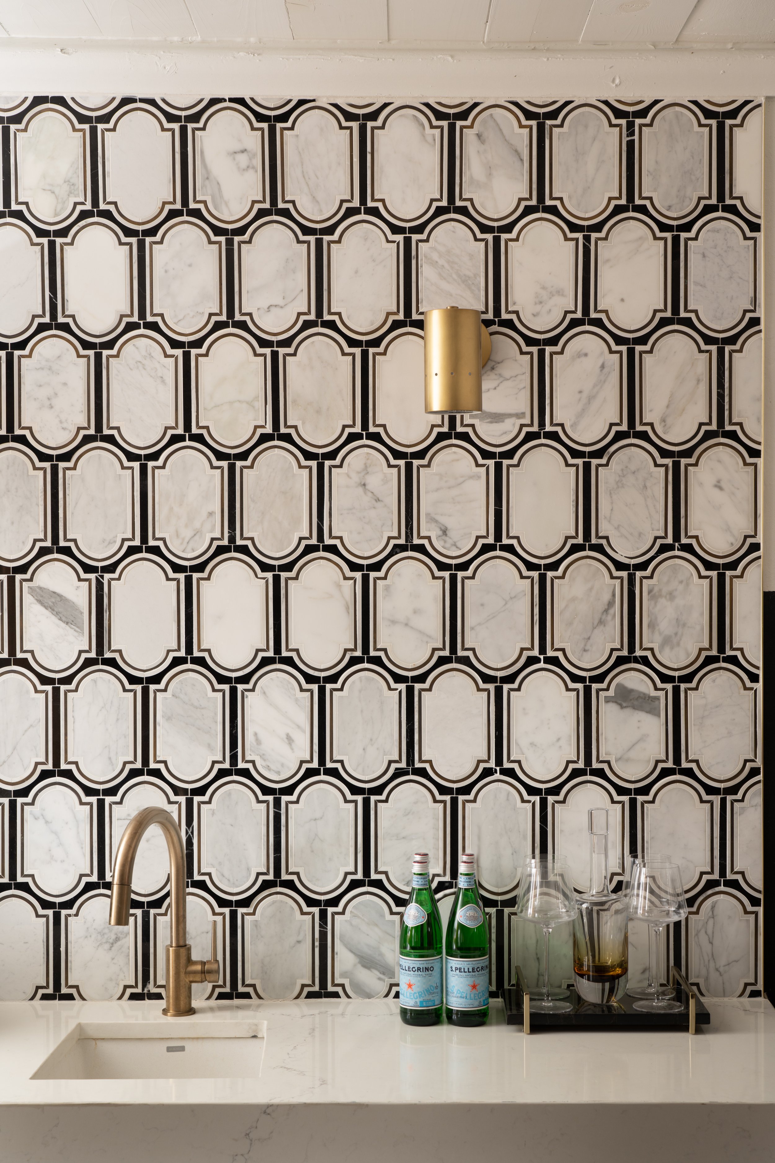
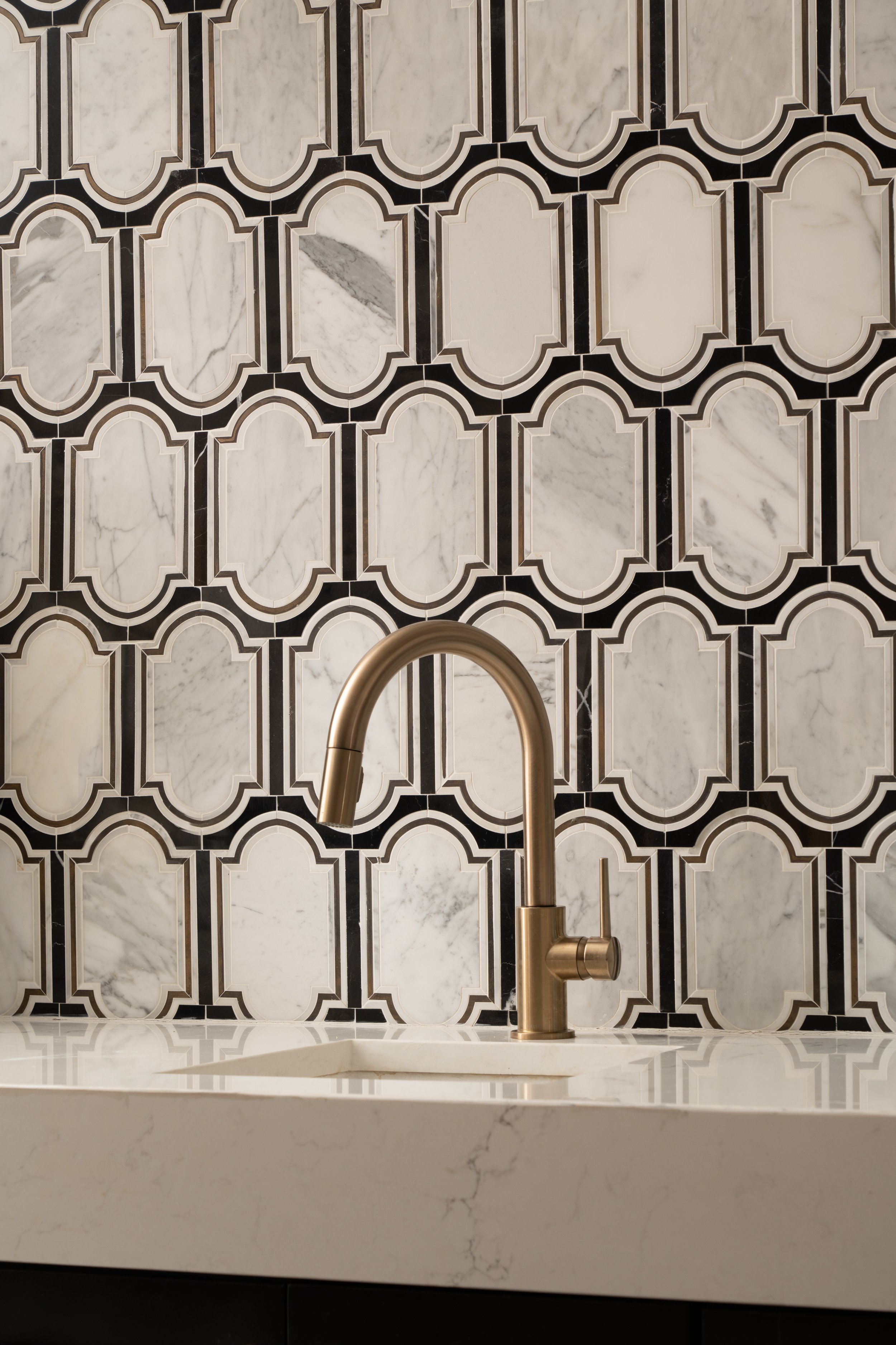
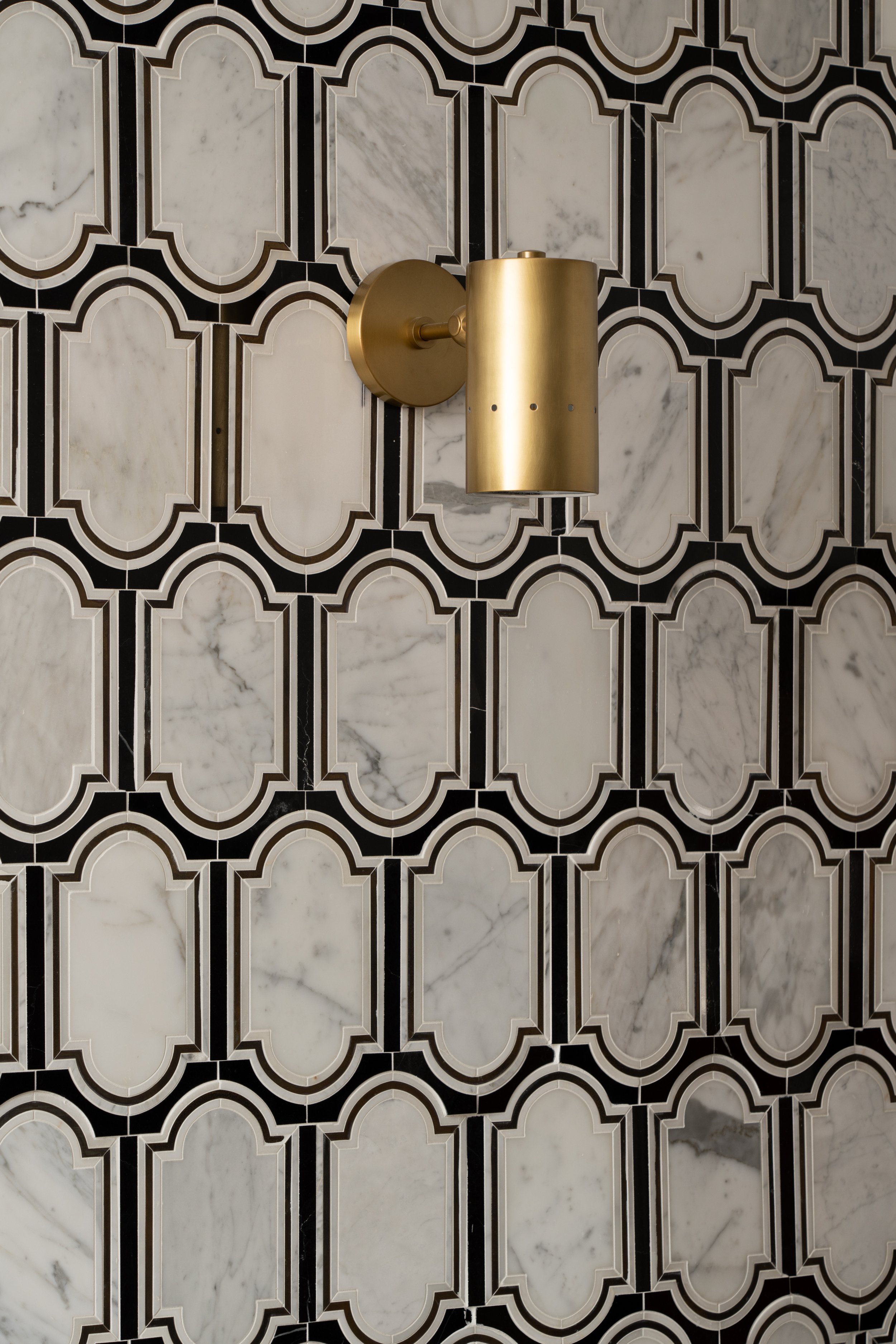
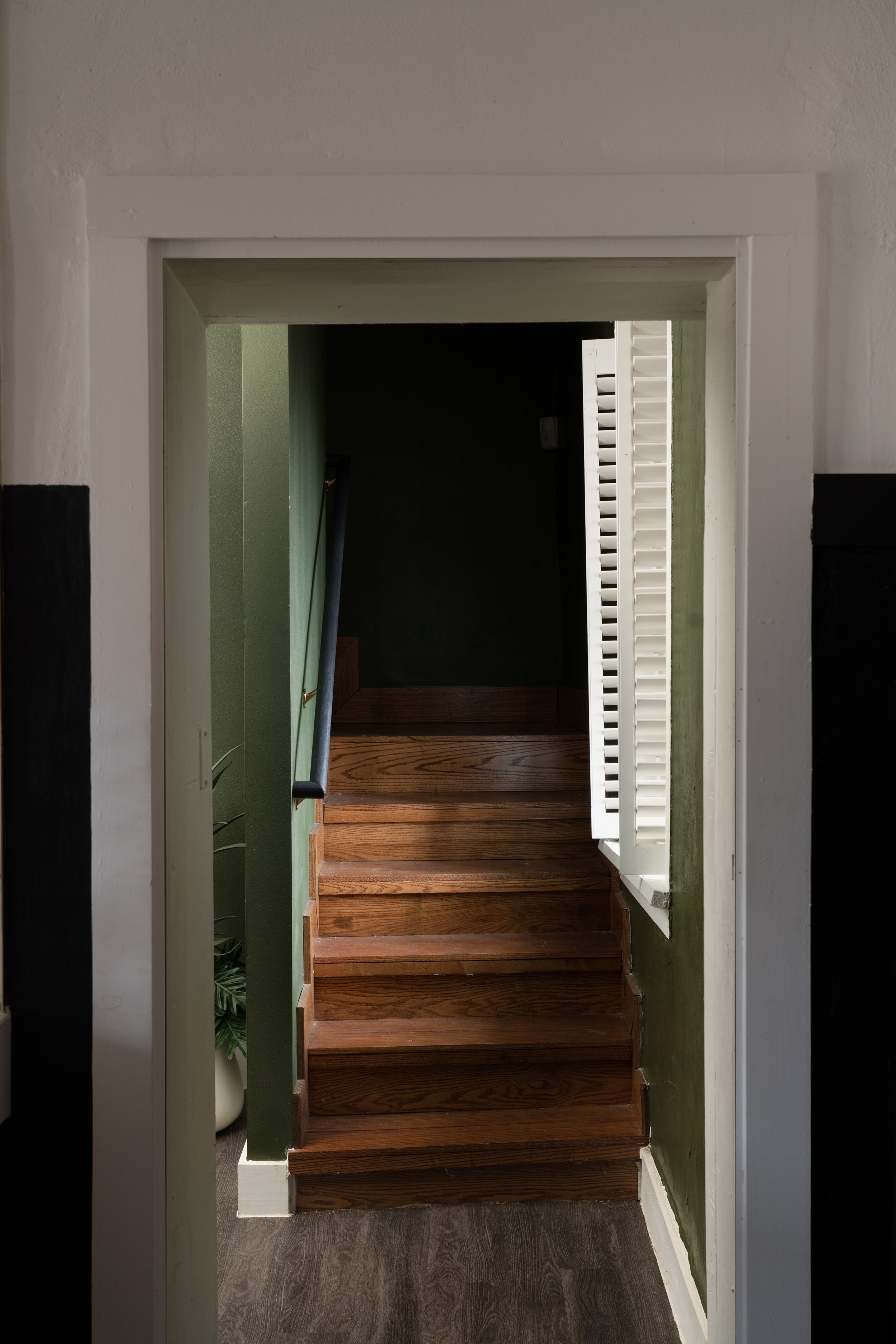
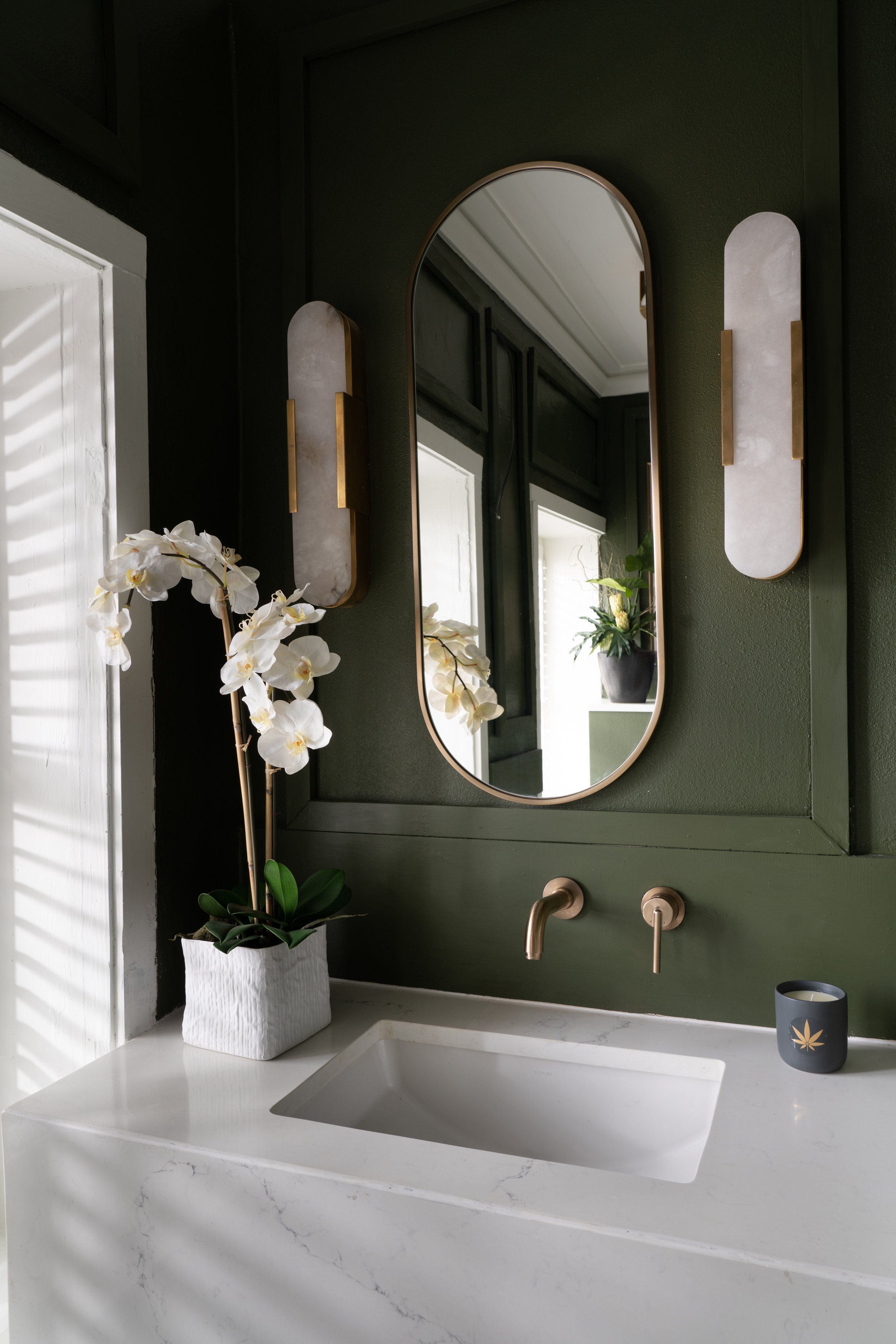
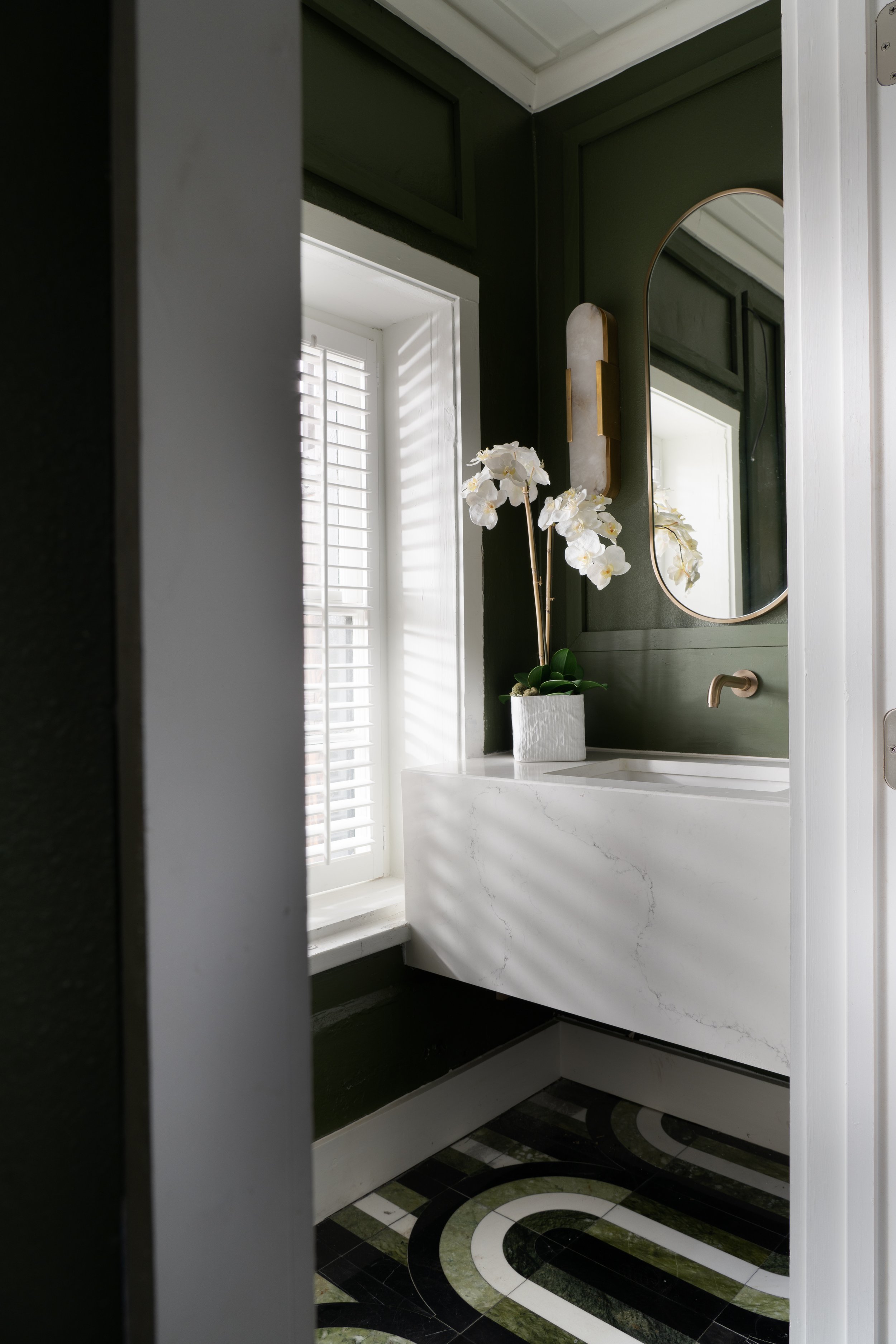
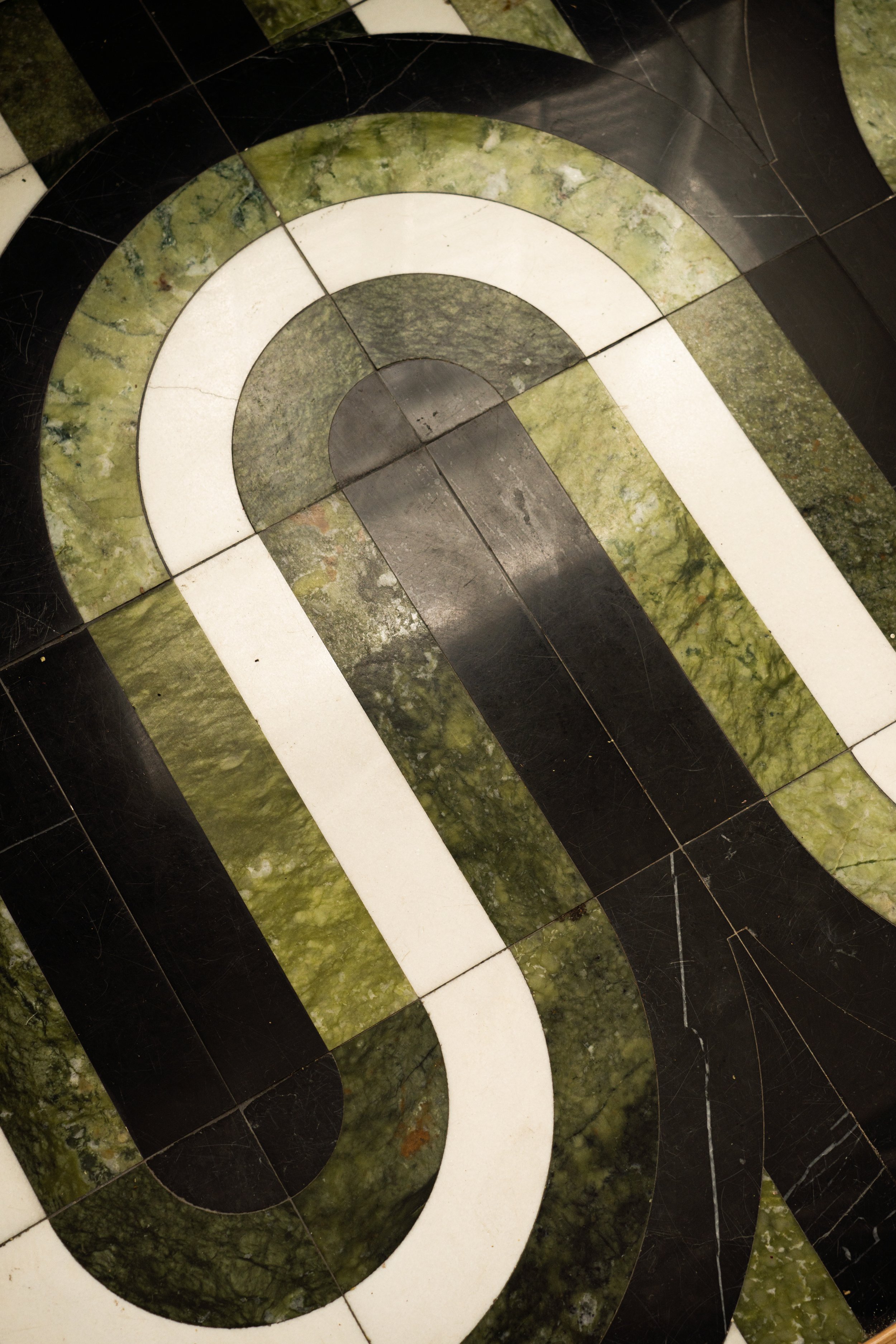
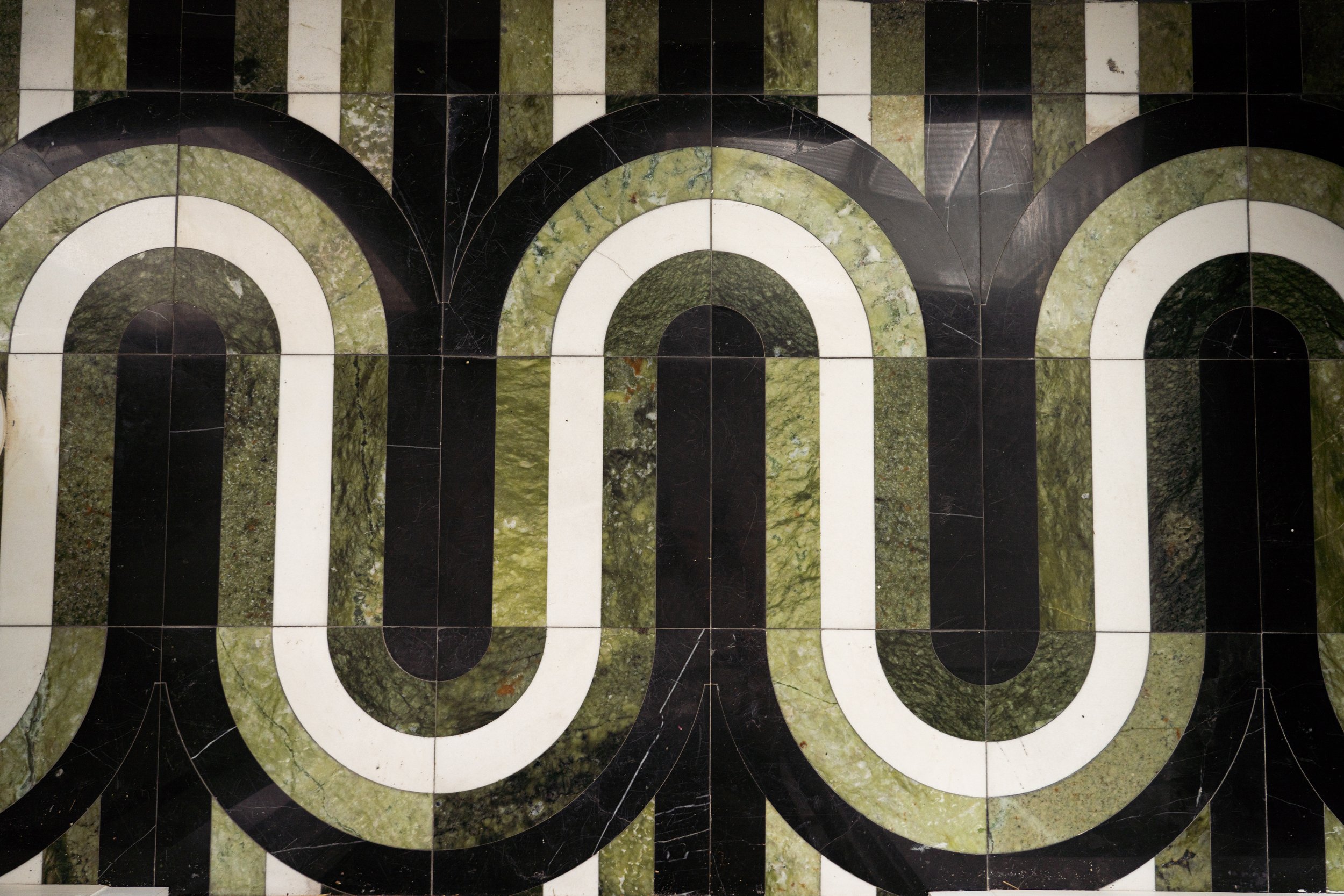
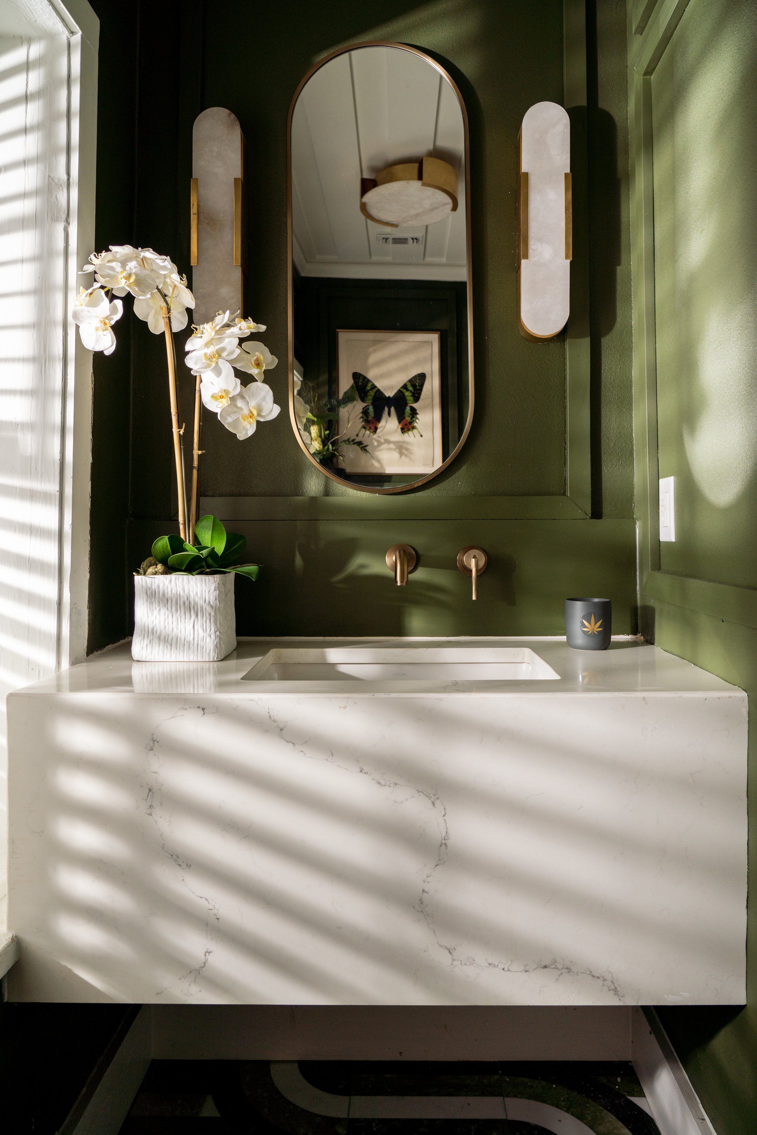
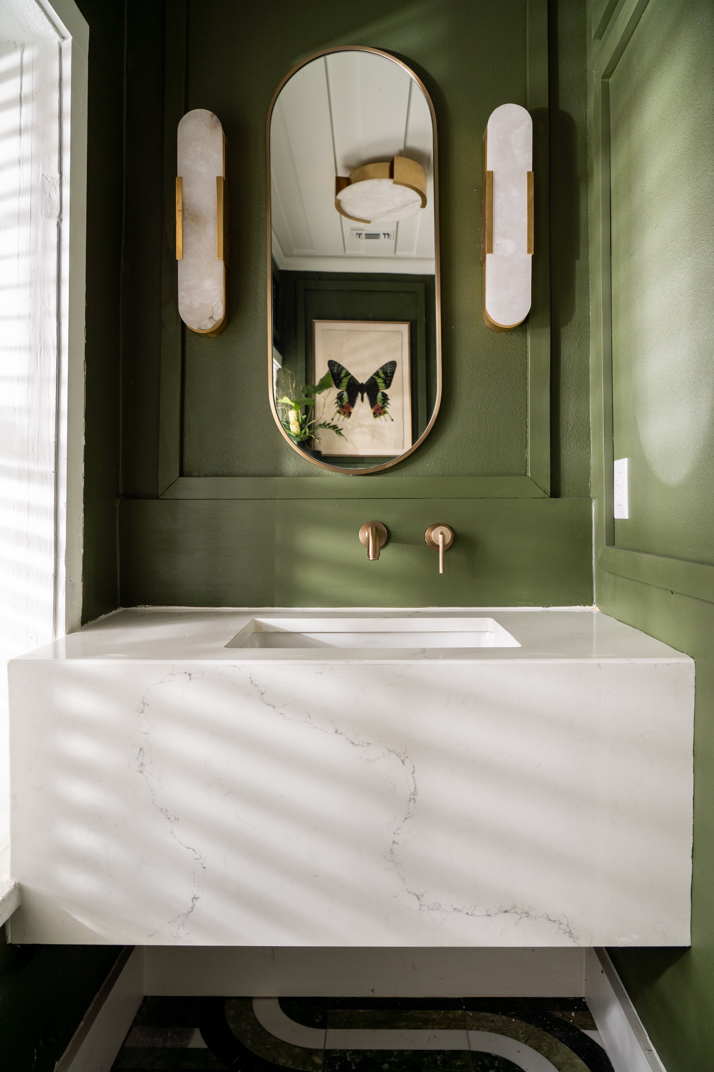
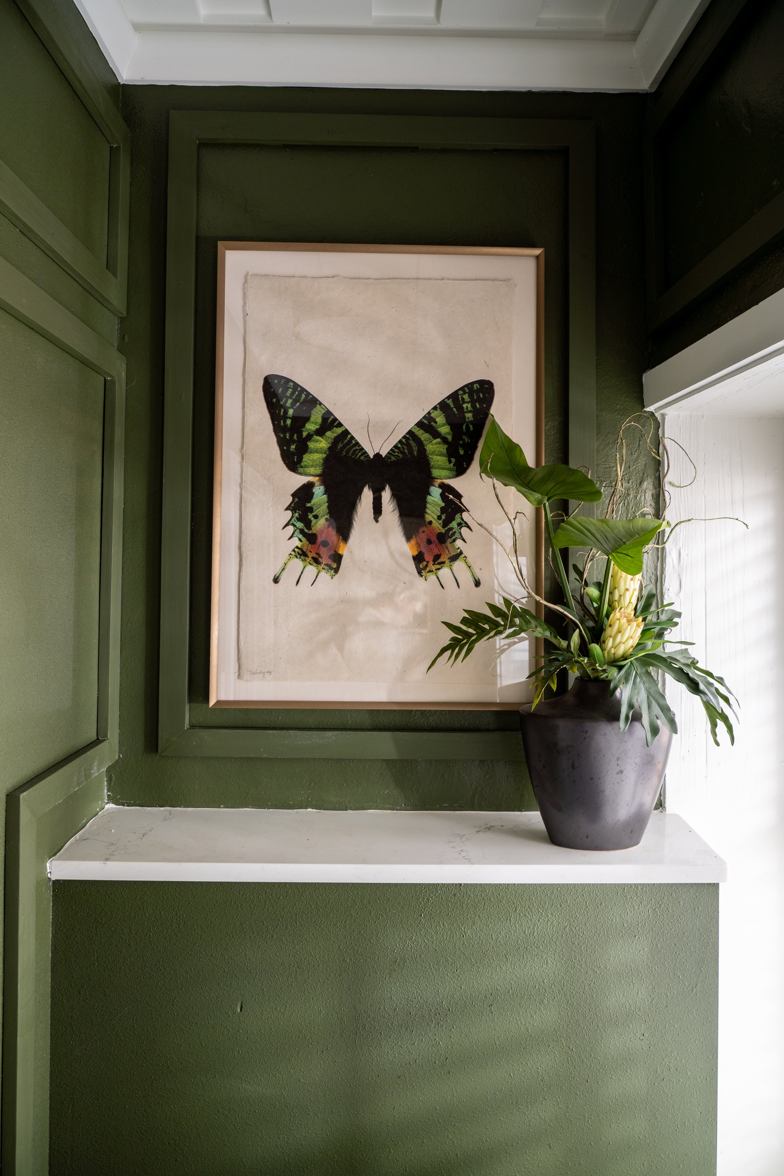
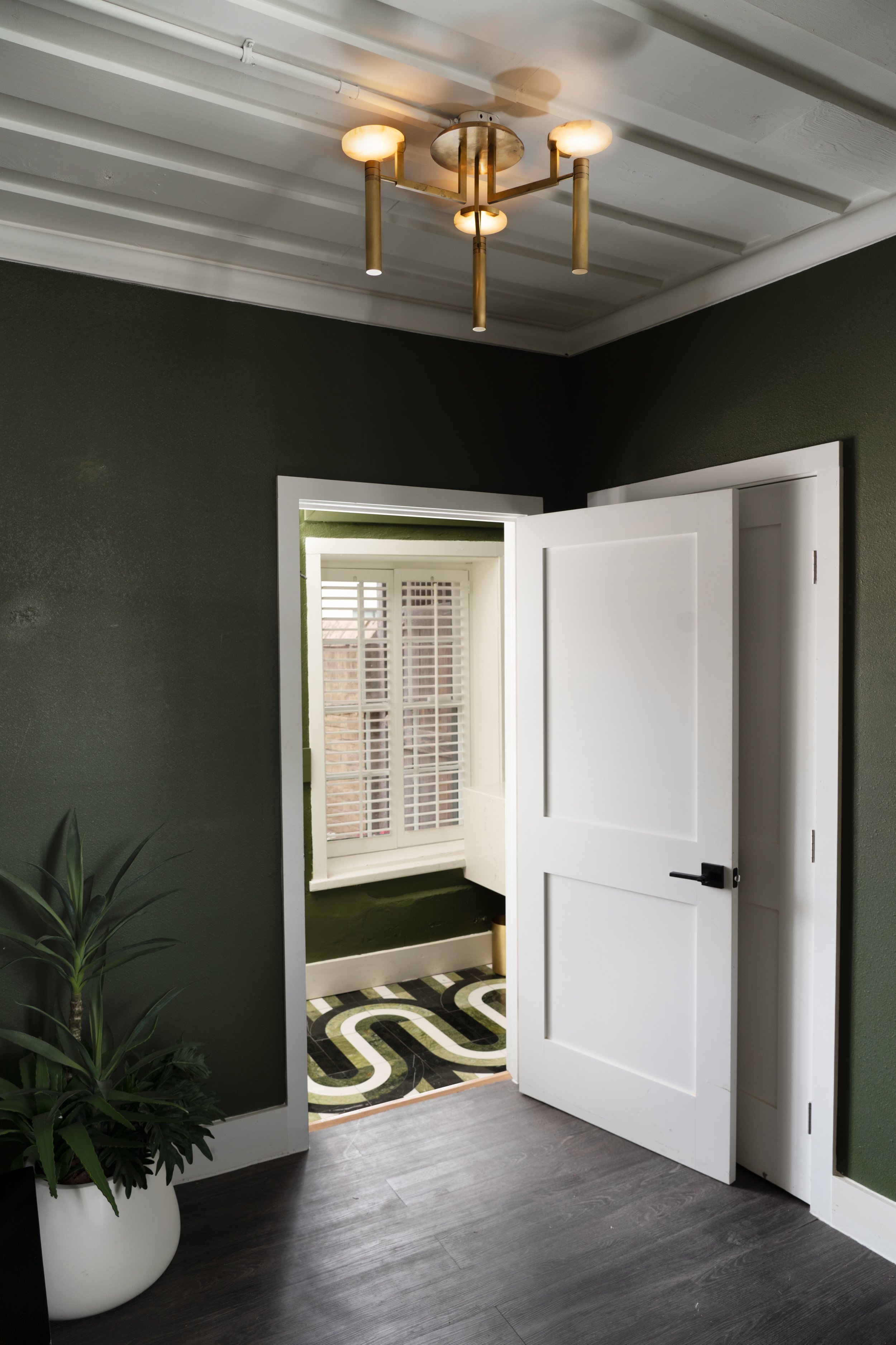
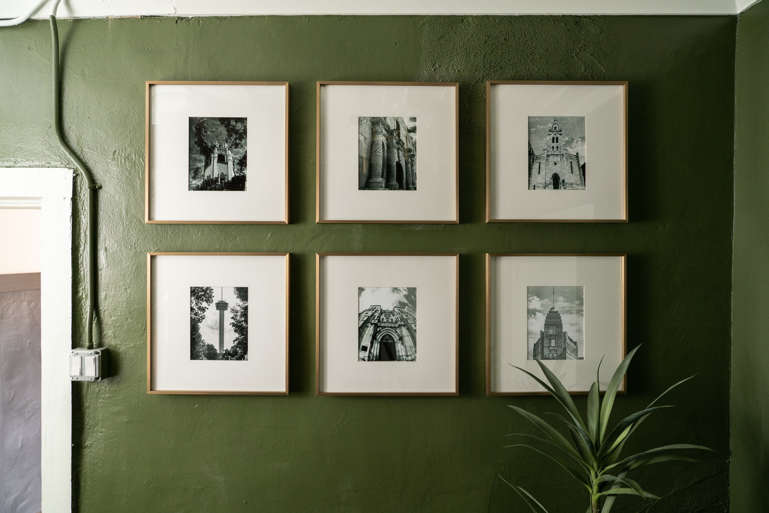
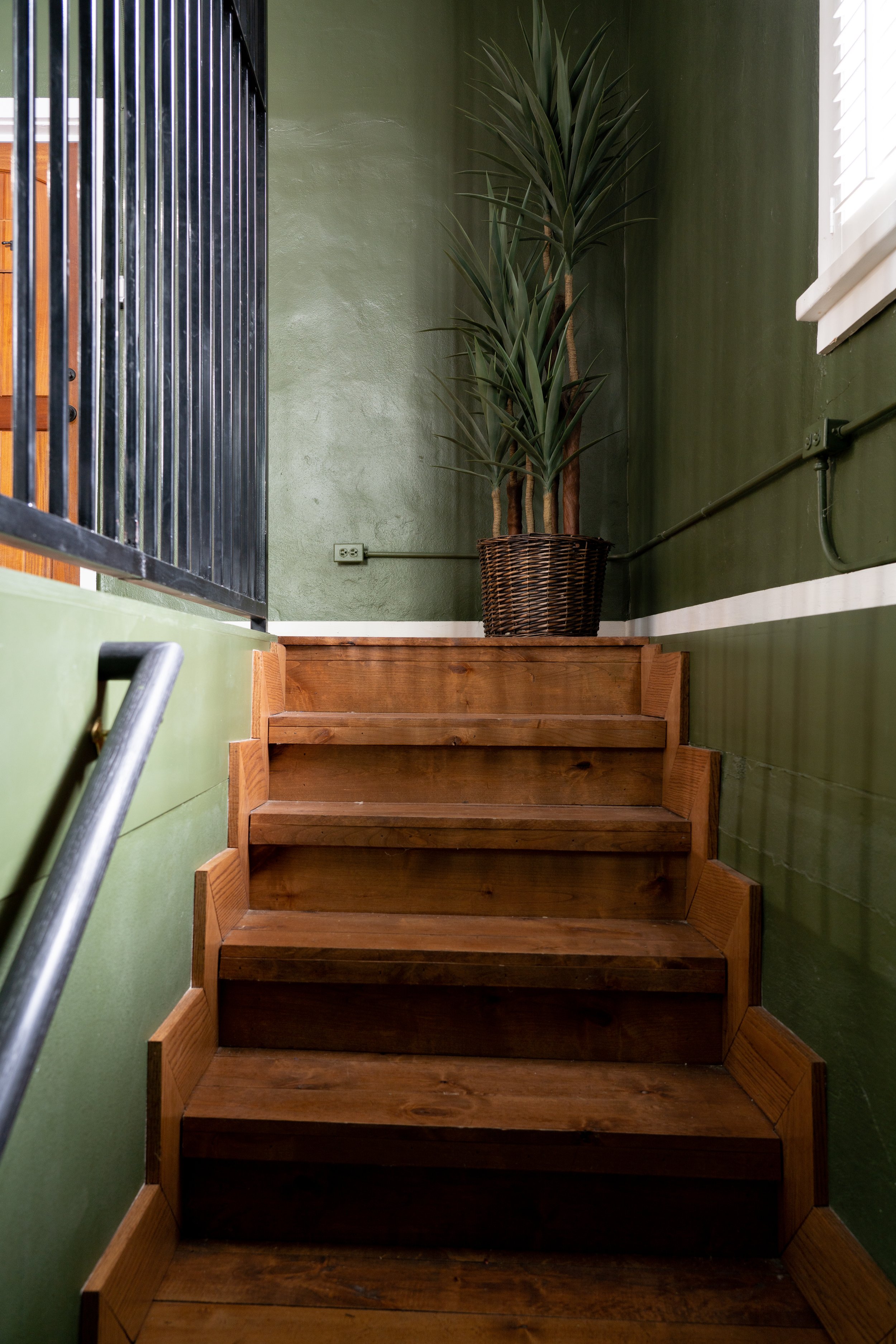
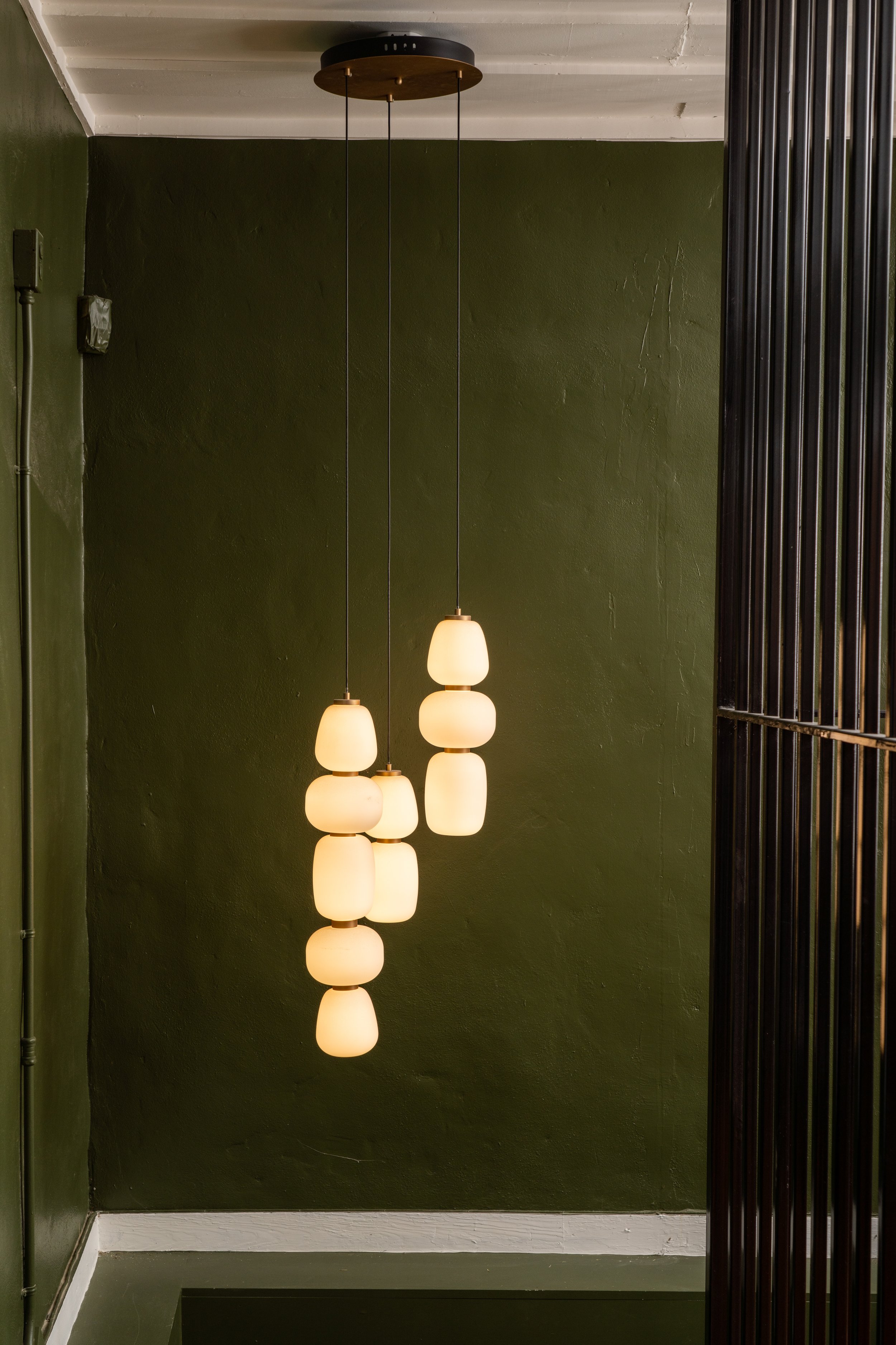
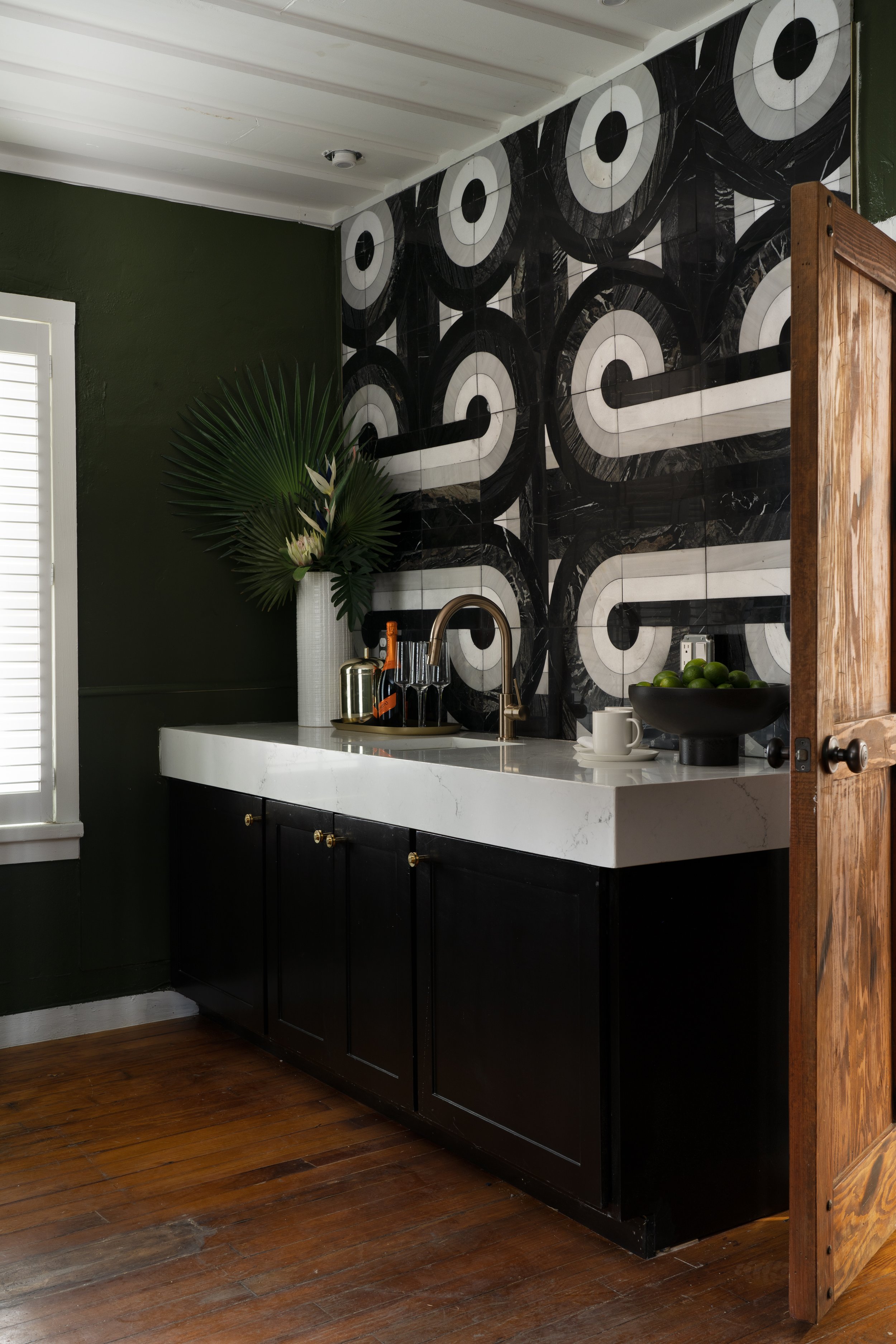
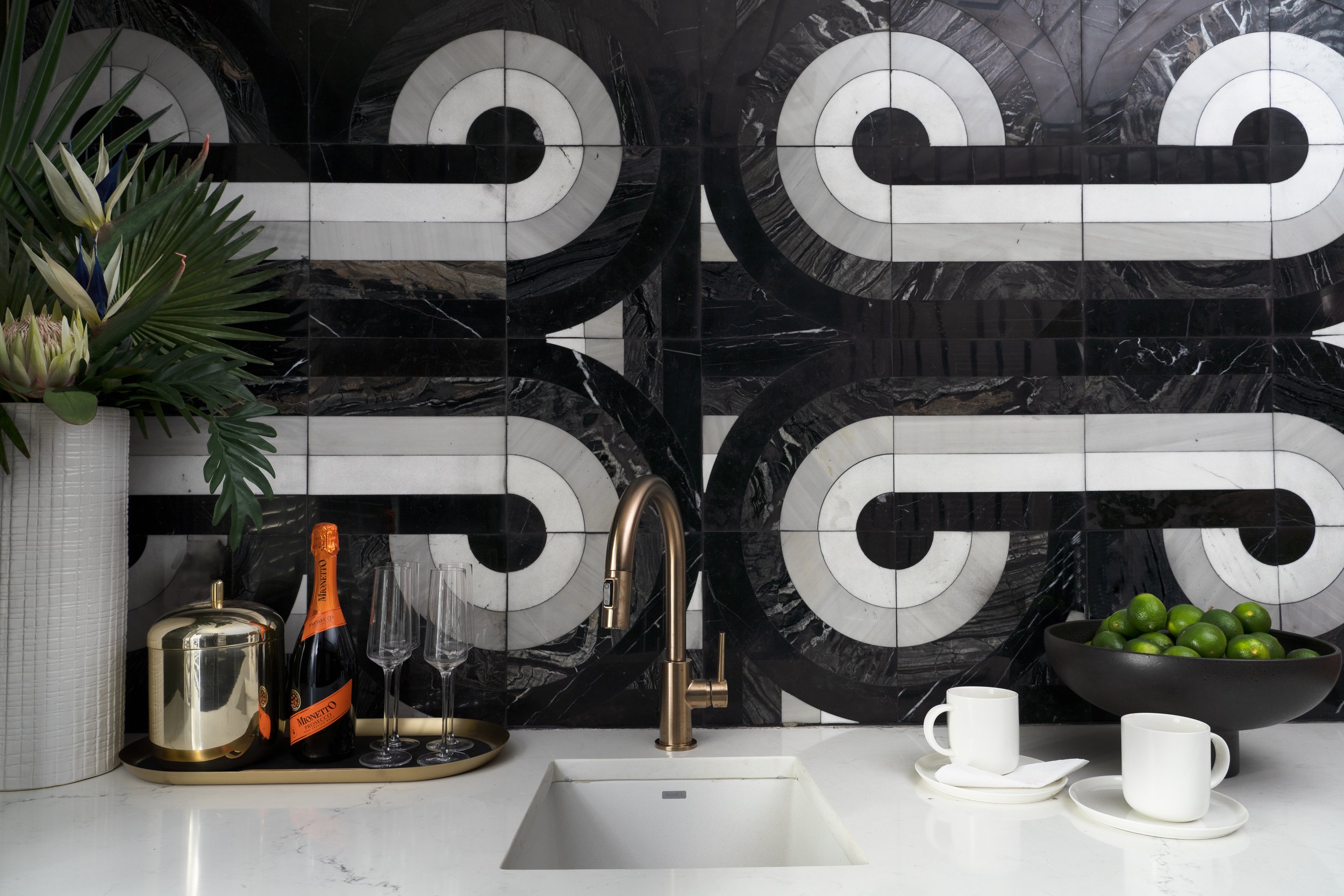
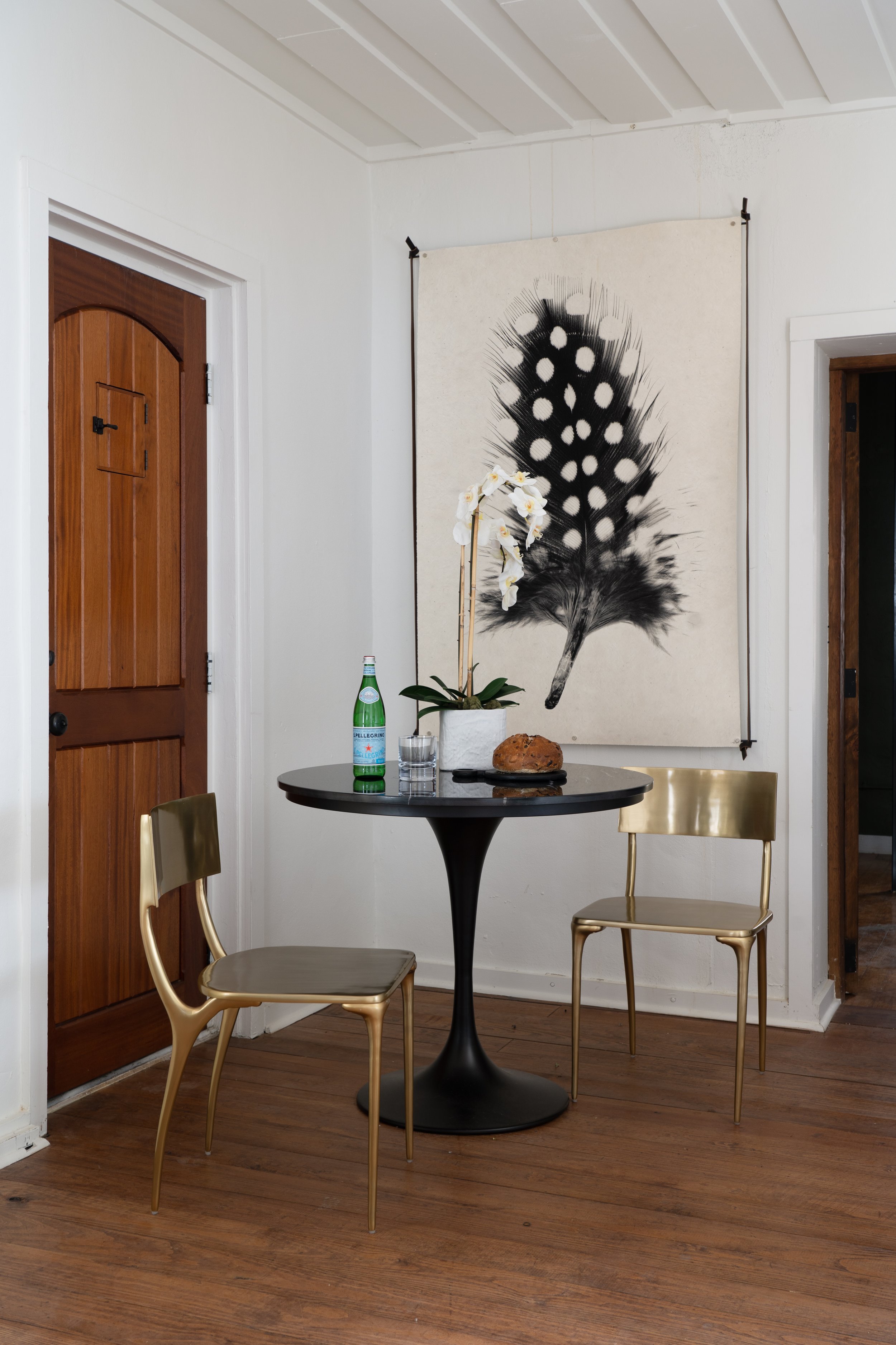
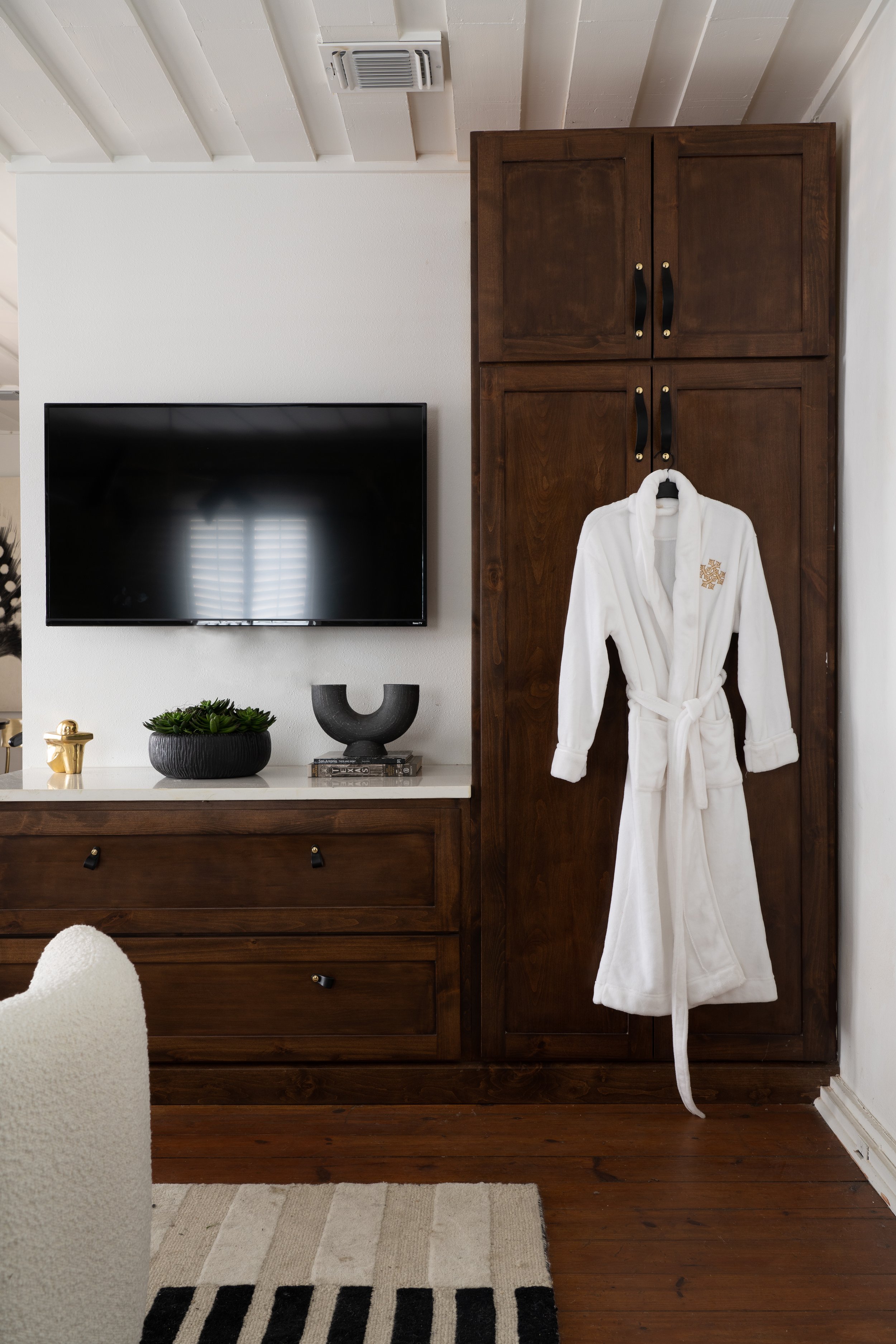
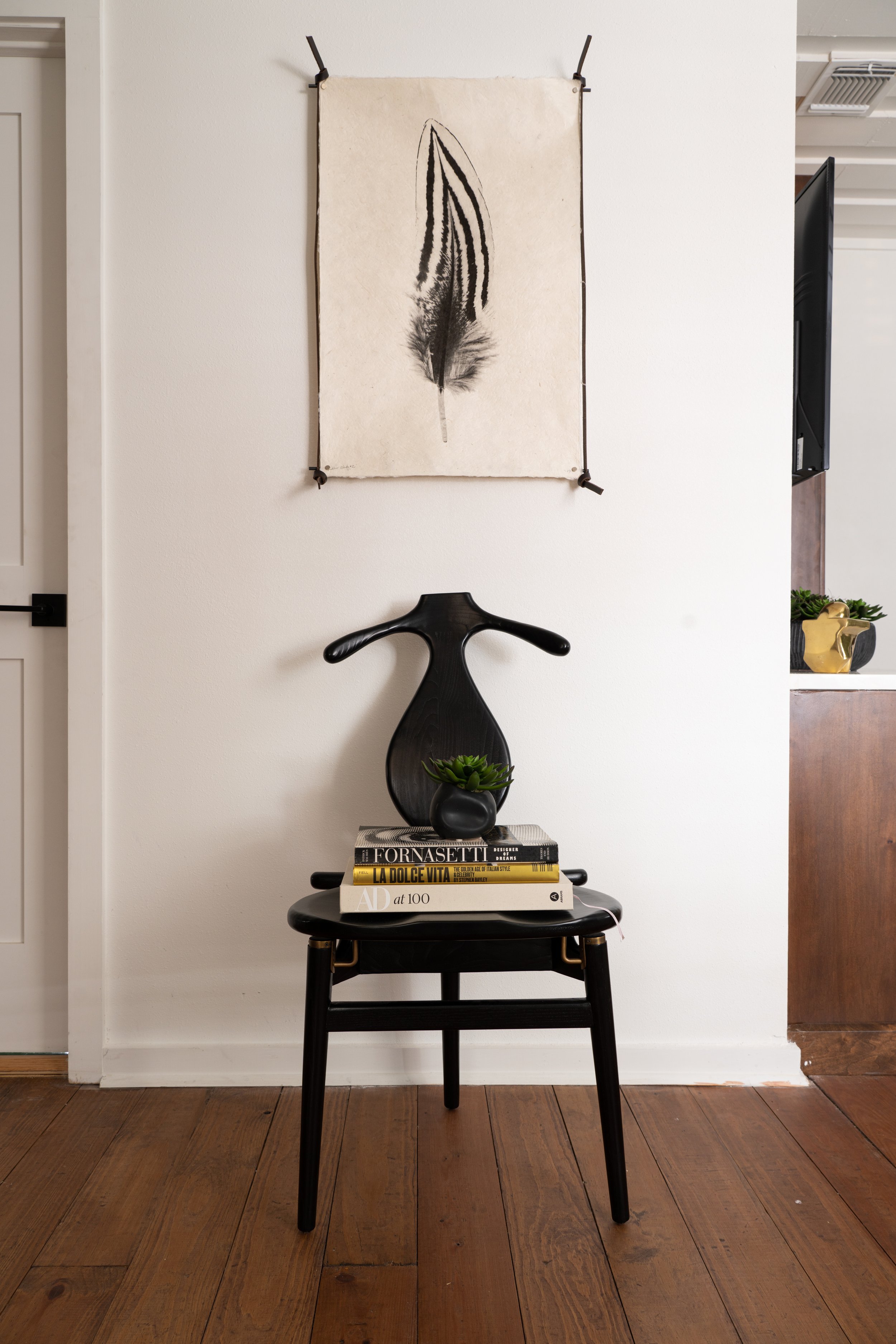
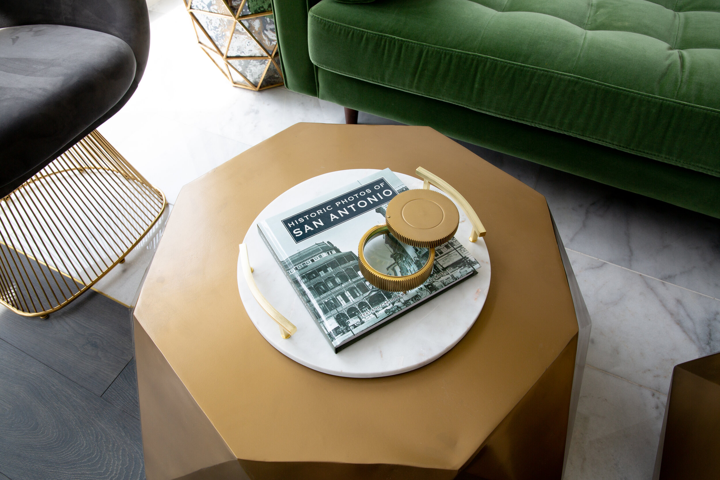
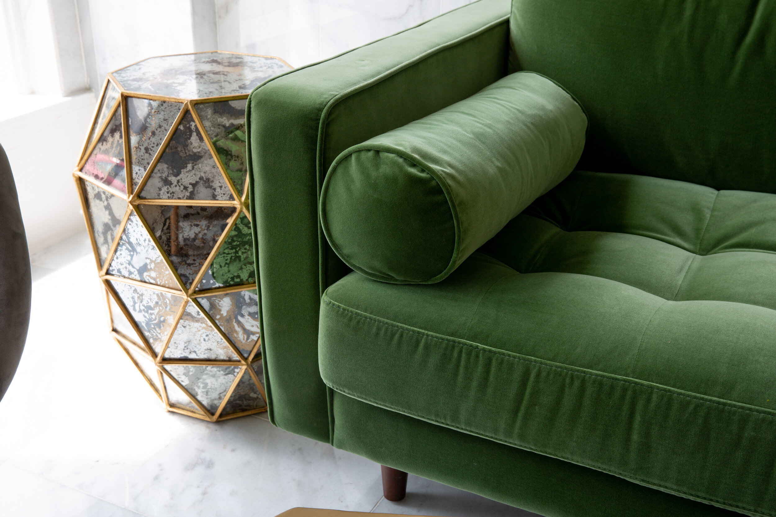
Heidgen House blends historic charm with modern luxury. Built in 1882, Heidgen House is the oldest standing homestead in San Antonio, apart from the neighboring Alamo. The renovation of the homestead into a luxury event venue and guest suite required expert care and creative problem-solving — updating modern fixtures while preserving the structure's historical integrity. The design features a palette of black, white, and gold accented with a rich emerald green that is neutral enough for party planners to pair with their own decor while bold enough to be impactful on its own. Nods to the home and city’s history can be found in marble tile patterns that mimic the Alamo’s arch, historic photographs, and subtle Texas star motifs that delight locals and visitors alike.
CORPORATE OFFICE
PROJECT: COMMERCIAL OFFICE
LOCATION: SAN ANTONIO, TX
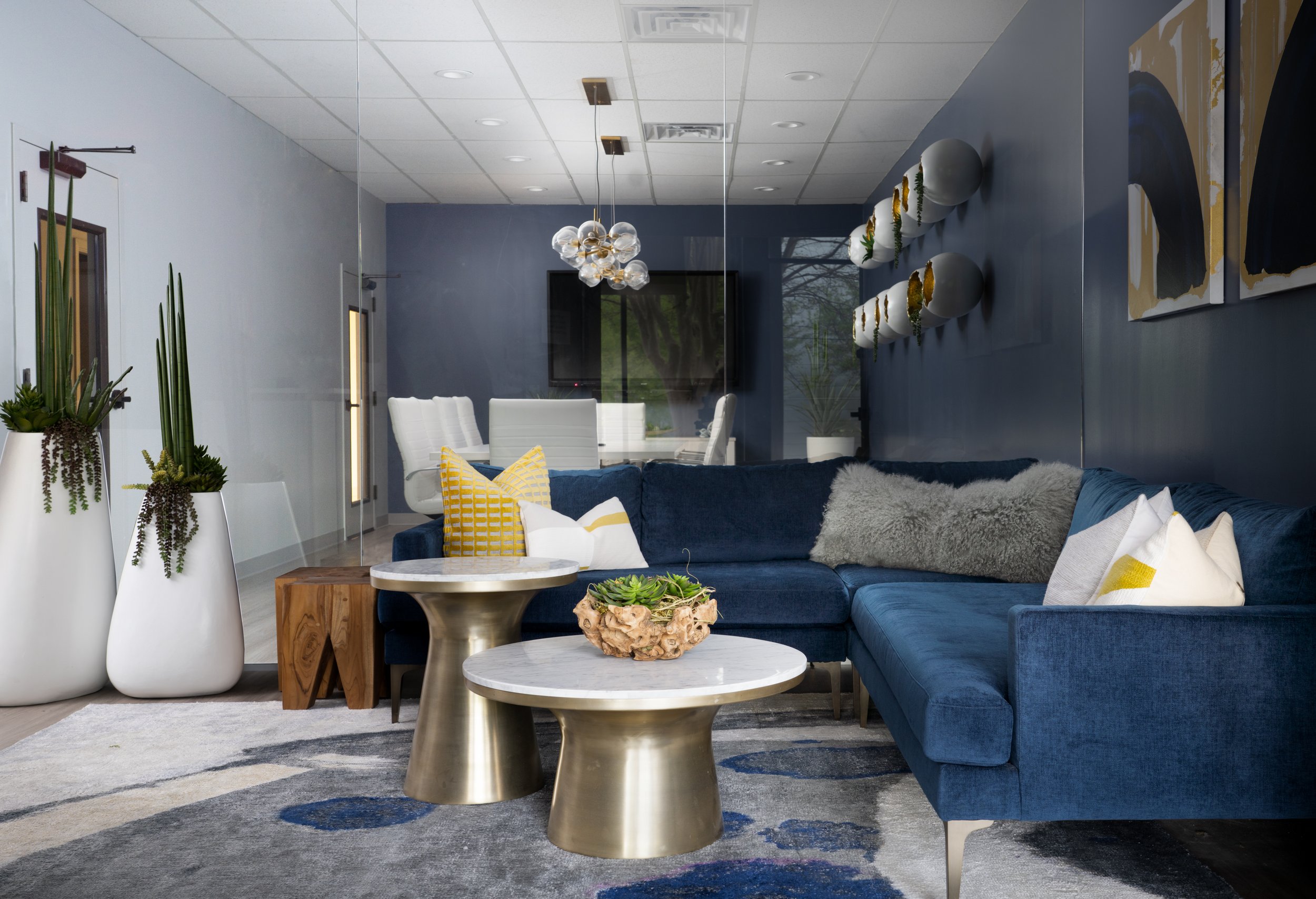
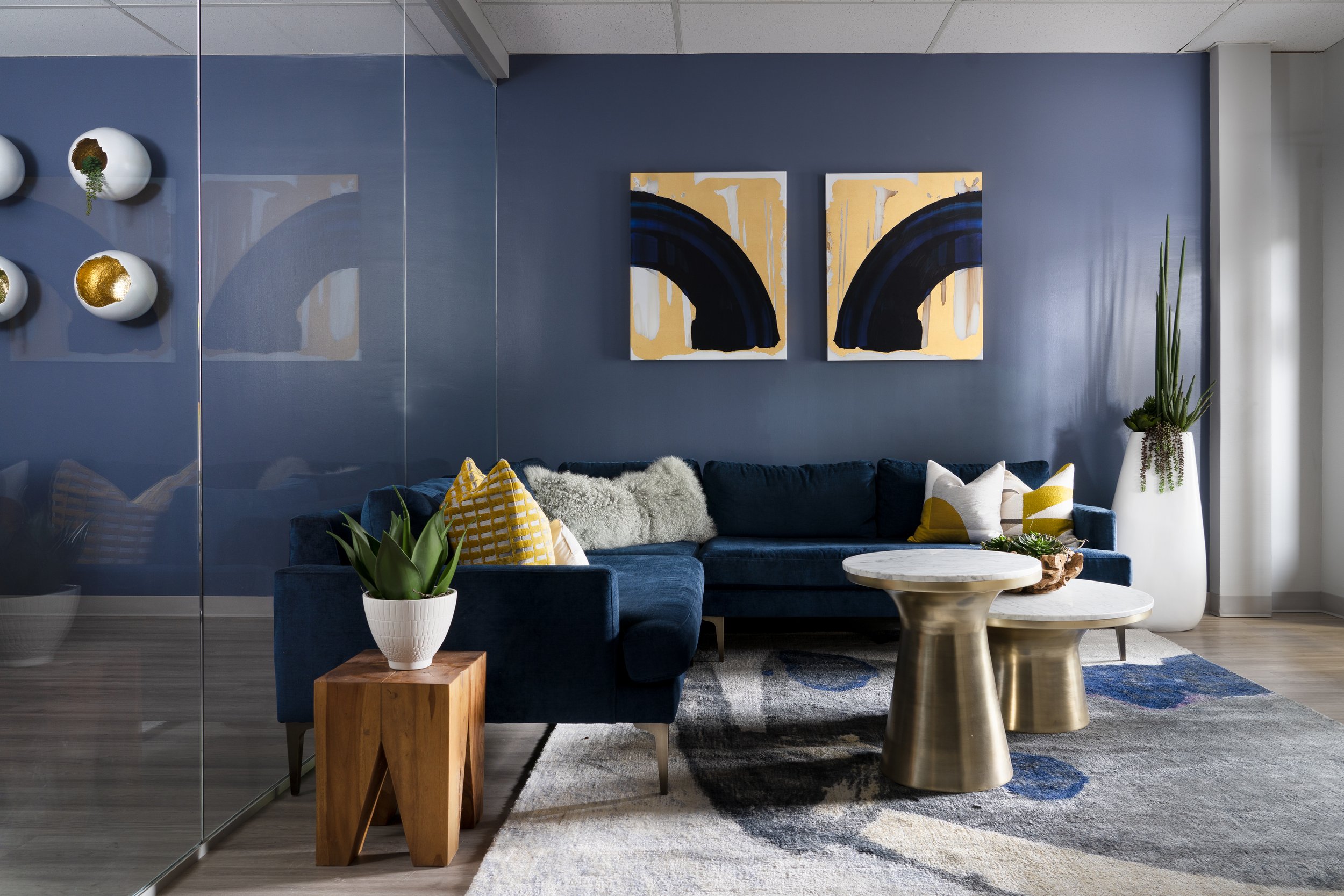
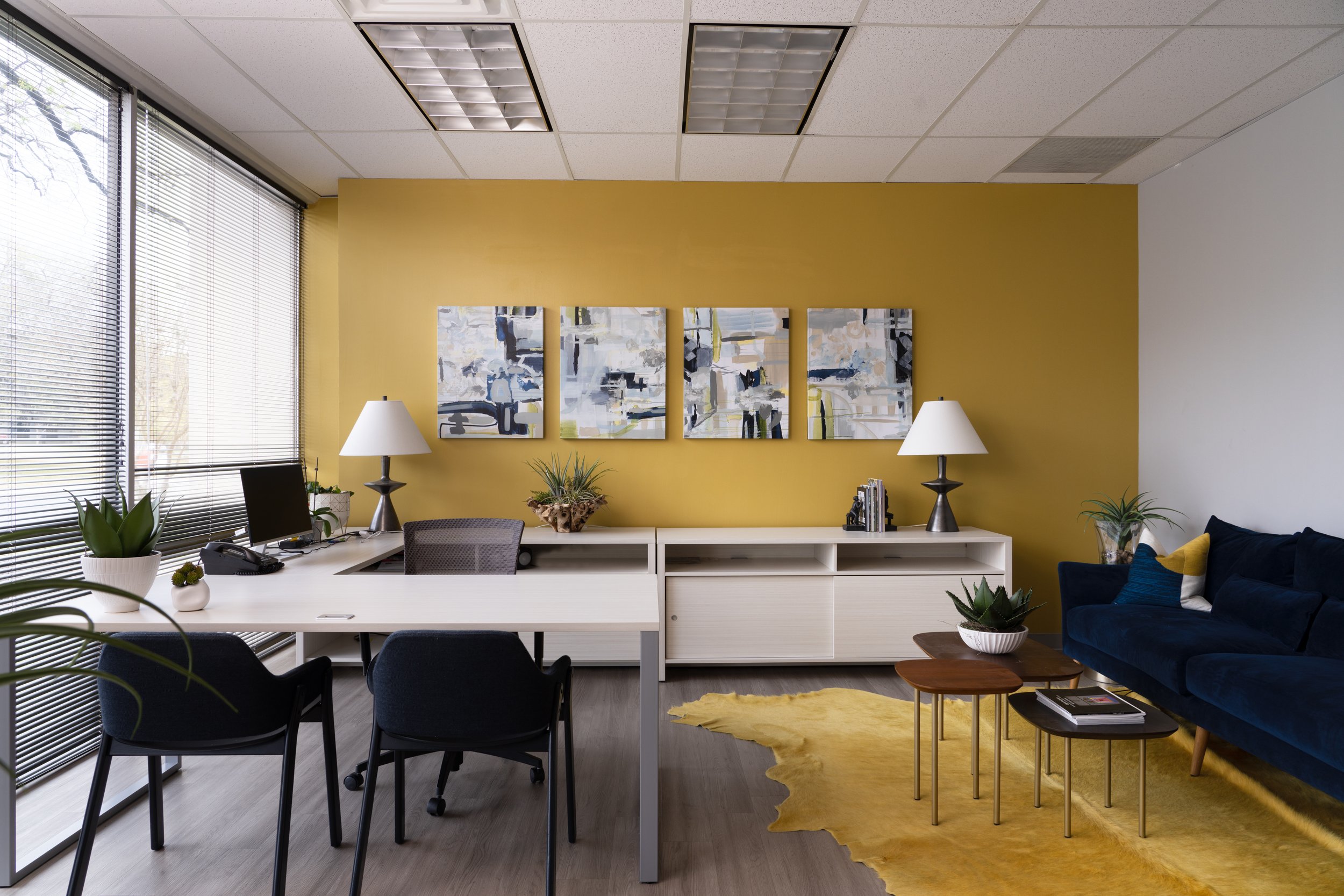
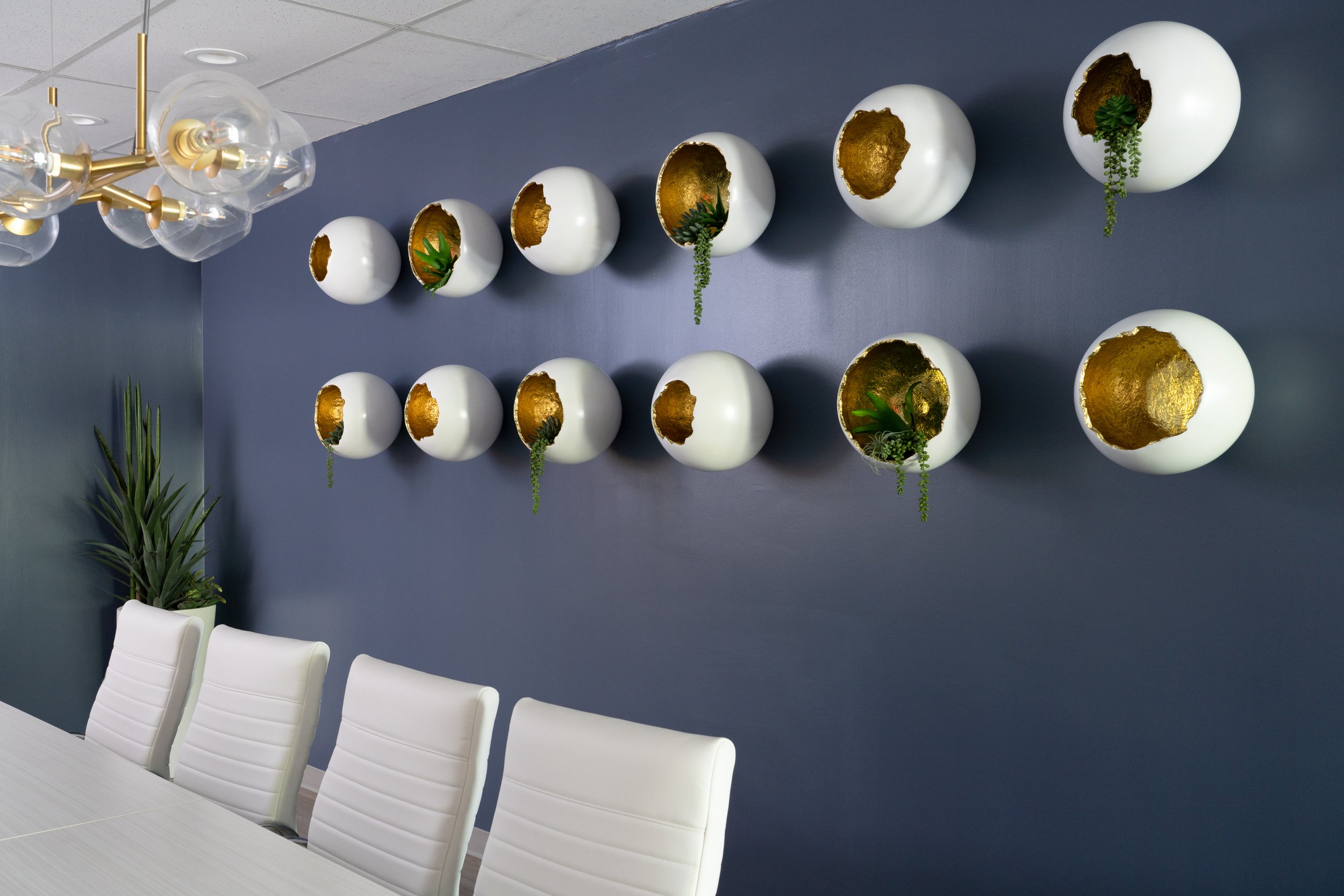
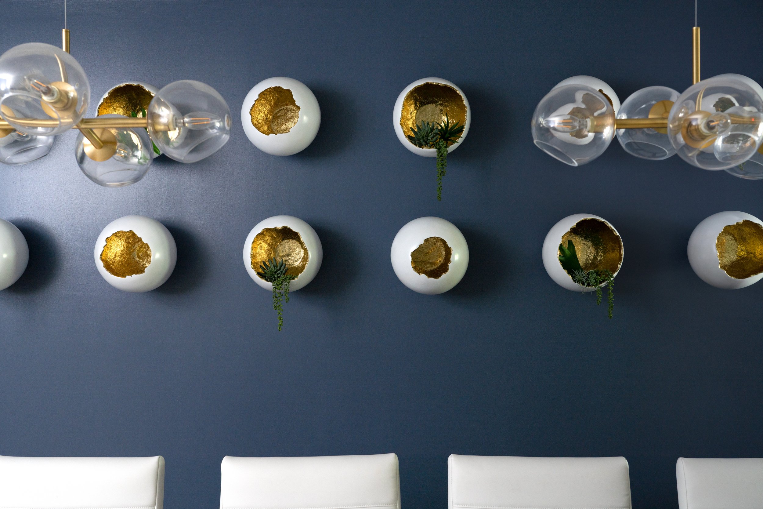
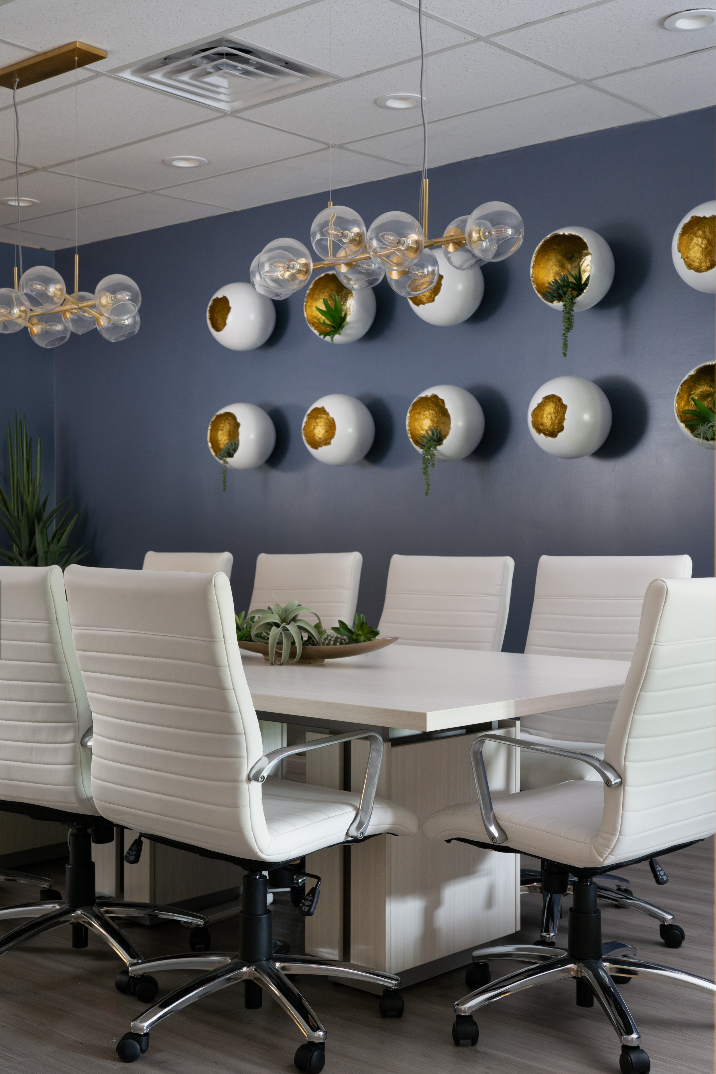
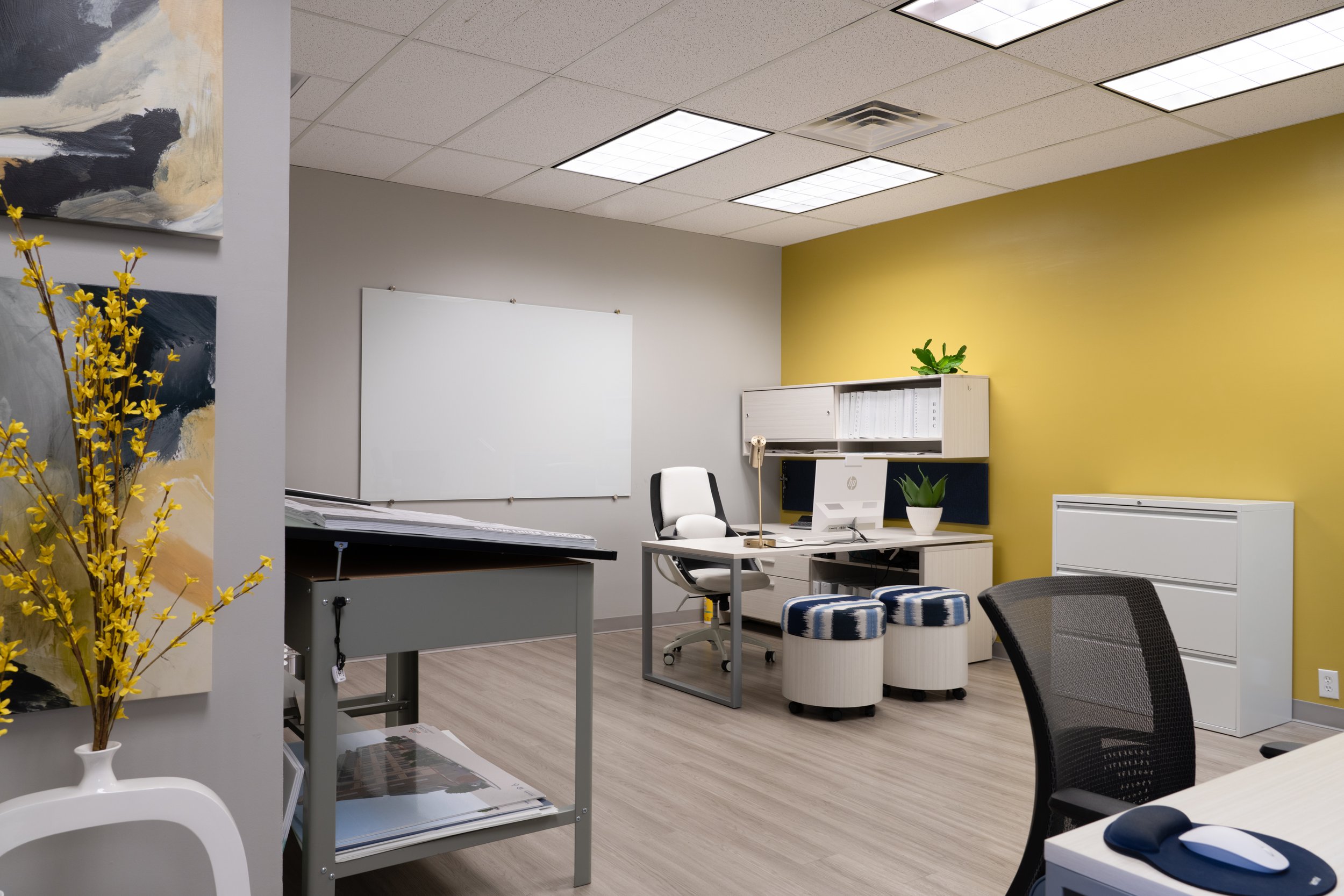
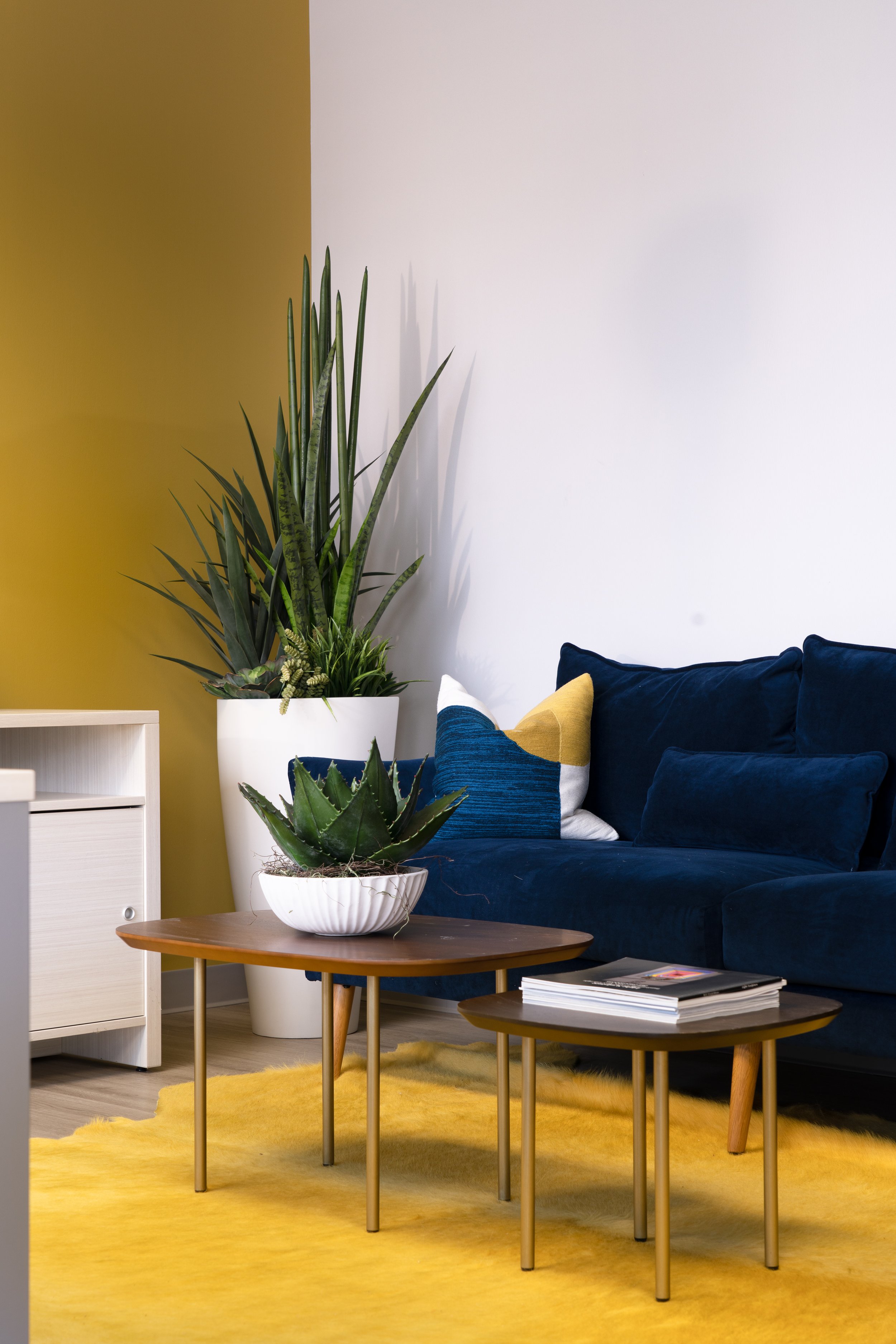
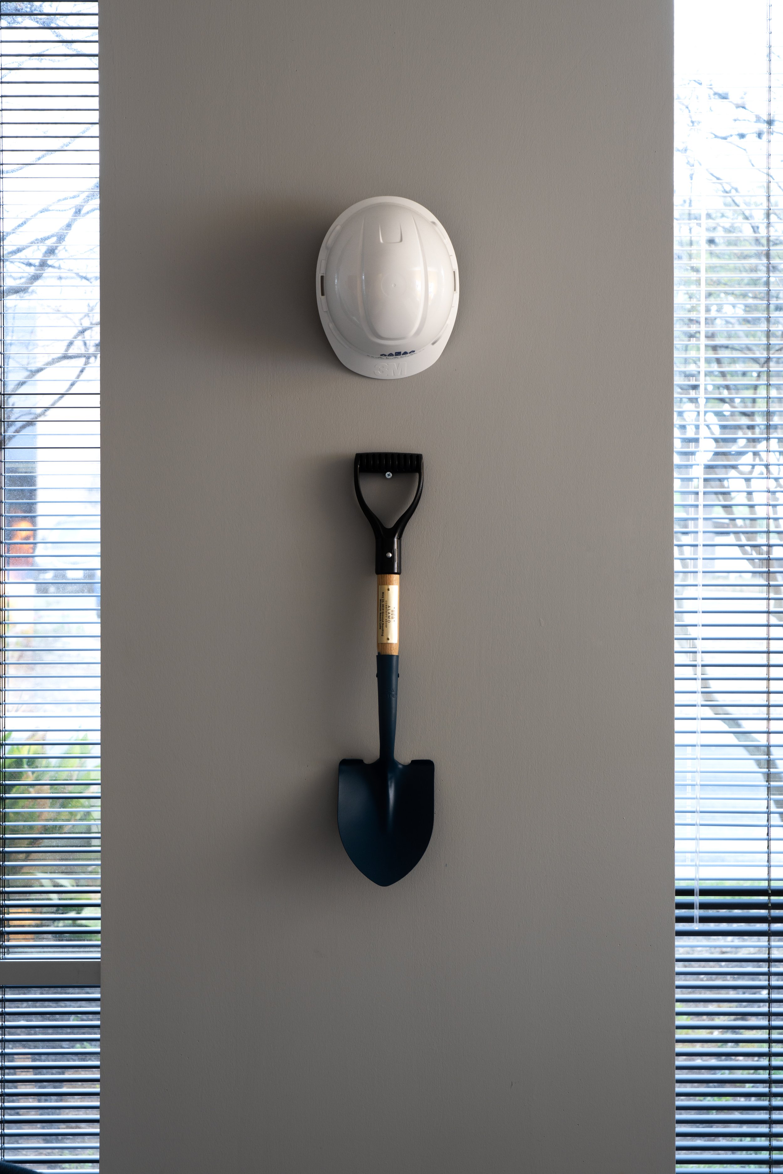
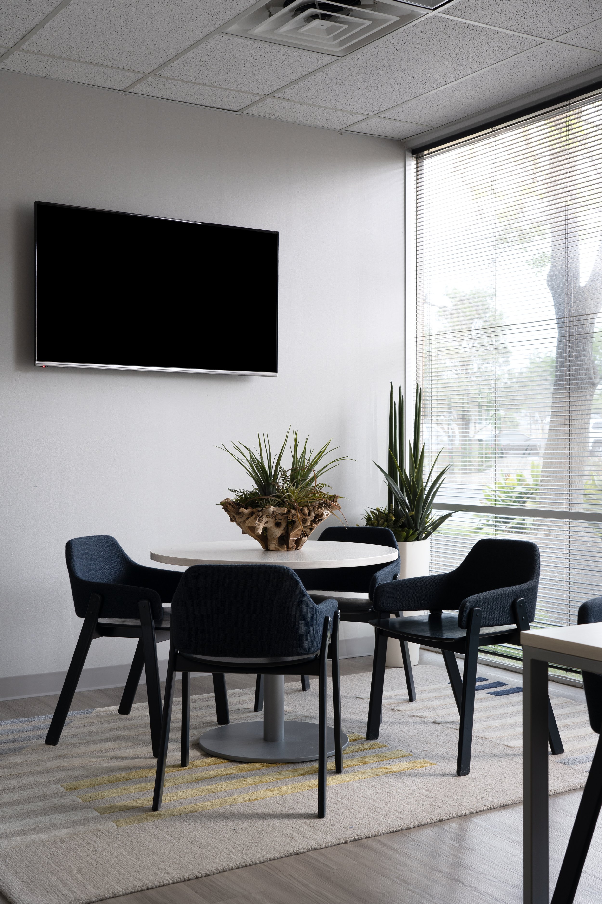
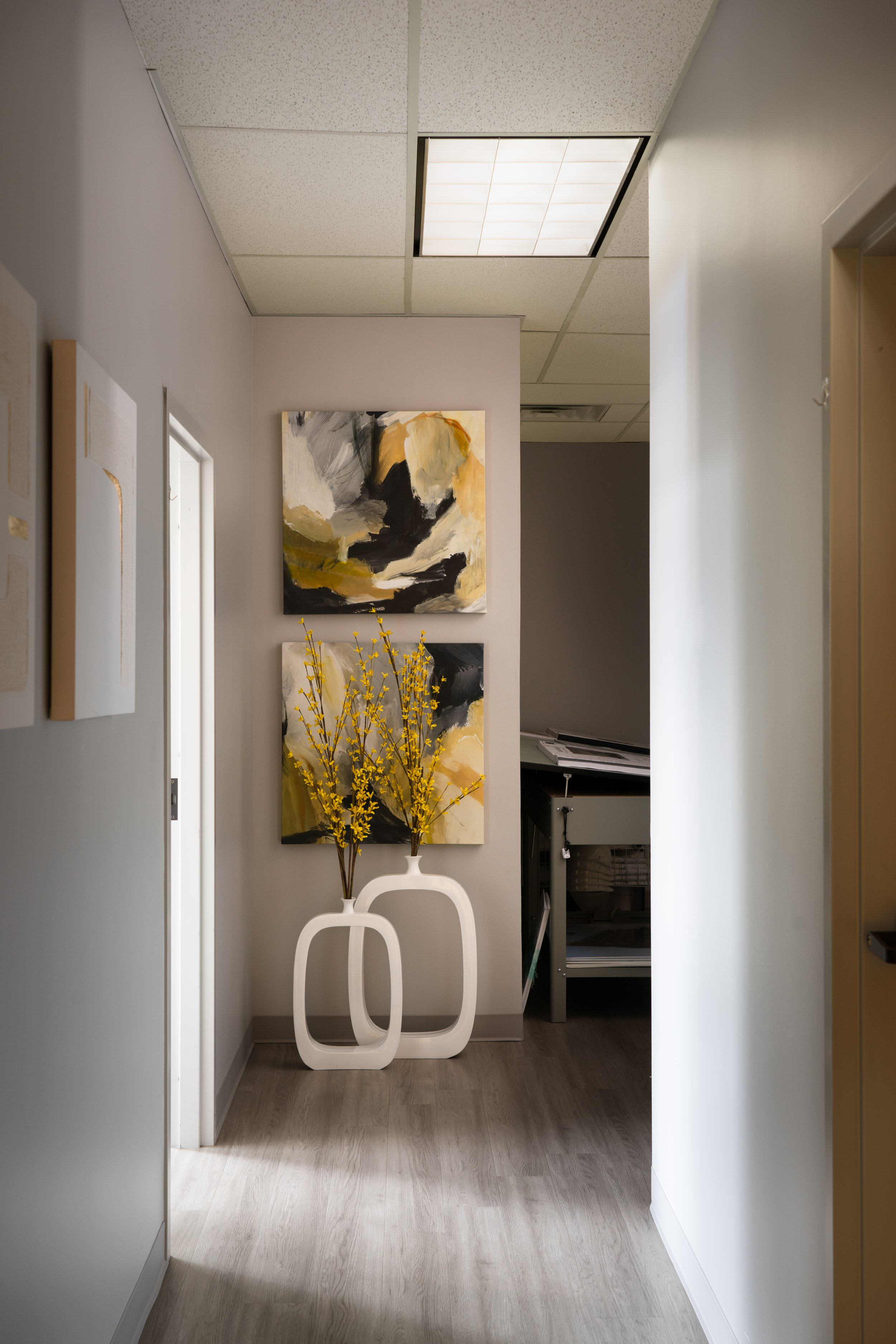
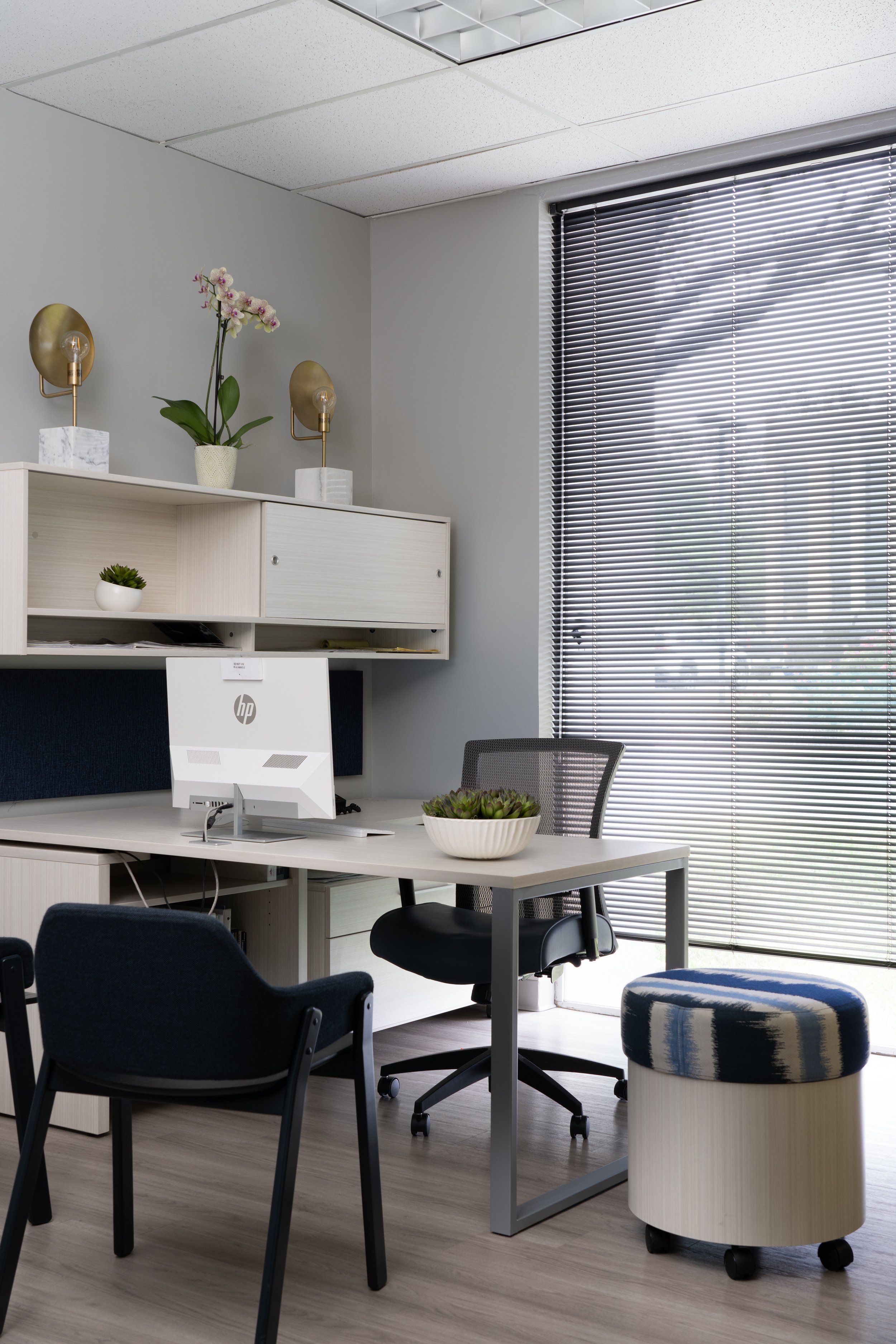
Loving where you work is the central design theme of this corporate office renovation. A previously dull, boring, and clinical space has been reignited with bold rich colors, stylish accessories, plush furnishings, and vibrant textiles throughout the work and reception areas. Adequate closed storage solutions contain office files while providing an easily accessible organization system. Clients and partners are greeted by a relaxed and inviting waiting space to unwind before a productive meeting in the conference room, where a custom art installation resembling hatching eggs symbolizes hatching new and bright ideas. Now, this organization's employees can feel pride and excitement for their workspace.
THOMPSON
PROJECT: APARTMENT LEASING OFFICE
LOCATION: SAN ANTONIO, TX
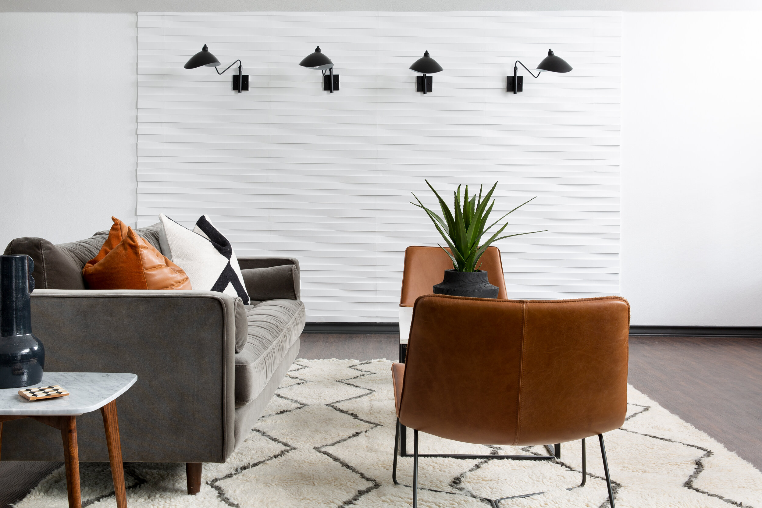
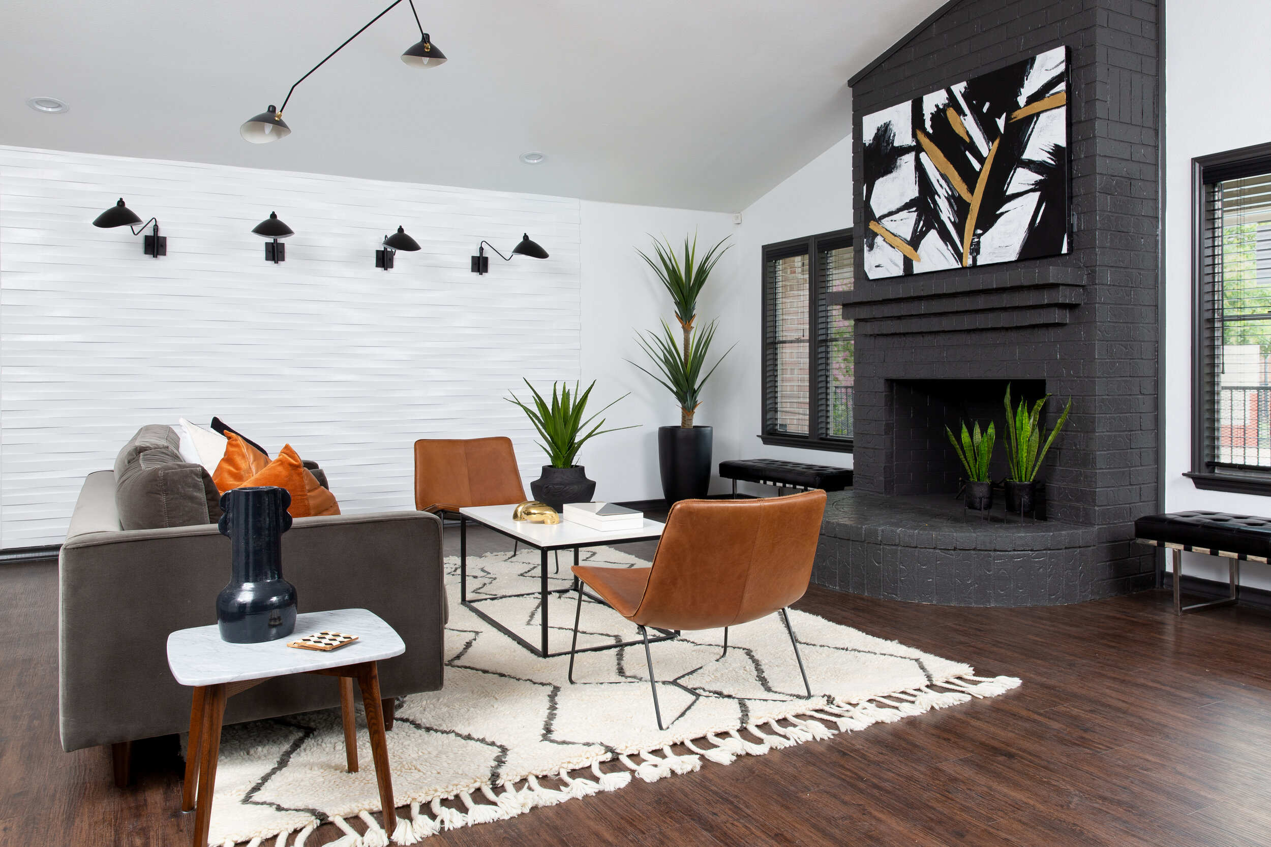
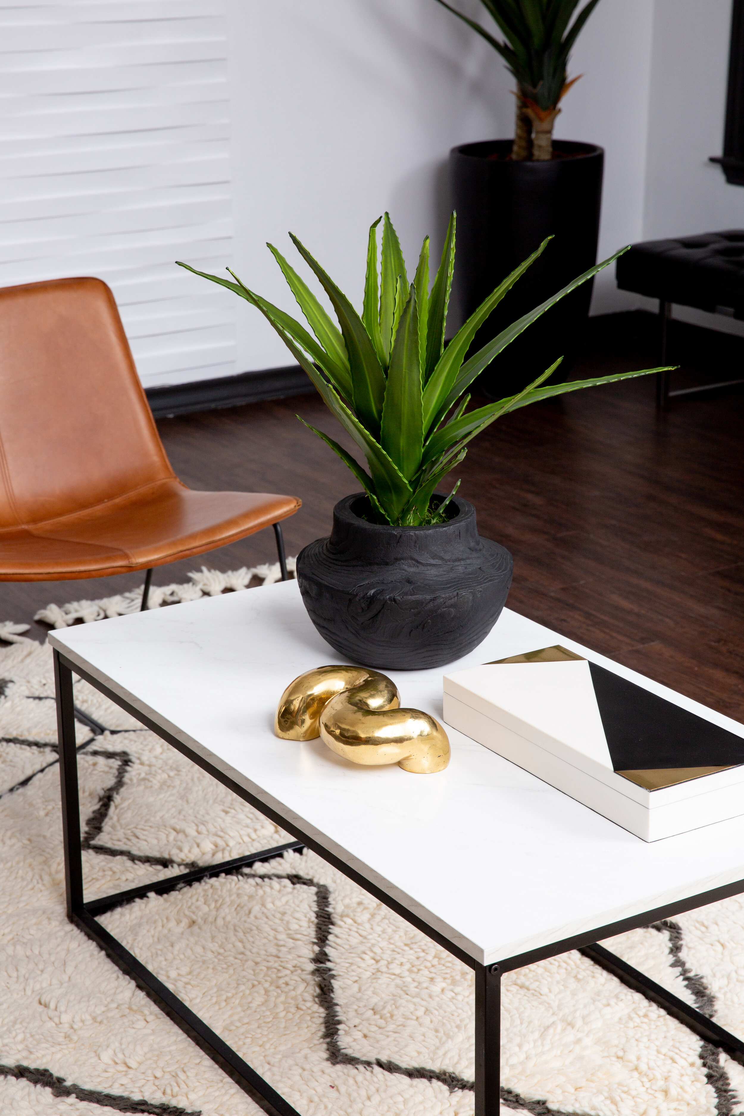
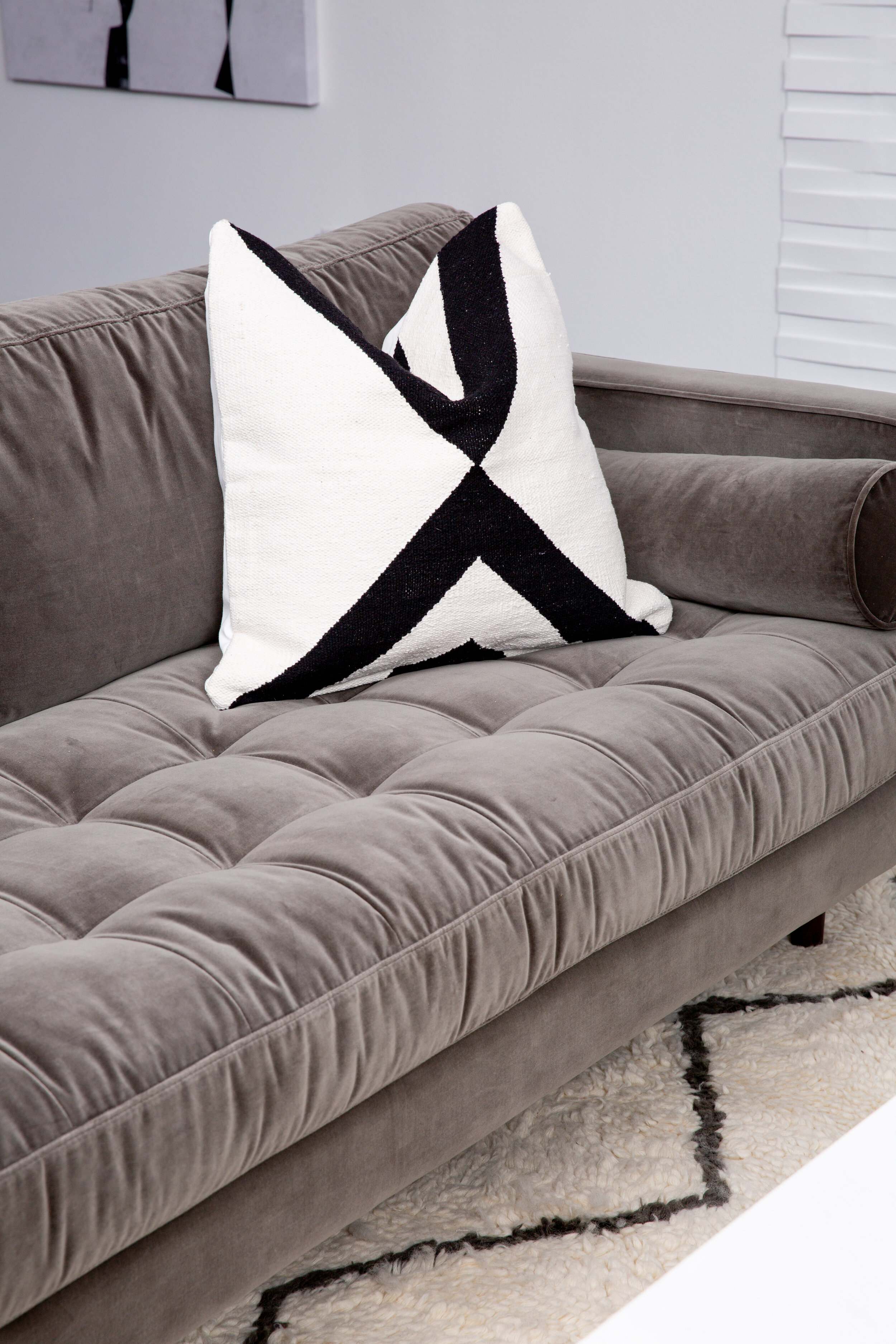
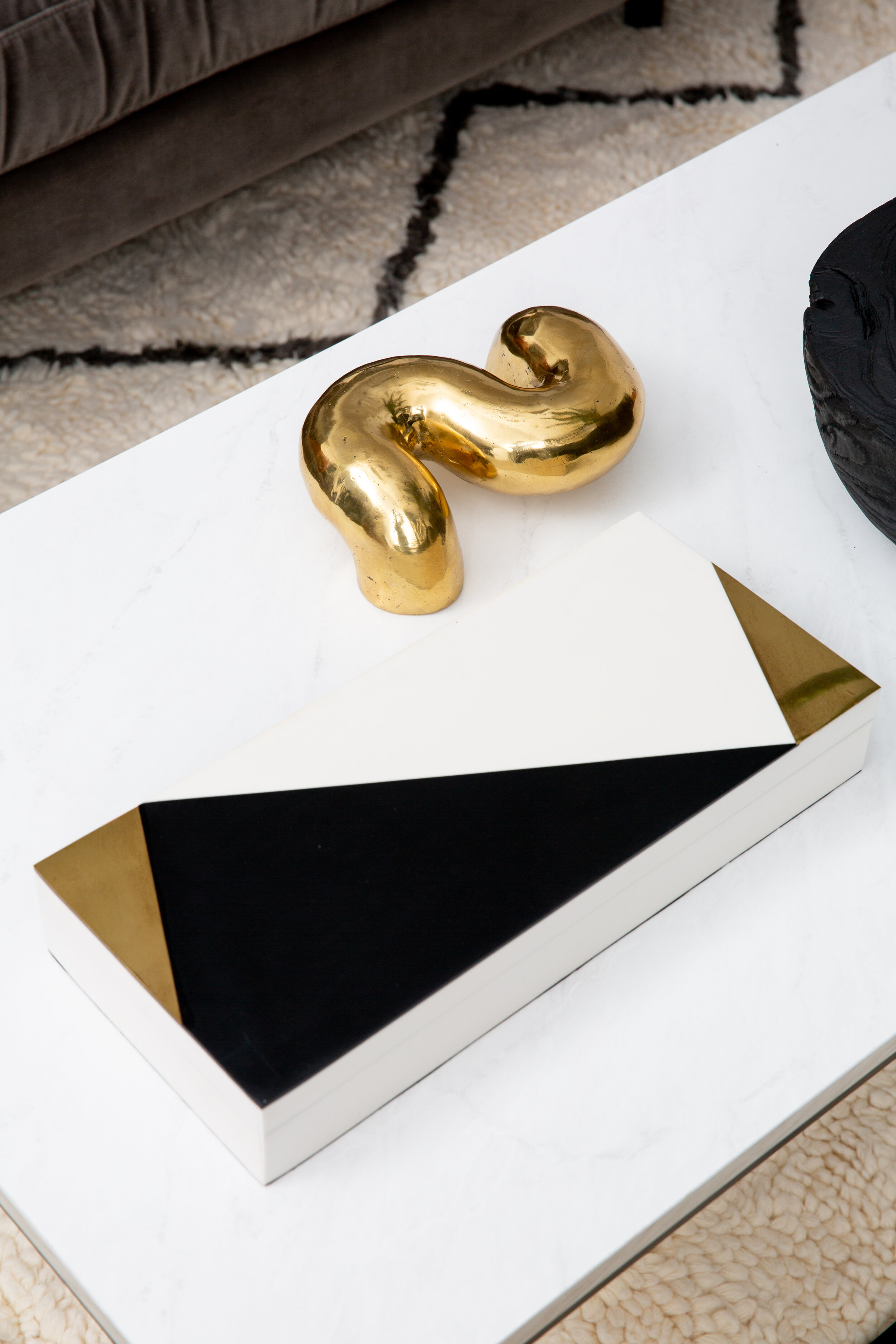
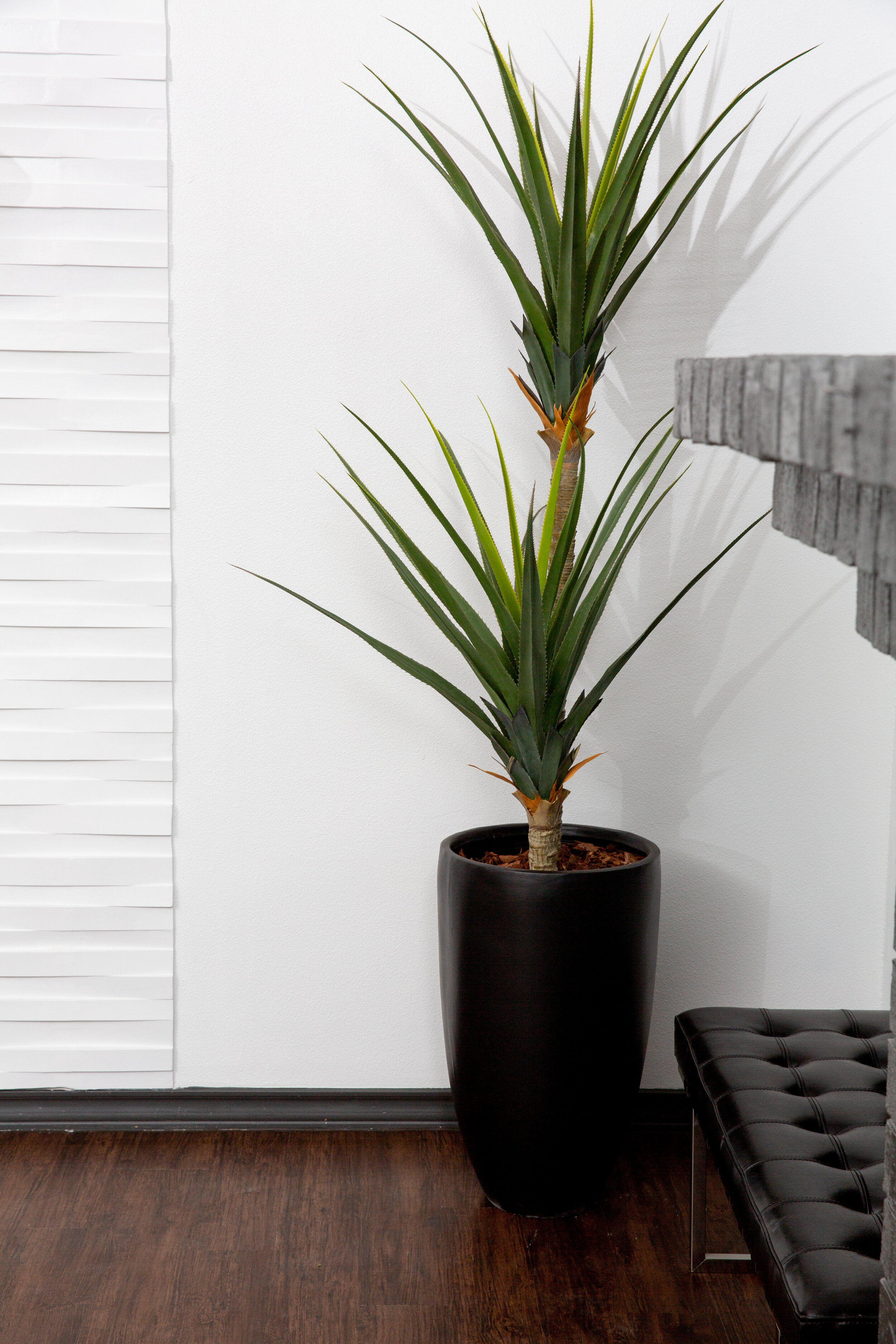
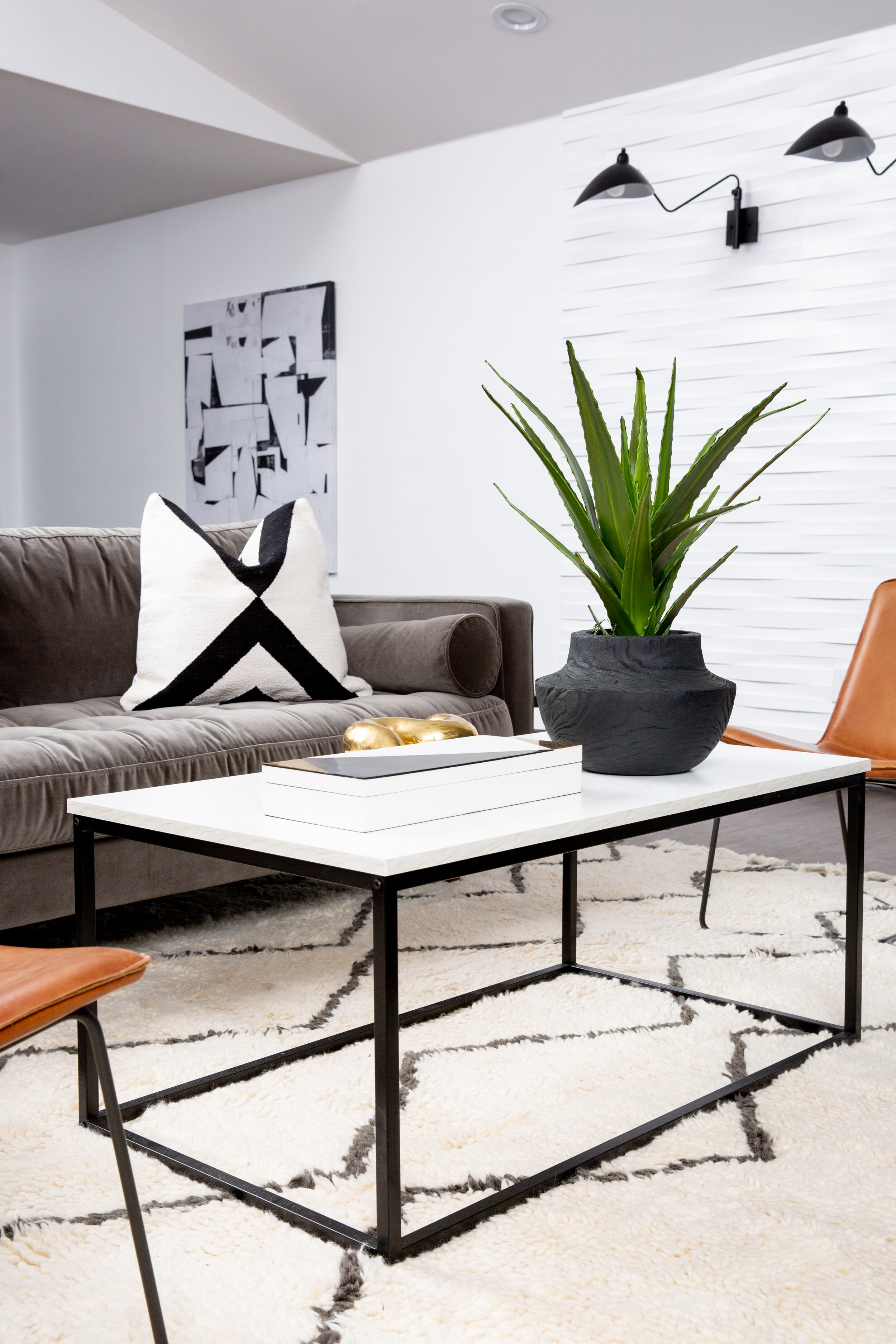
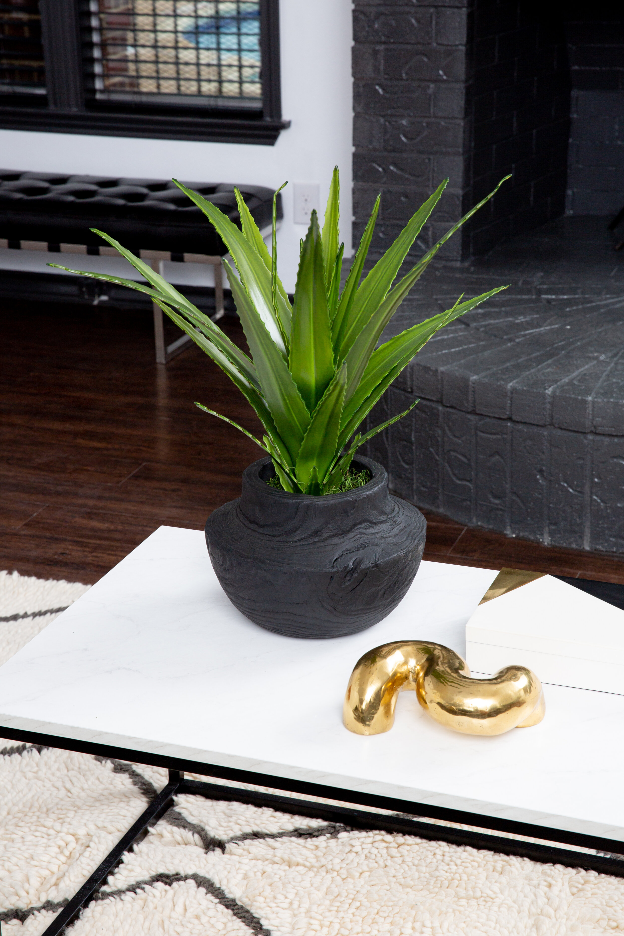
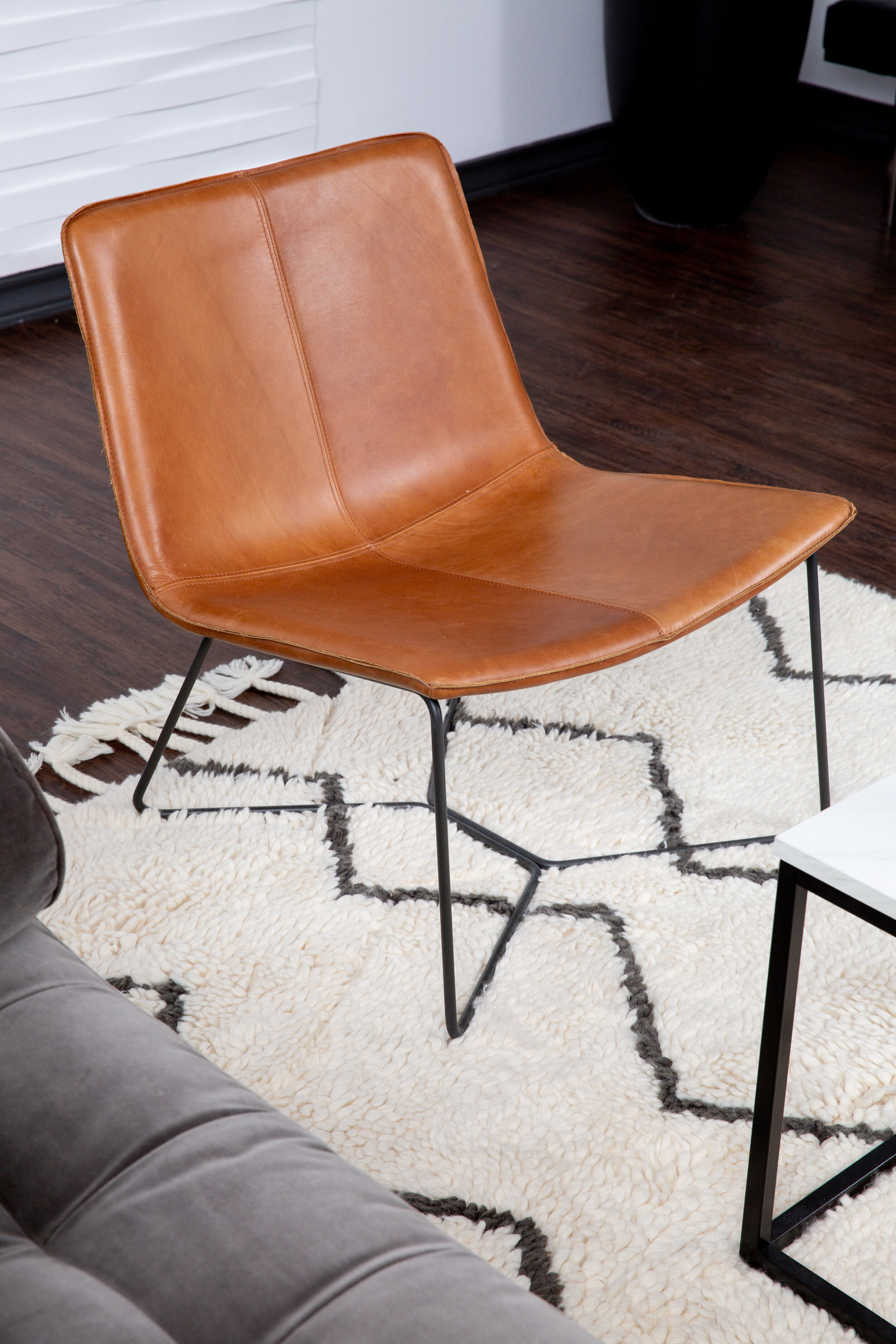
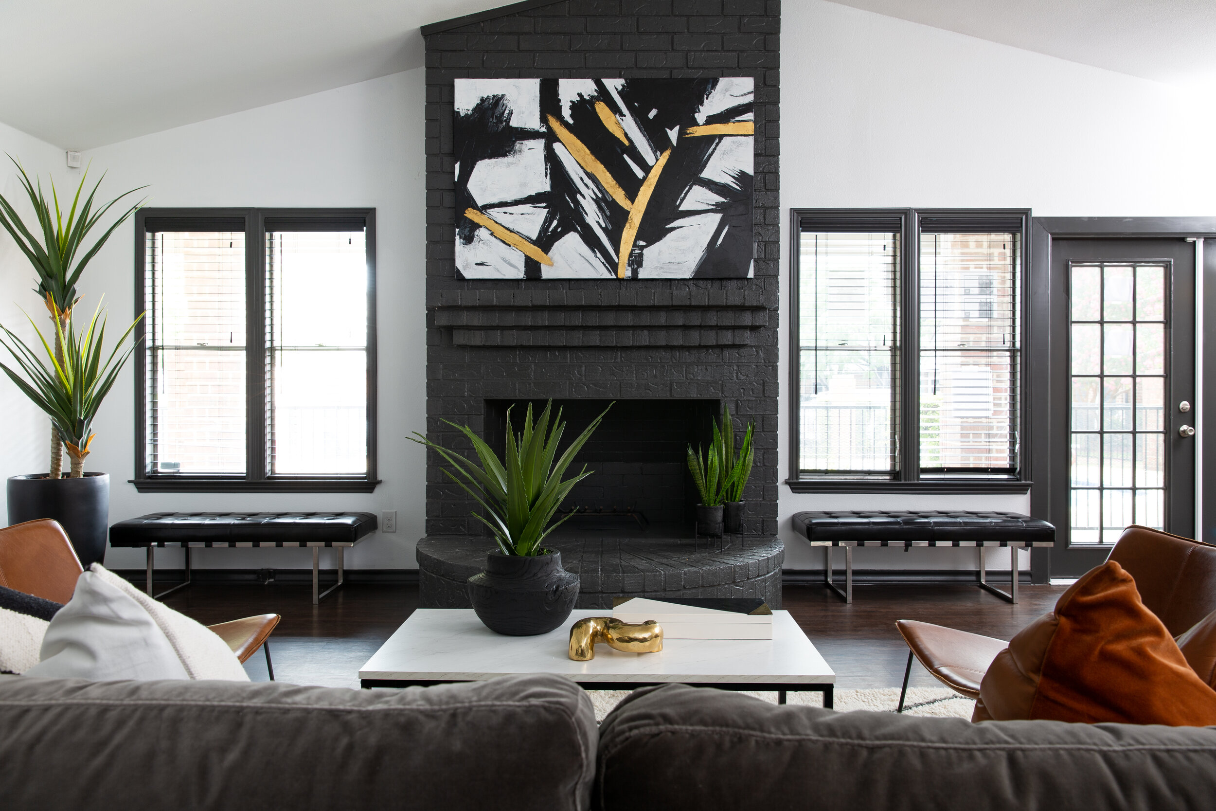
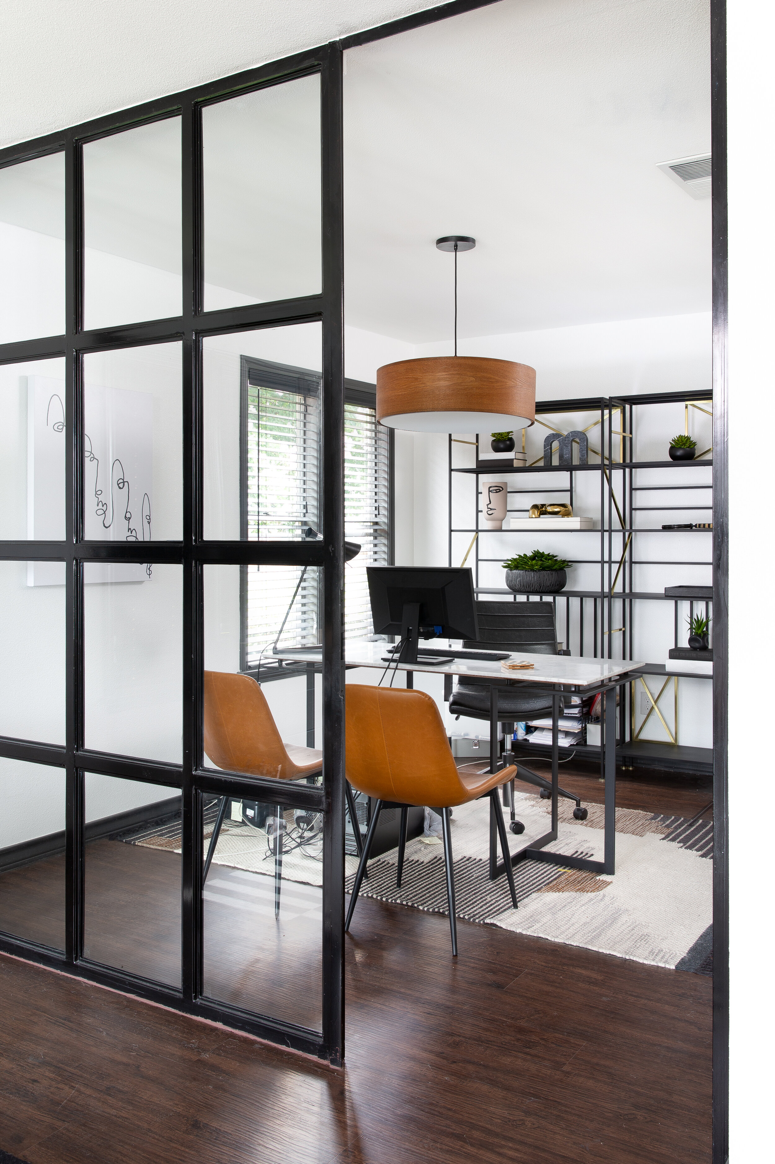
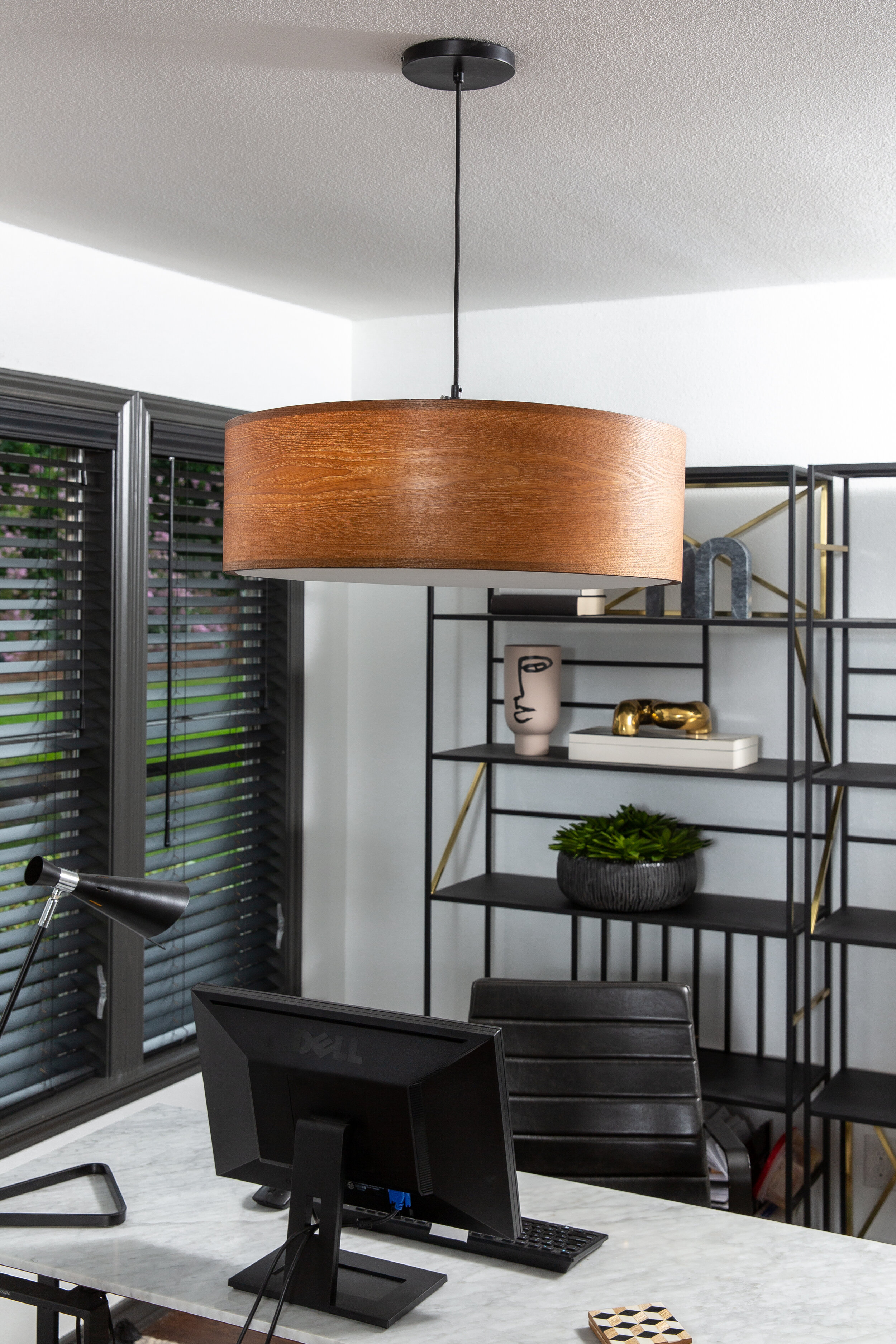
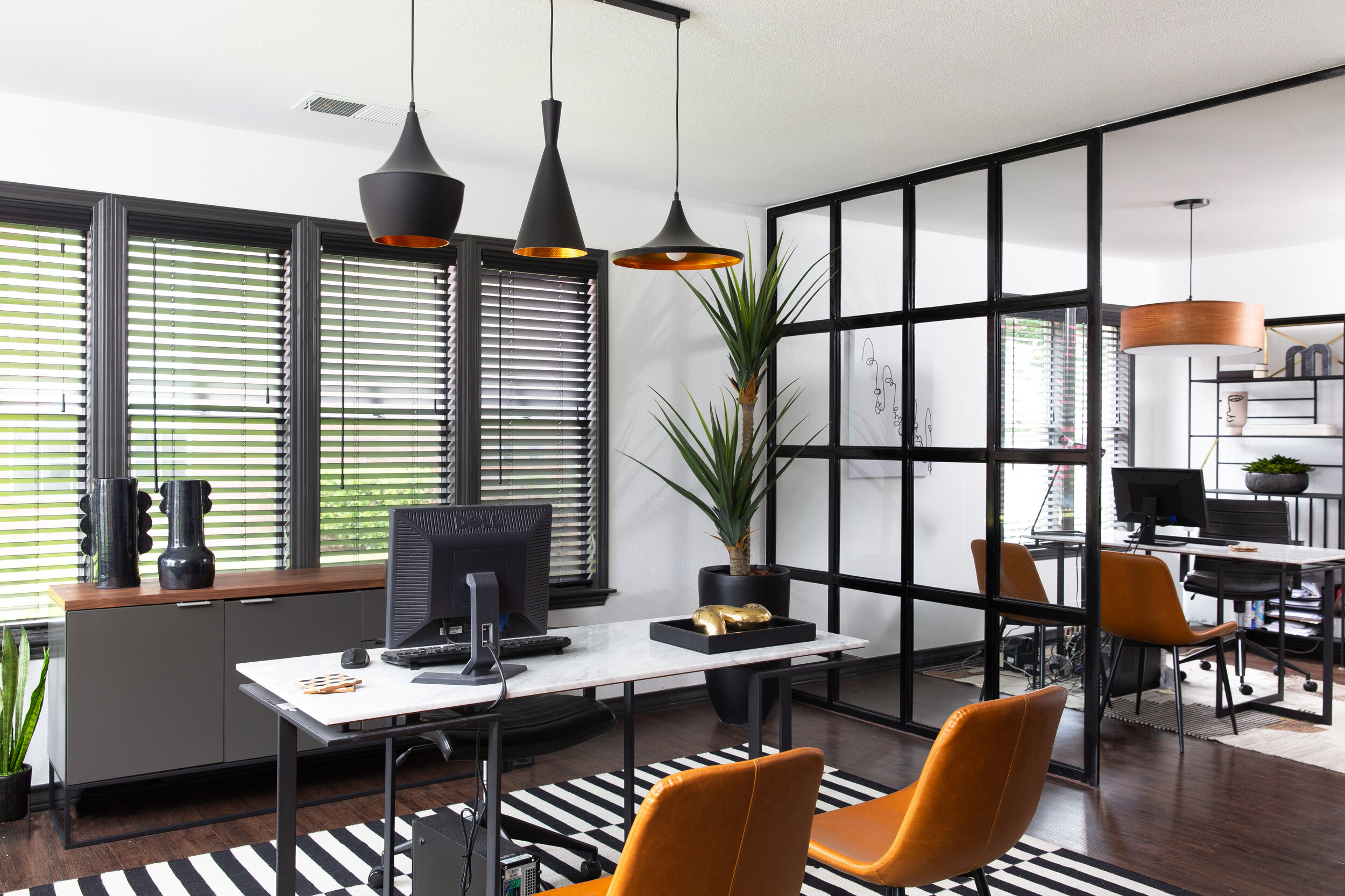
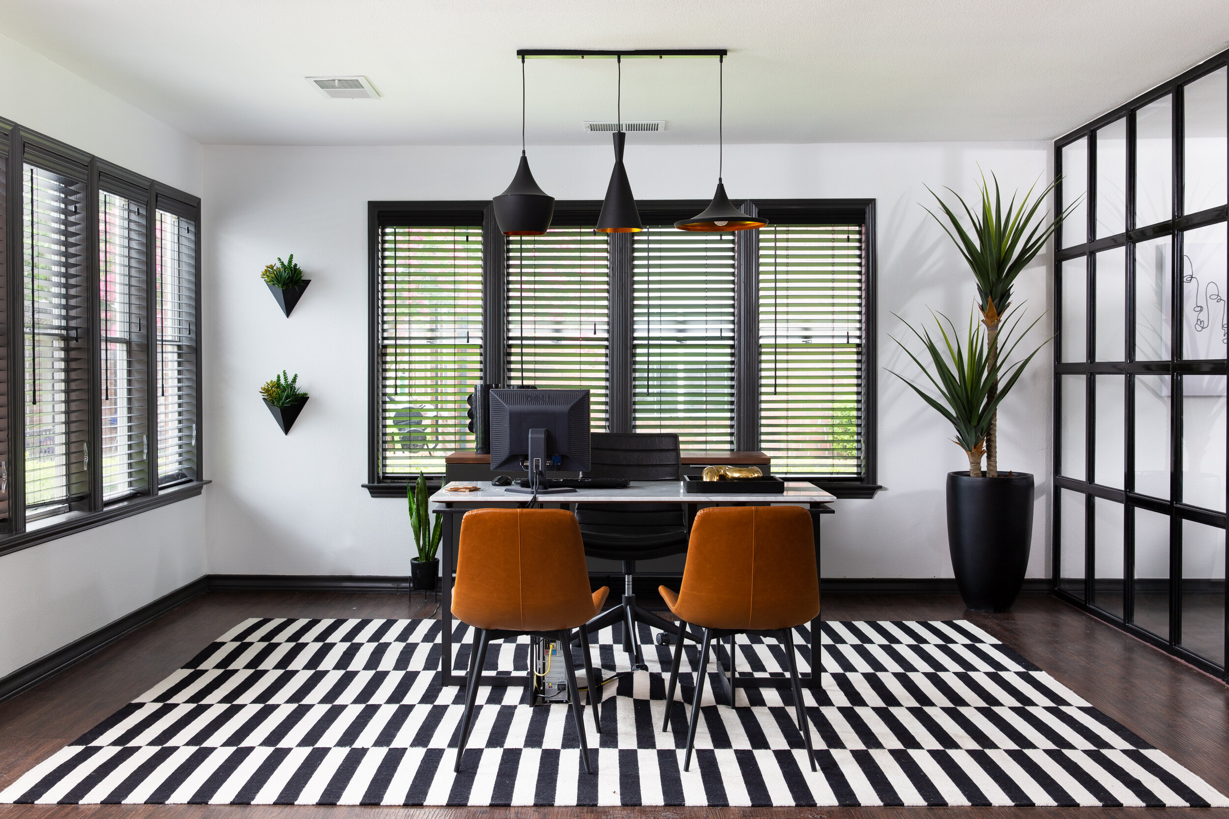
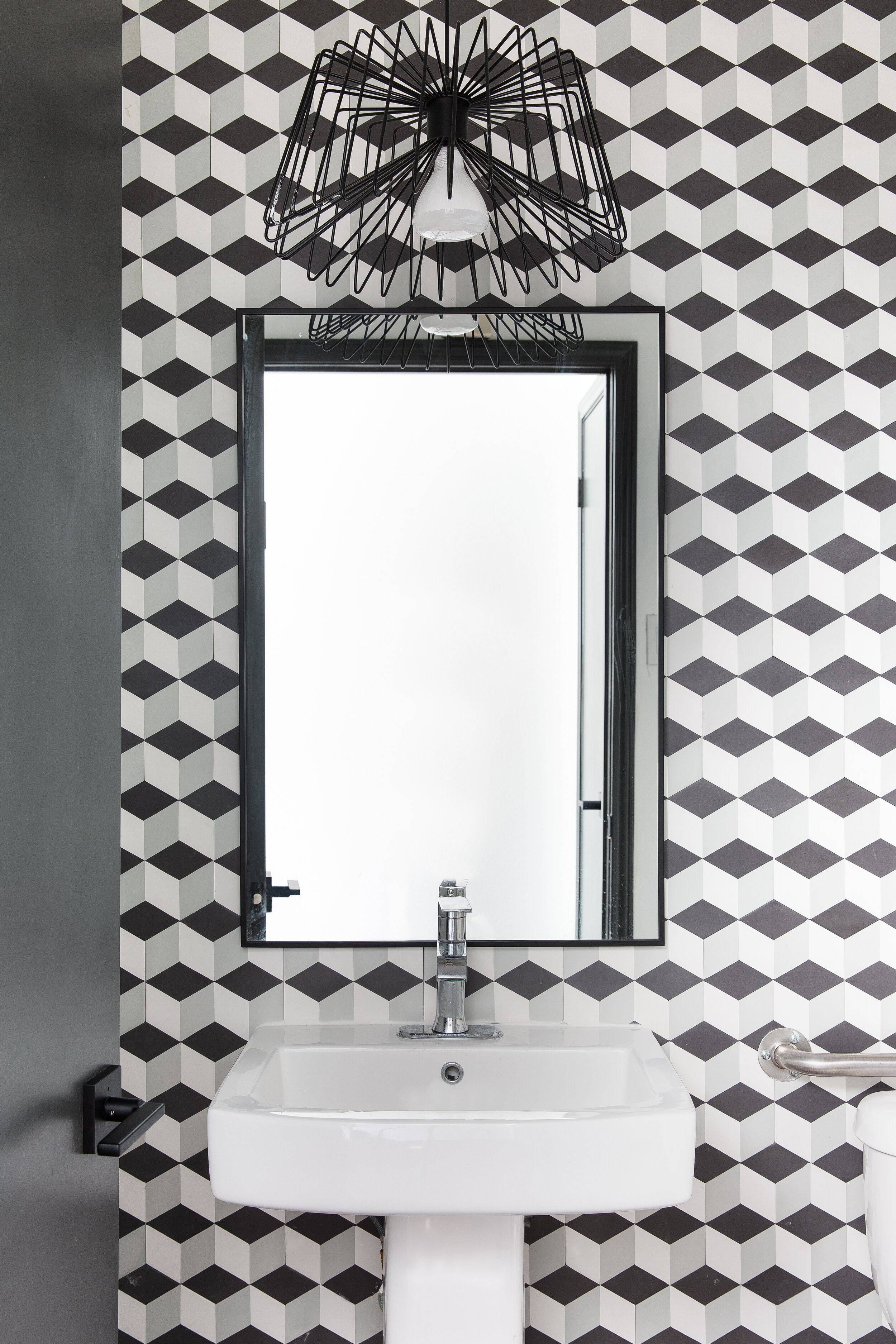
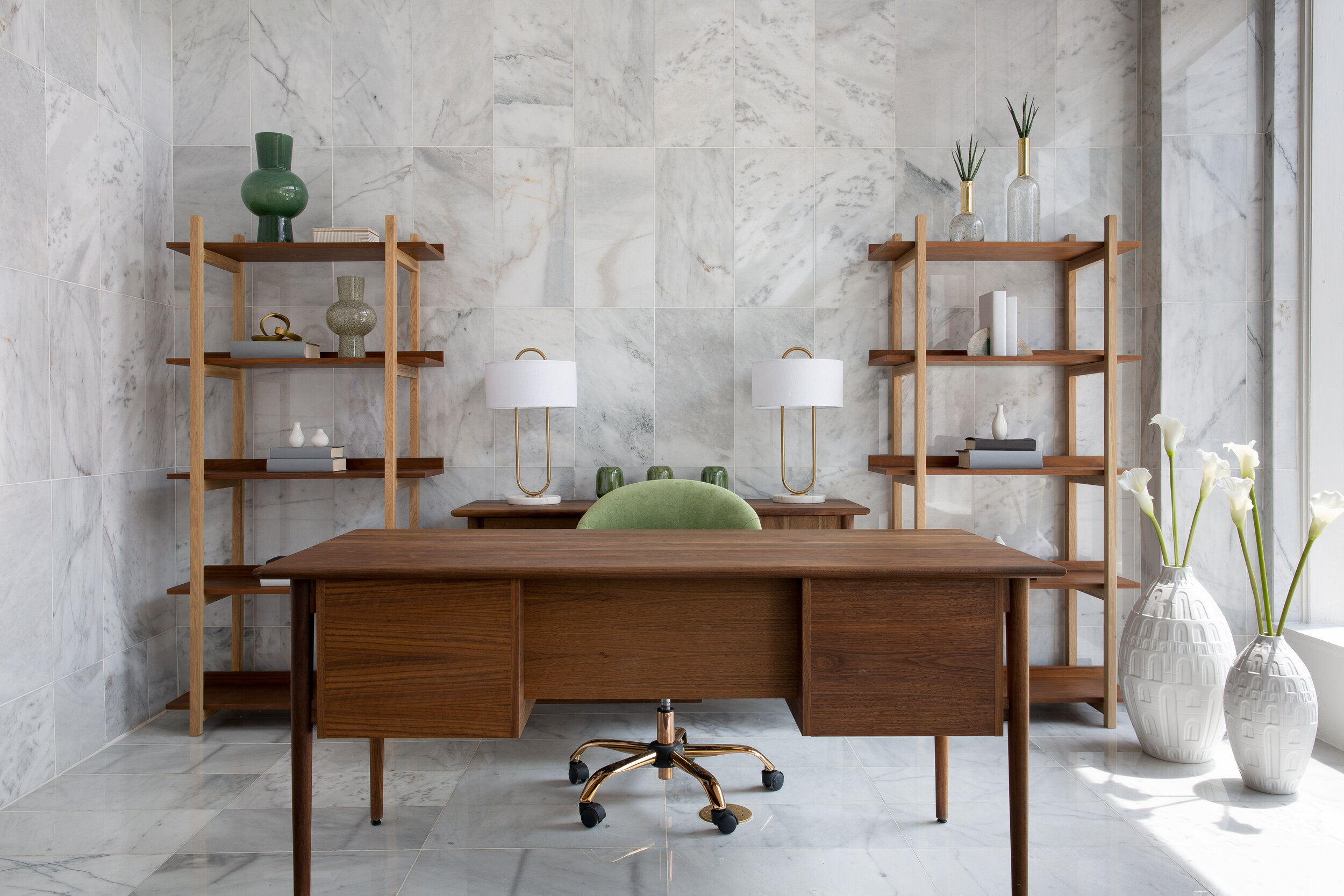
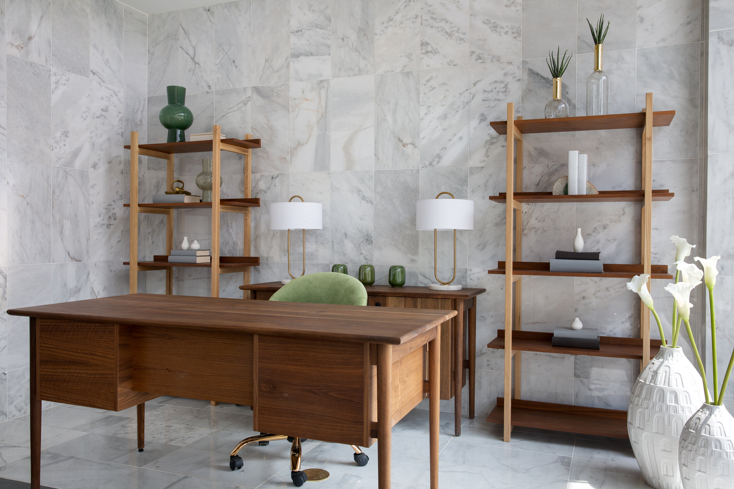
A simple color palette, gentle nods to nature, and unexpected surprises define the design of the Thompson Place resident lounge, lobby, and leasing center. The renovation of this South San Antonio apartment complex aimed to revitalize a sleepy traditional structure with high contrast and impactful industrial modern design. Bold black and white patterns and crisp lines are softened with velvety textiles, warm leathers, and plush rugs. While the space is guided by simplicity, oversized Mid Century Modern light fixtures, gold accents, and bold geometric wall tiles add a layer of contrast and variation. Angular palm plants bring in an organic element while maintaining a modern flair.
CALCASIEU
PROJECT: APARTMENT LEASING OFFICE
LOCATION: SAN ANTONIO, TX
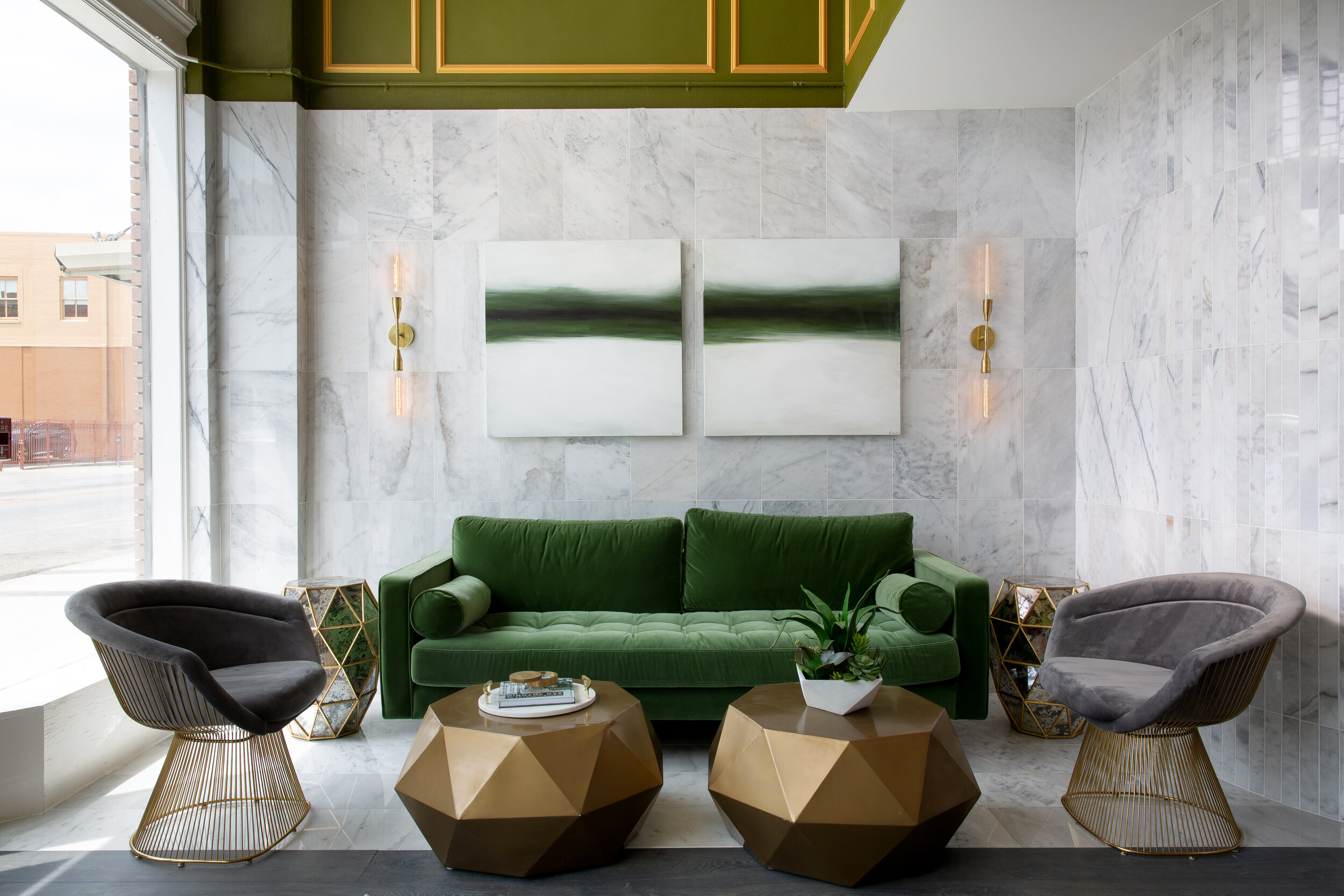
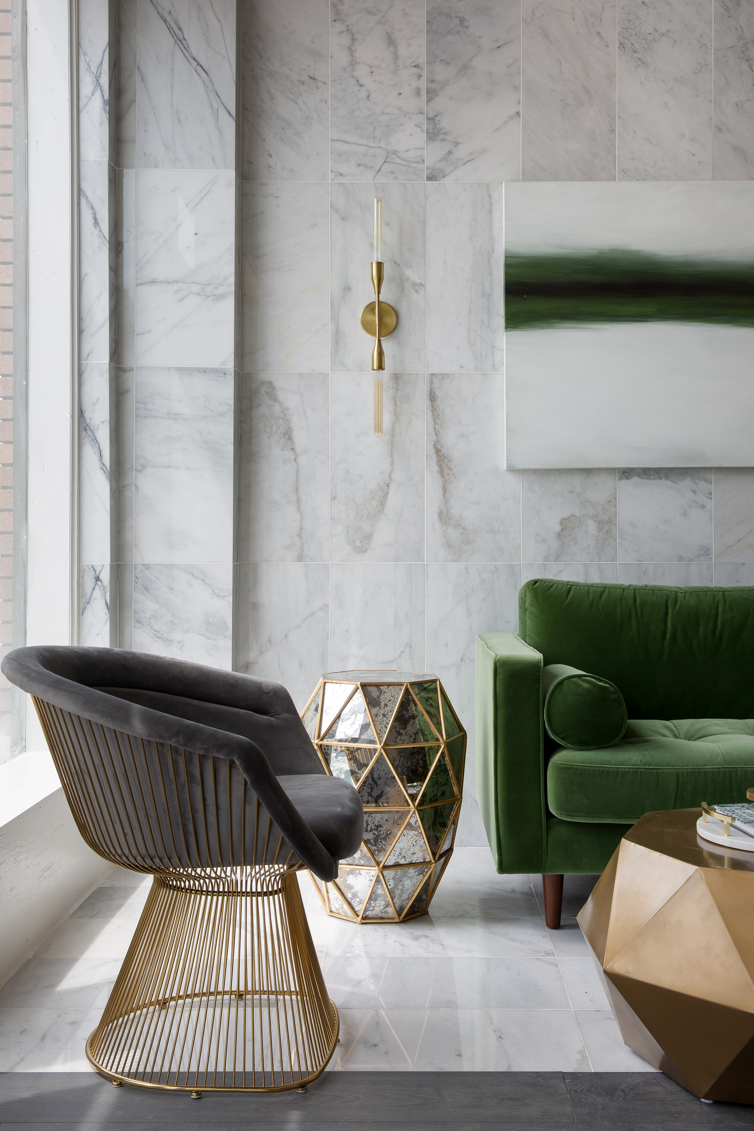
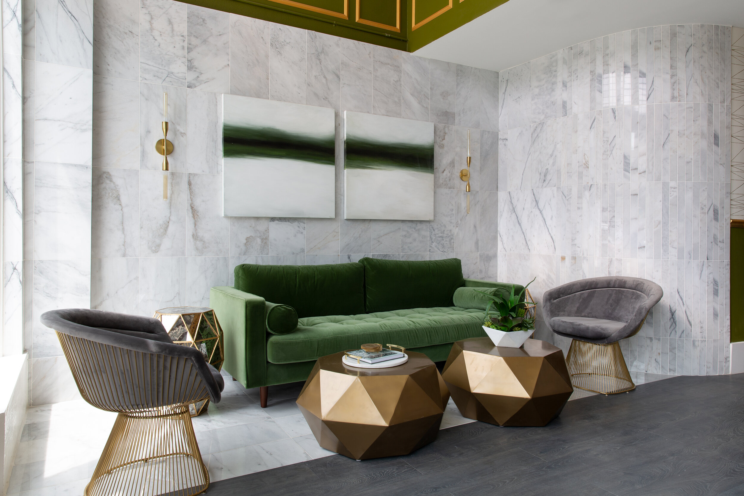
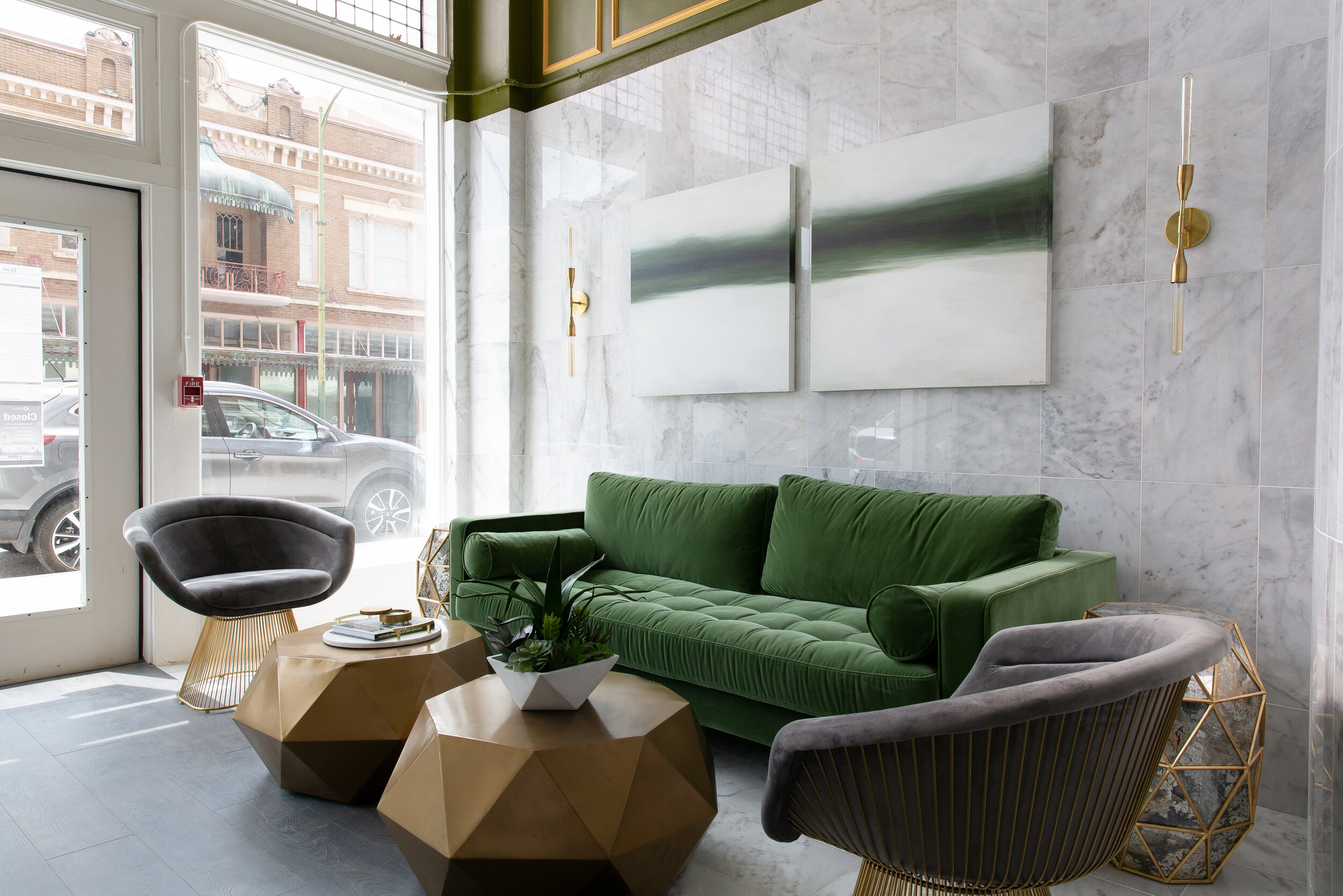
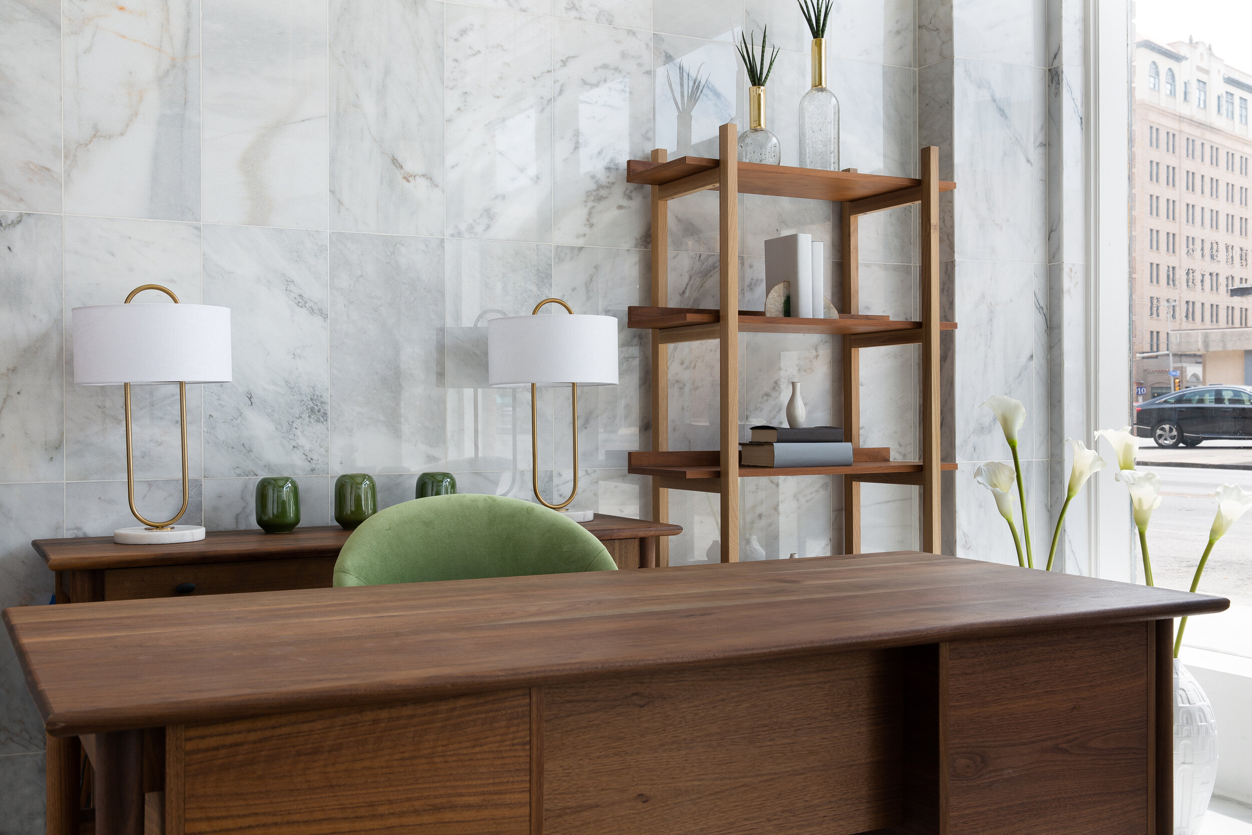
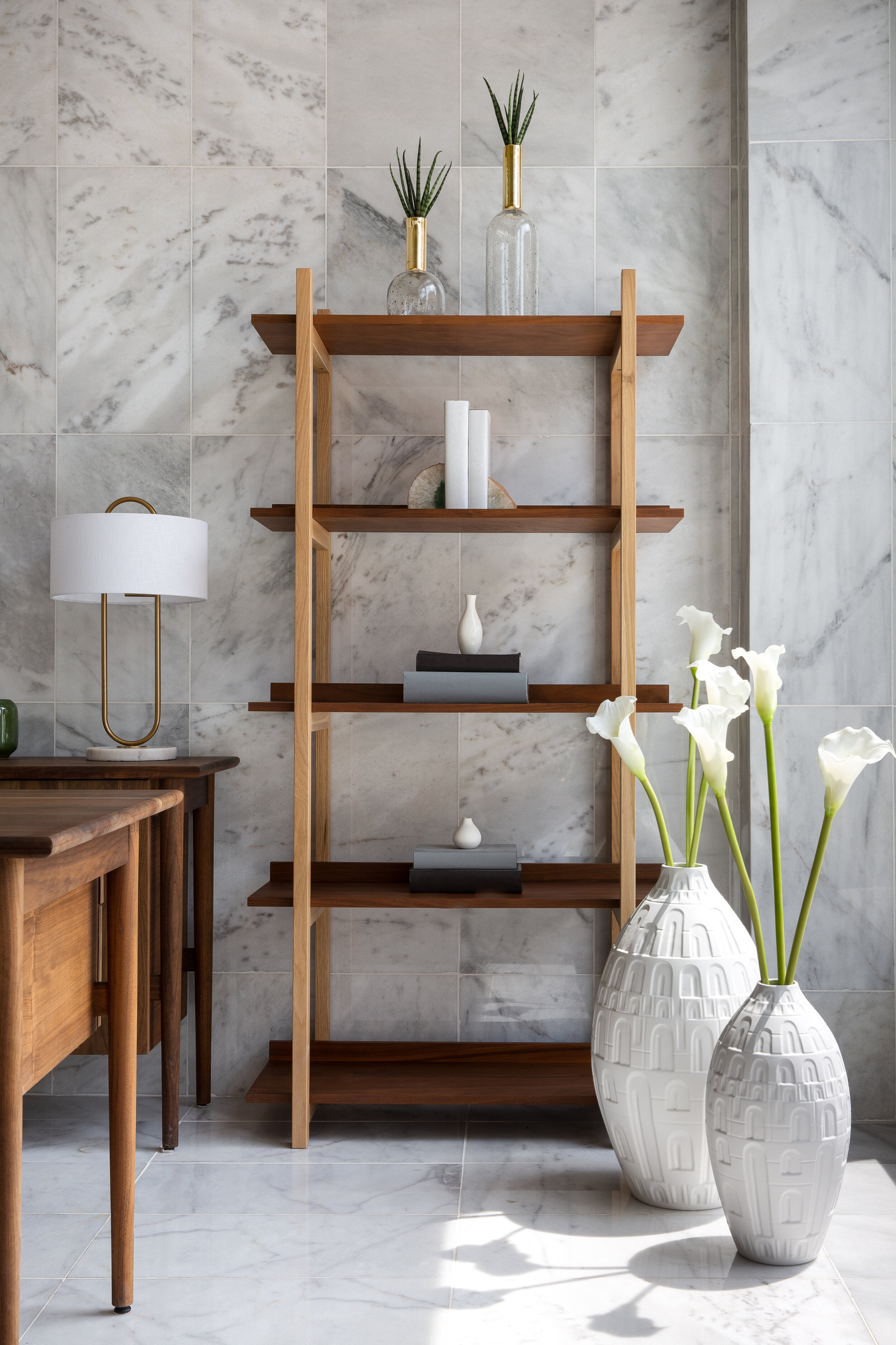
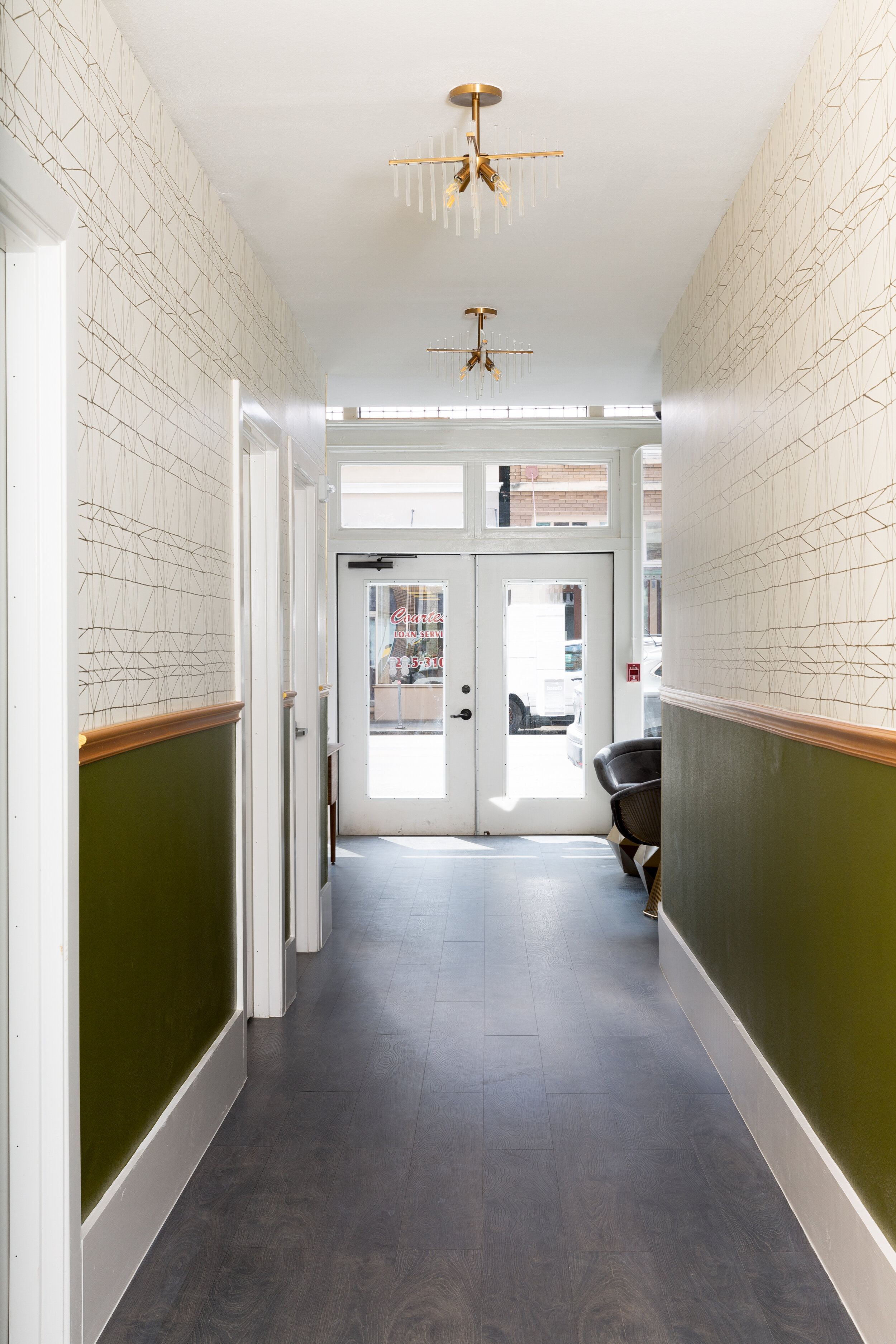
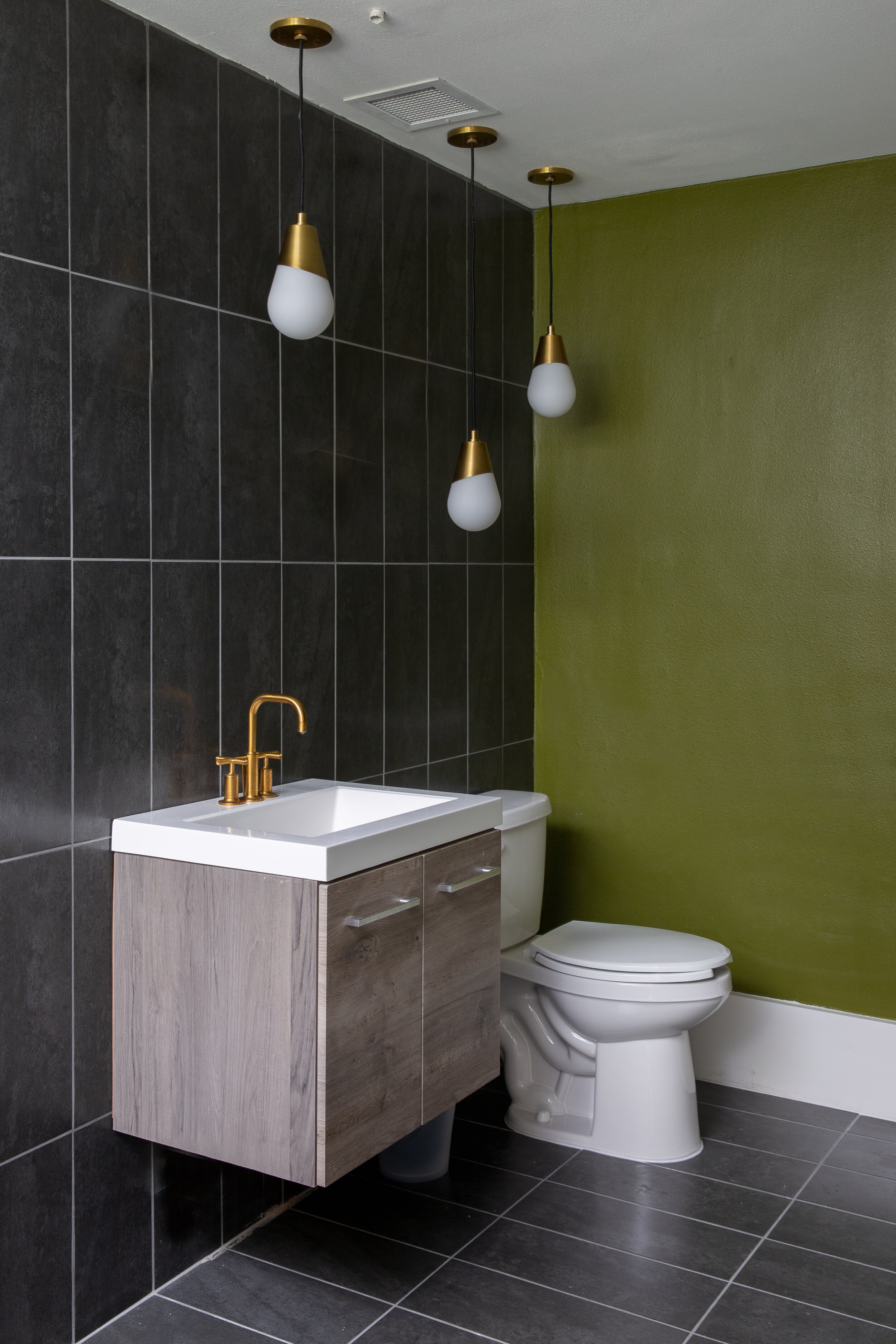
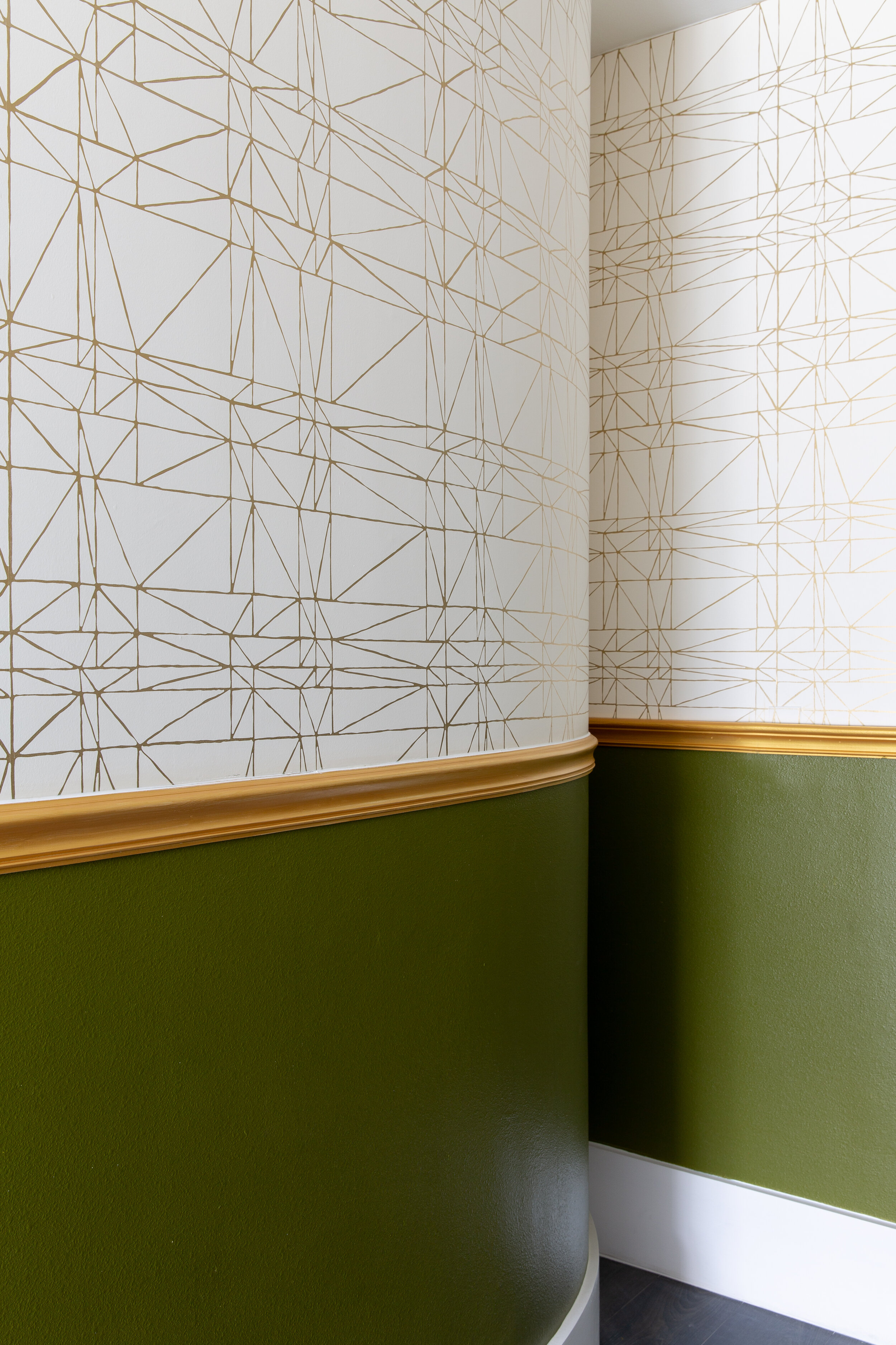
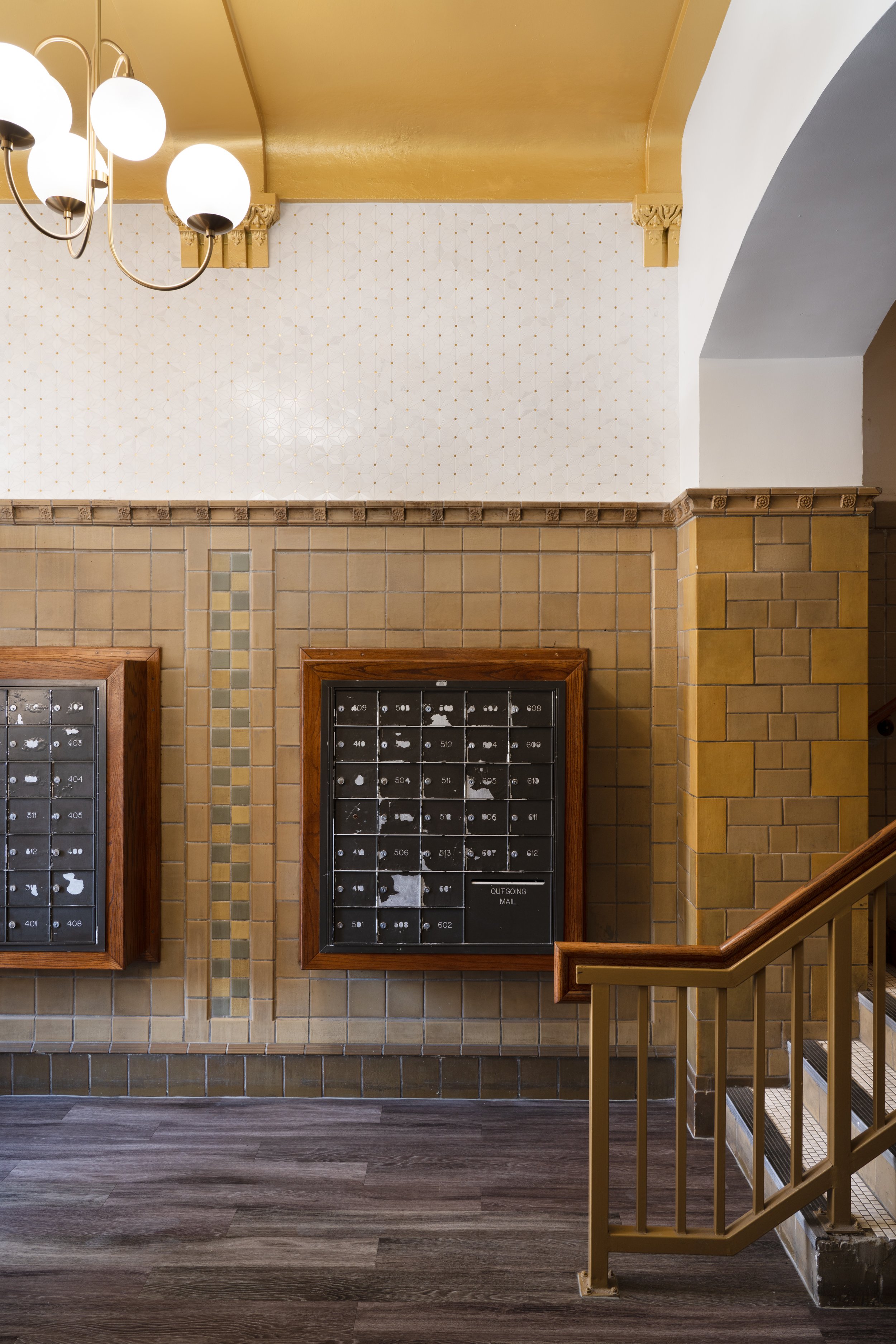
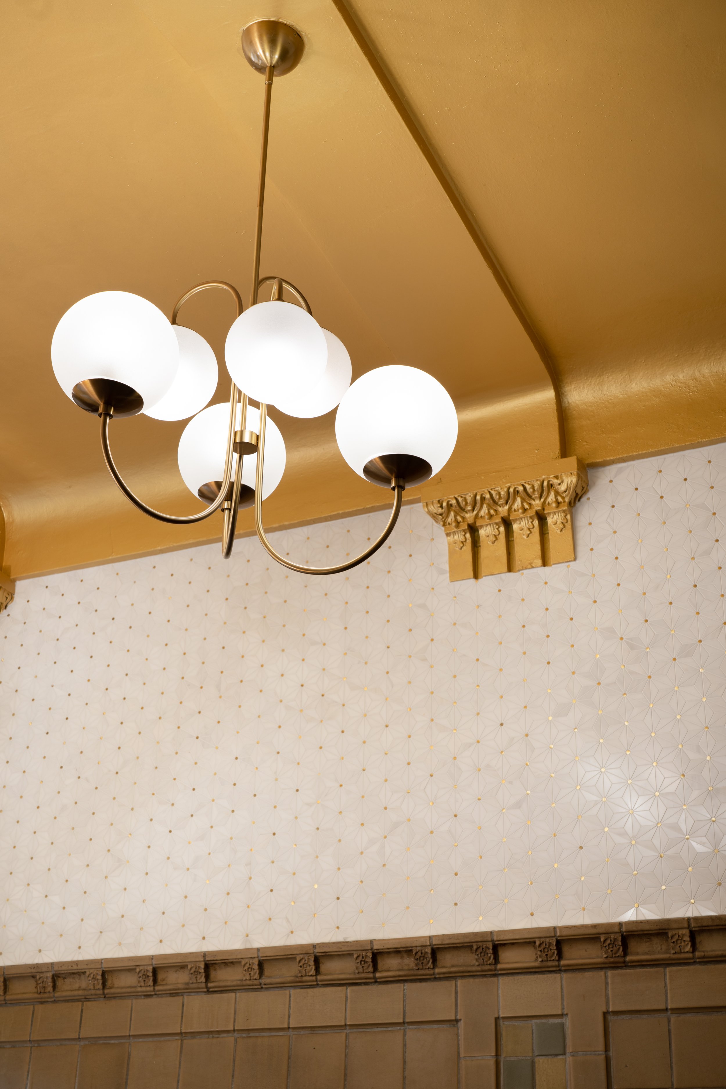
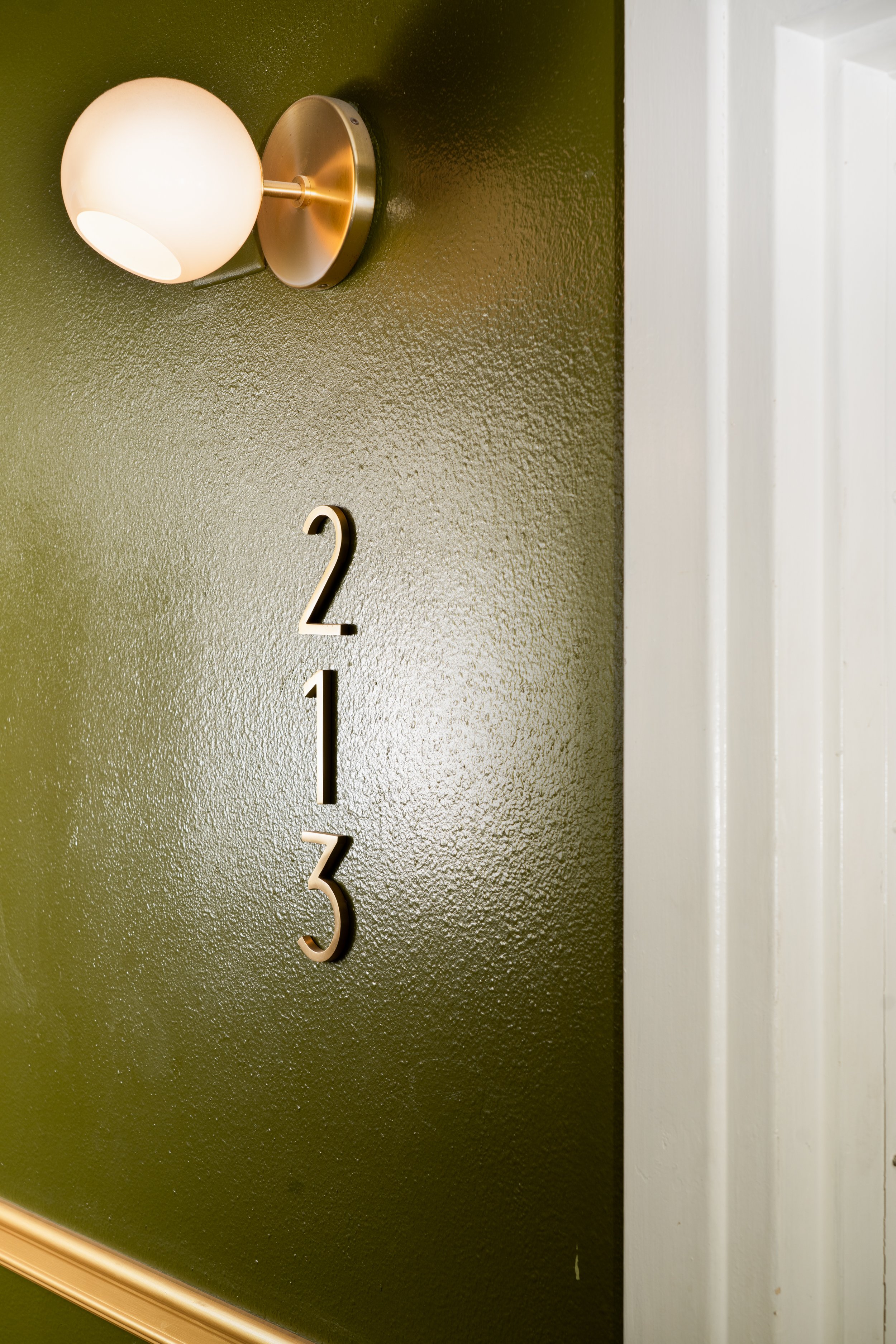
Rich history meets modern elegance in the lobby of the Calcasieu Apartments in downtown San Antonio. This multimillion-dollar renovation required balancing the preservation of classical detailing with an injection of contemporary luxury. Upon entering the lobby, guests and residents are greeted with marble-clad walls that cascade onto the floor and accentuate the building’s unique curves. Satin brass light fixtures, dark walnut wood tones, and rich emerald textiles add a sense of tailored aspiration while providing a warm welcome home. Finally, a band of dark wood floors provides a guided path down a gold and emerald hall to the apartment homes within.
KLK
PROJECT: KAREEM’S LEBANESE KITCHEN RESTAURANT
LOCATION: NAPLES, FL
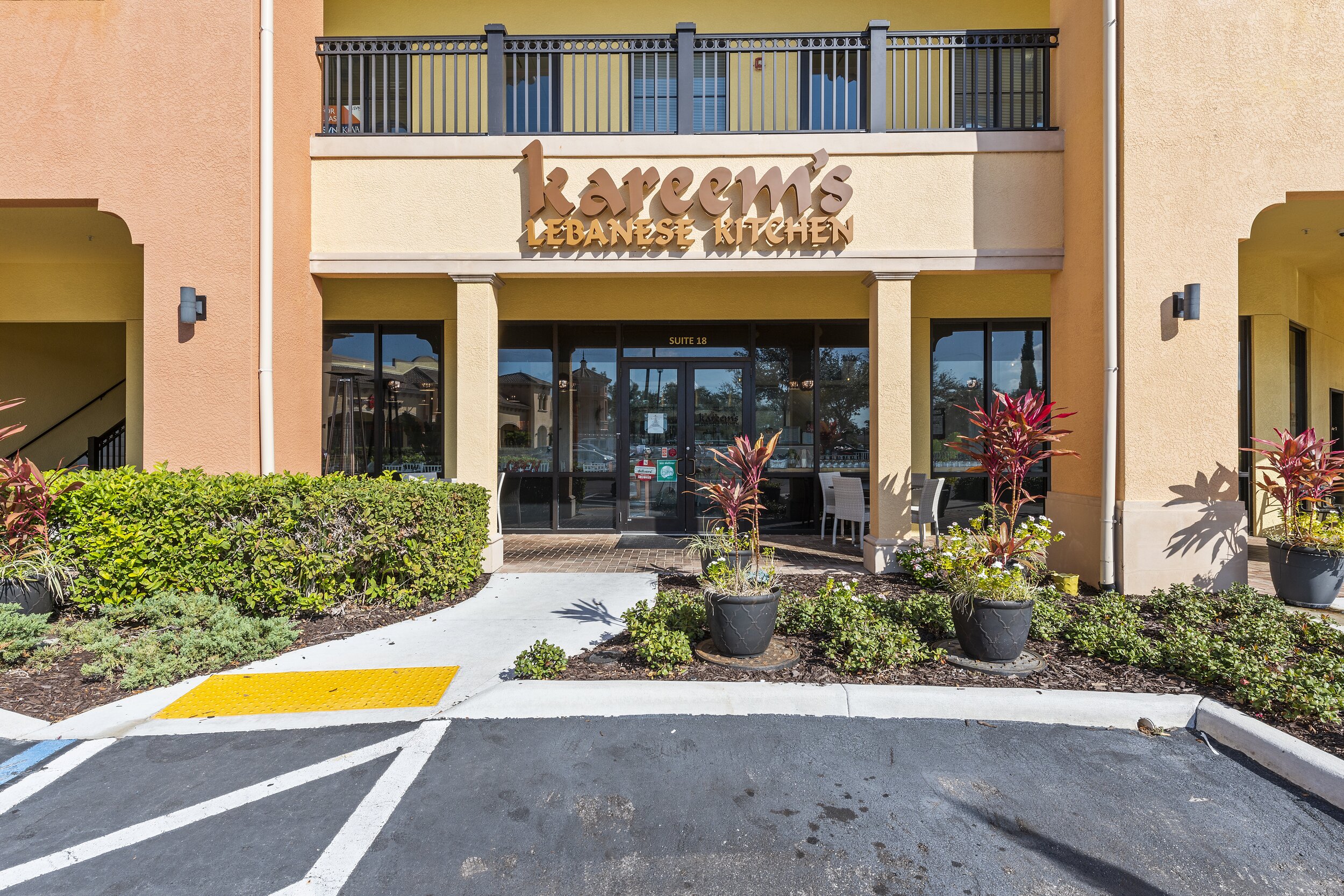
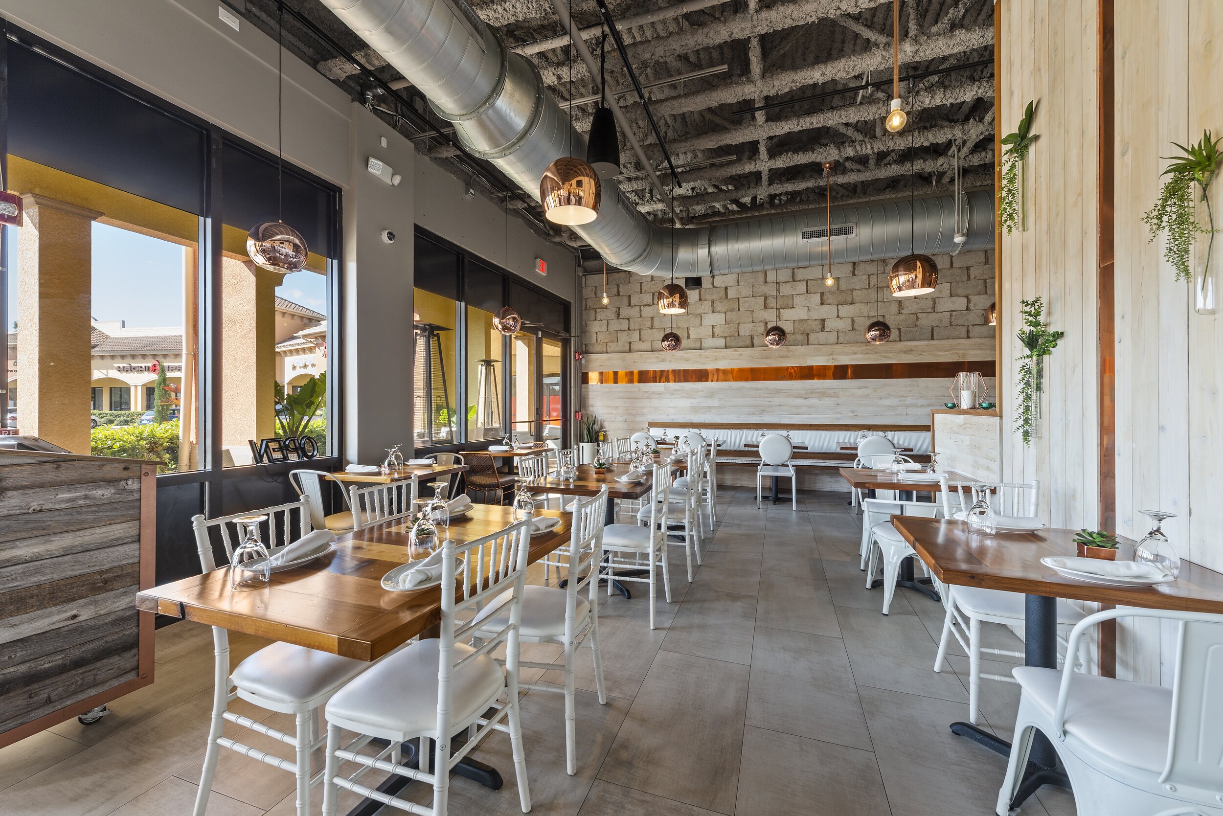
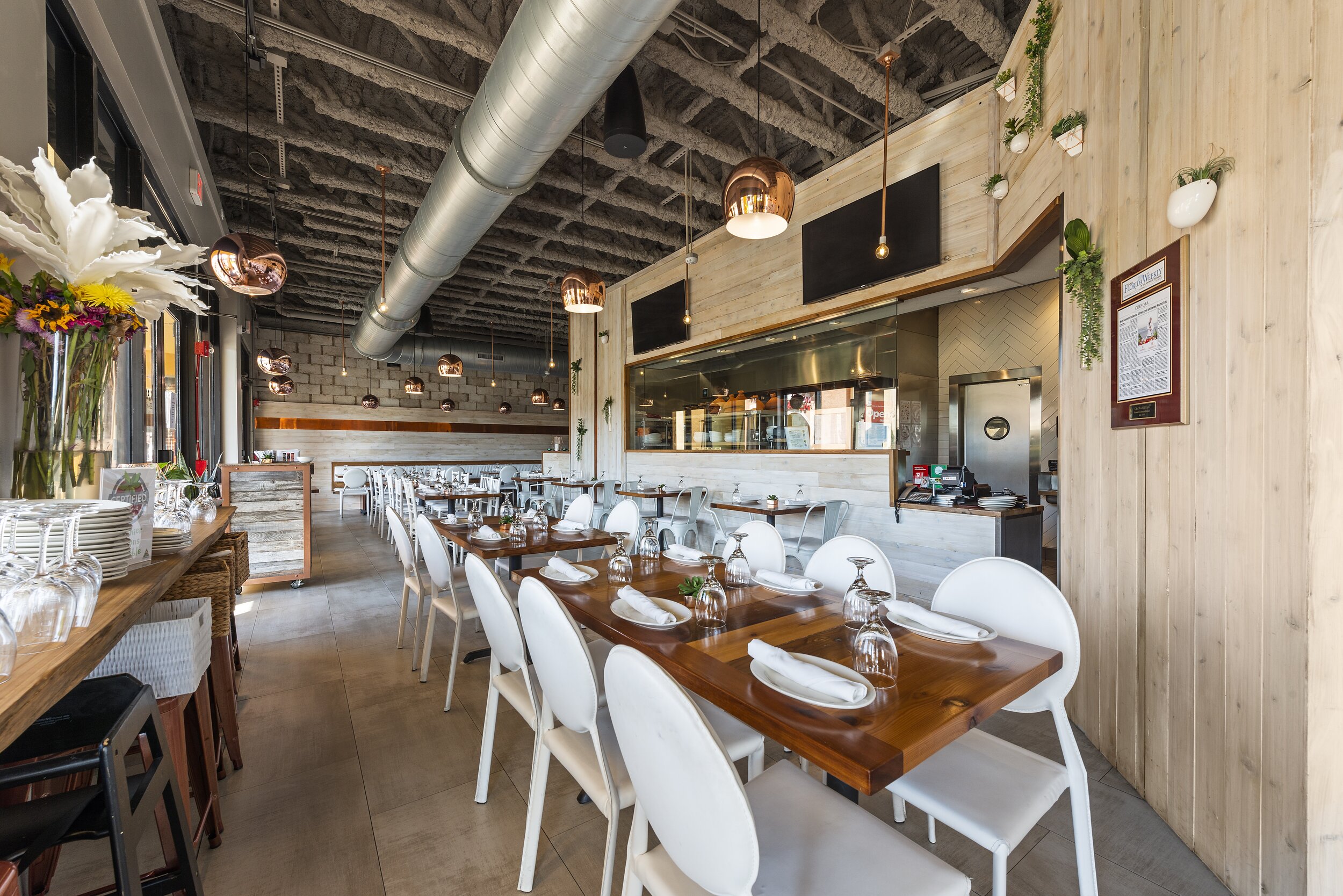
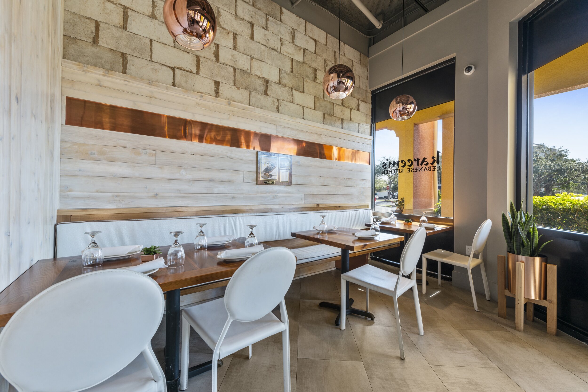
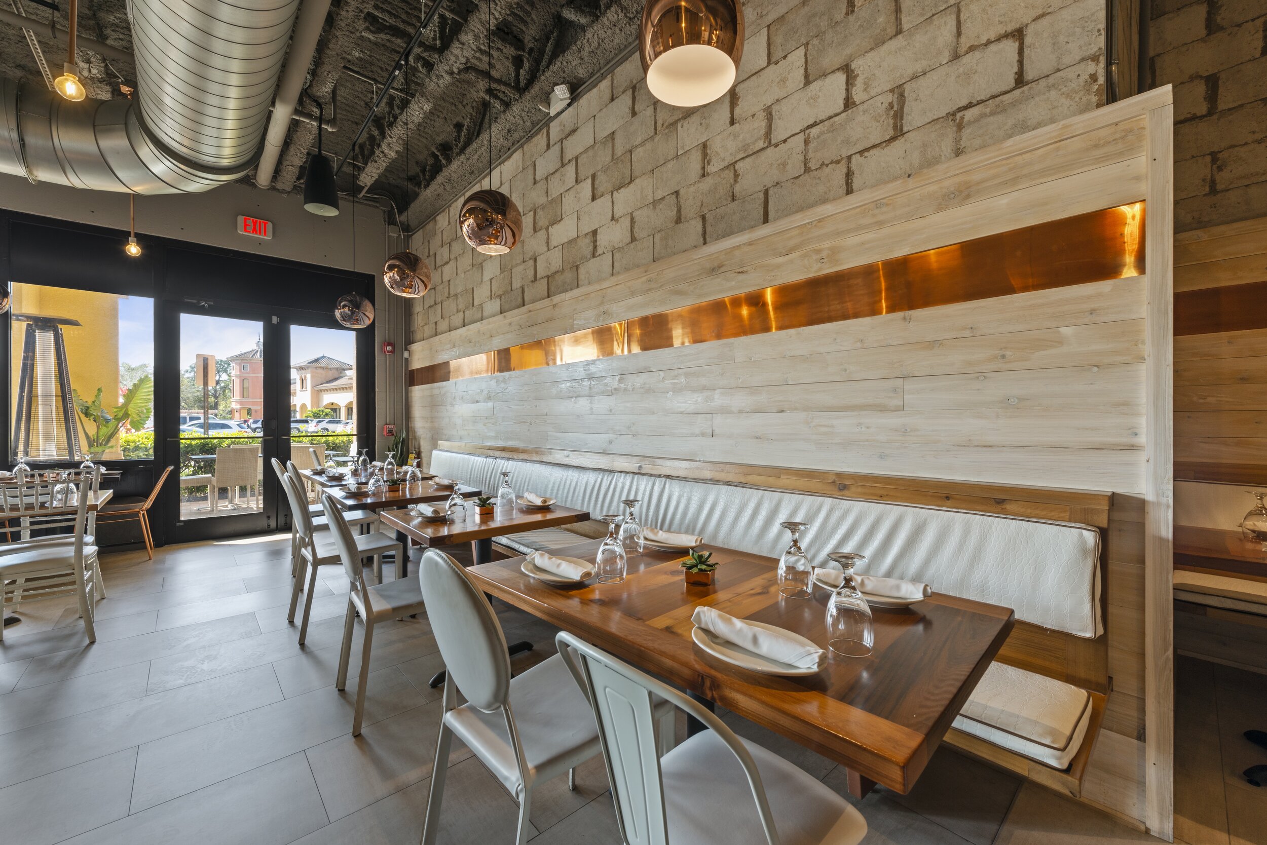
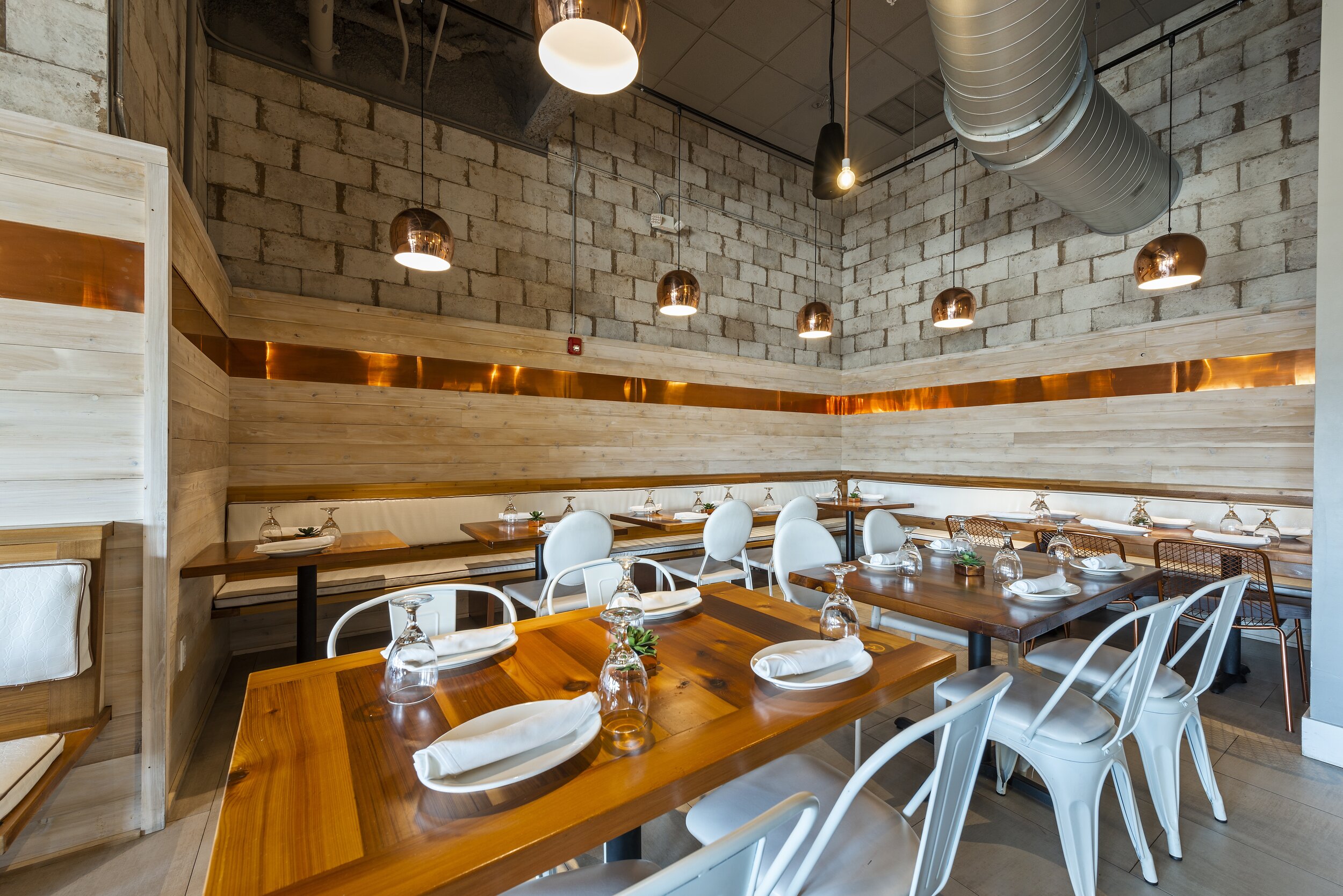
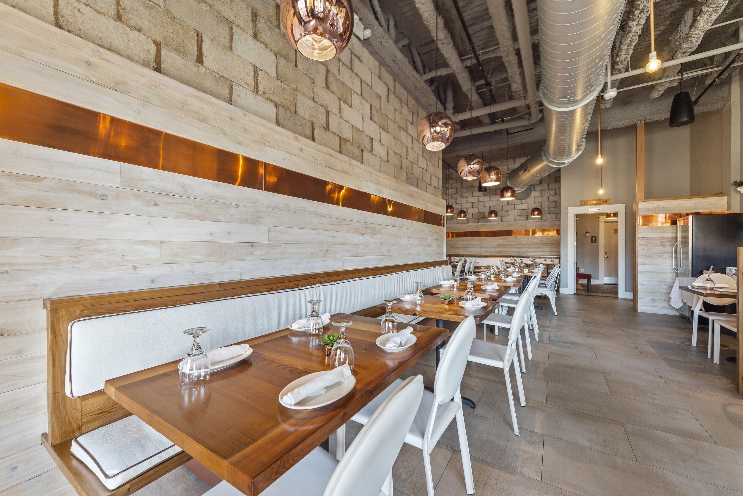
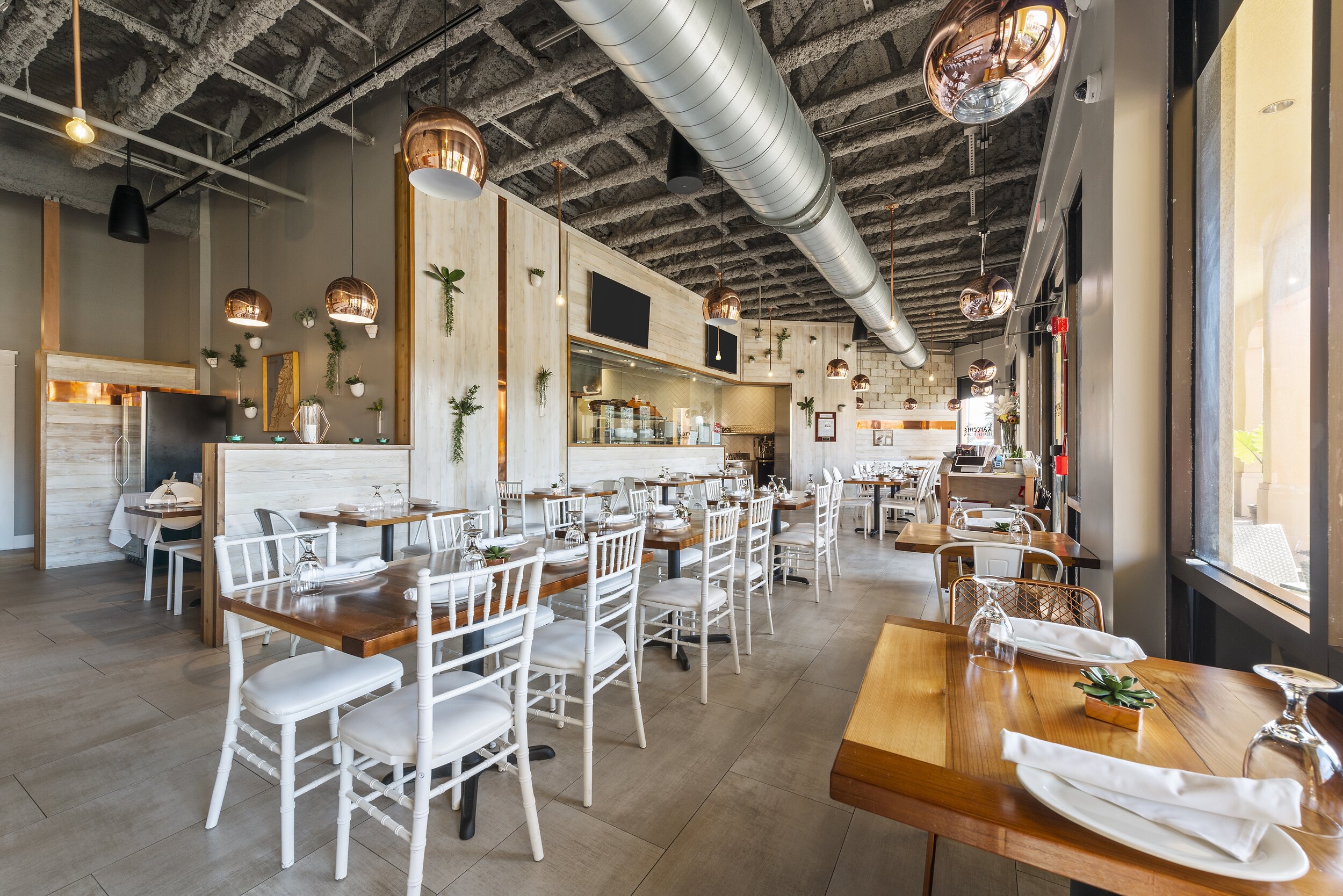
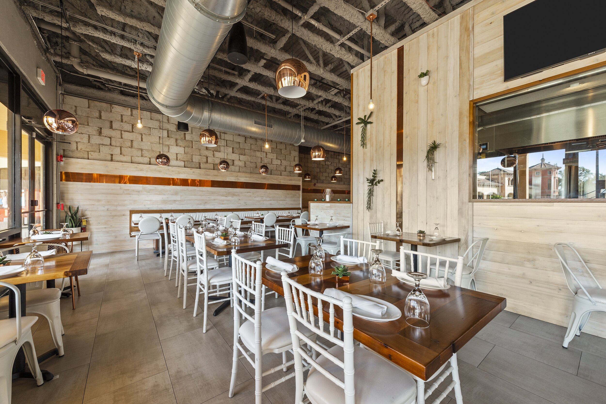
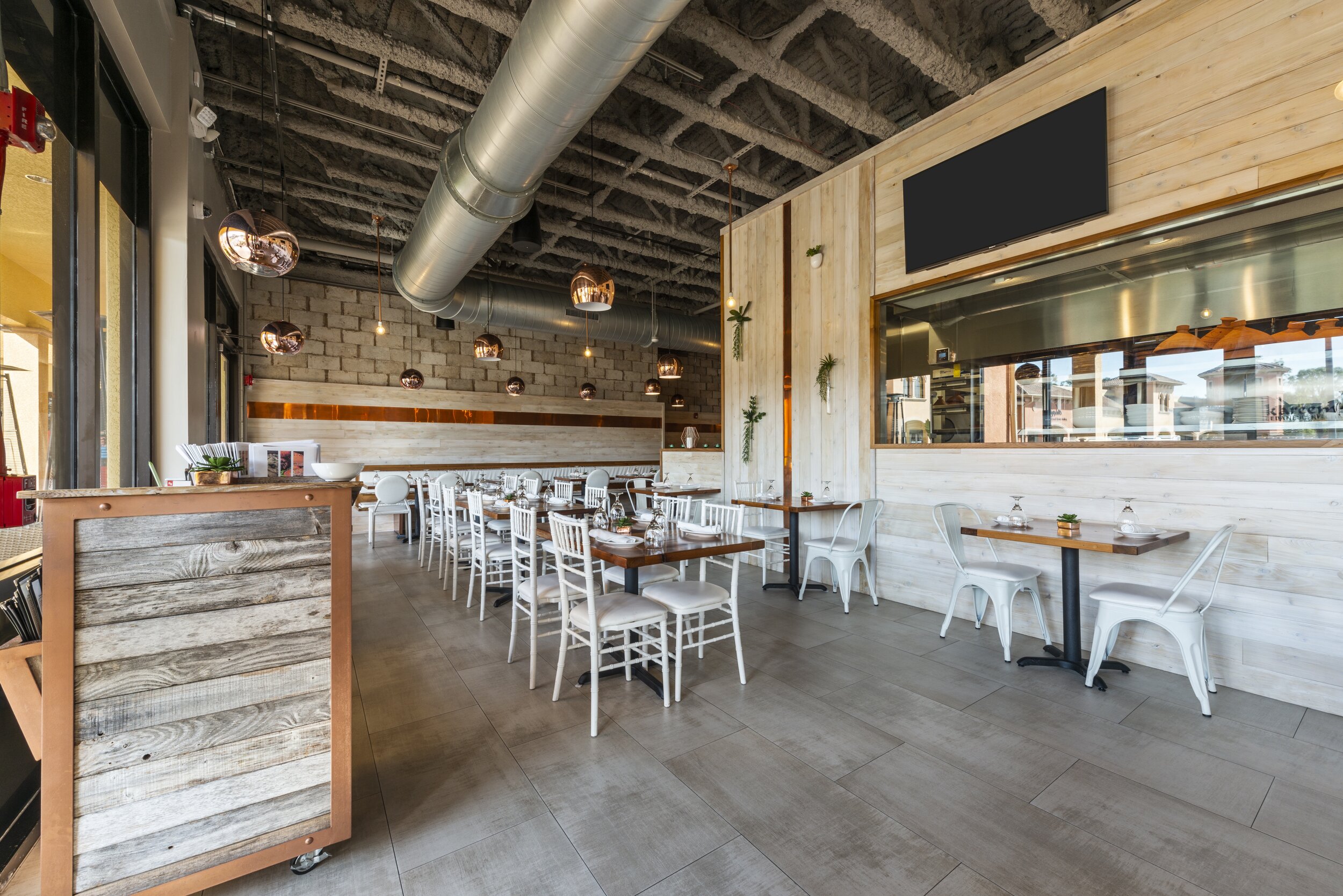
Once they’ve entered Kareem’s Lebanese Kitchen, diners leave the busy streets of Naples, Florida, and are transported to the laid back, open-air patios of the Mediterranean. Chef Rachid’s authentic Lebanese dishes inspired the warm, earthy color palette that evokes the feeling of the Lebanon coast. Whitewashed cedar walls are accented with copper cladding that carries through to copper light fixtures and caramel wood plank tables. The collection of dining chairs is brought together with a single unifying shade of white, giving an upscale feel to the laid back atmosphere. In this space, diners can live at the slower pace of the Mediterranean as they embrace the flavors of the region.
21 SPICES
PROJECT: PROGRESSIVE INDIAN FINE DINING RESTAURANT
LOCATION: NAPLES, FL
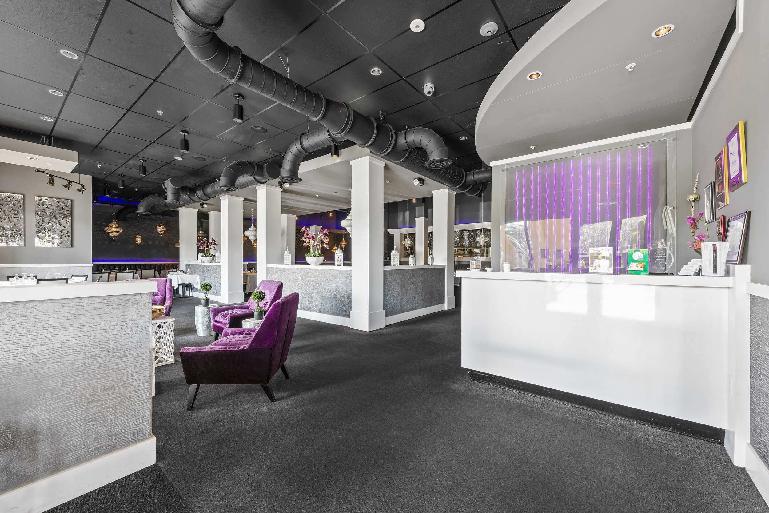
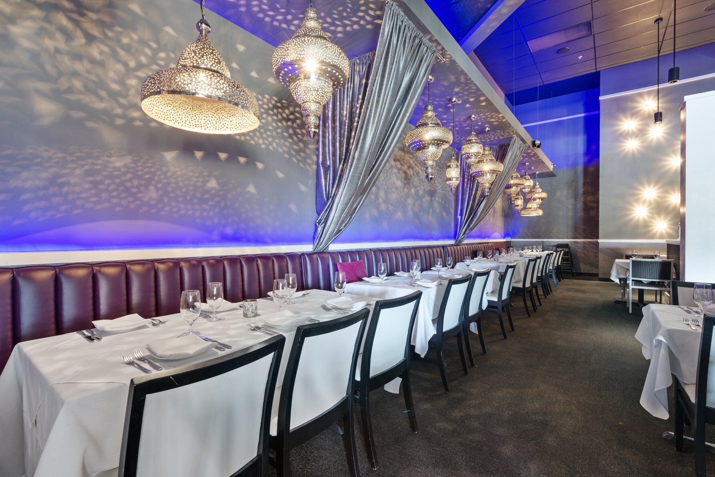
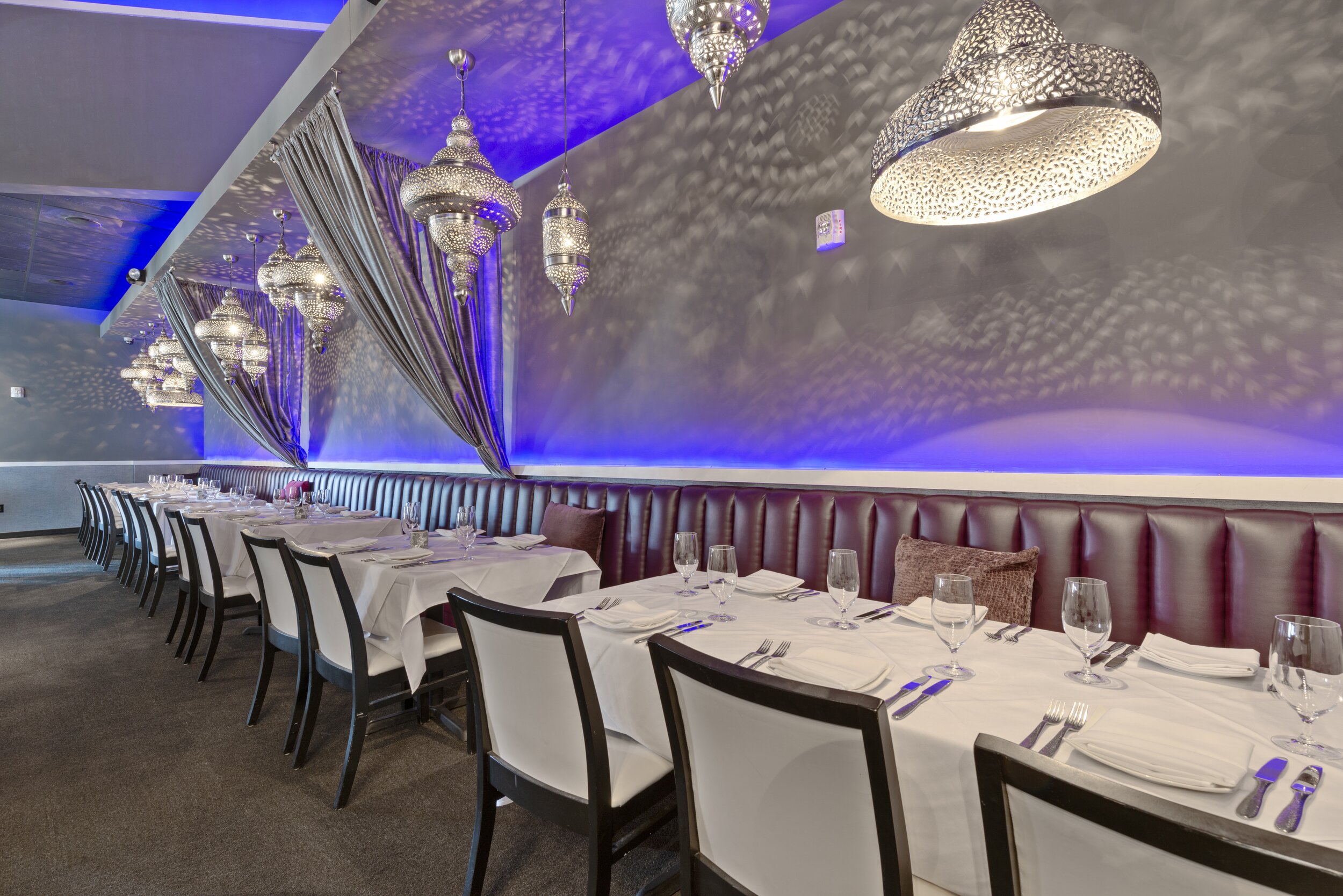
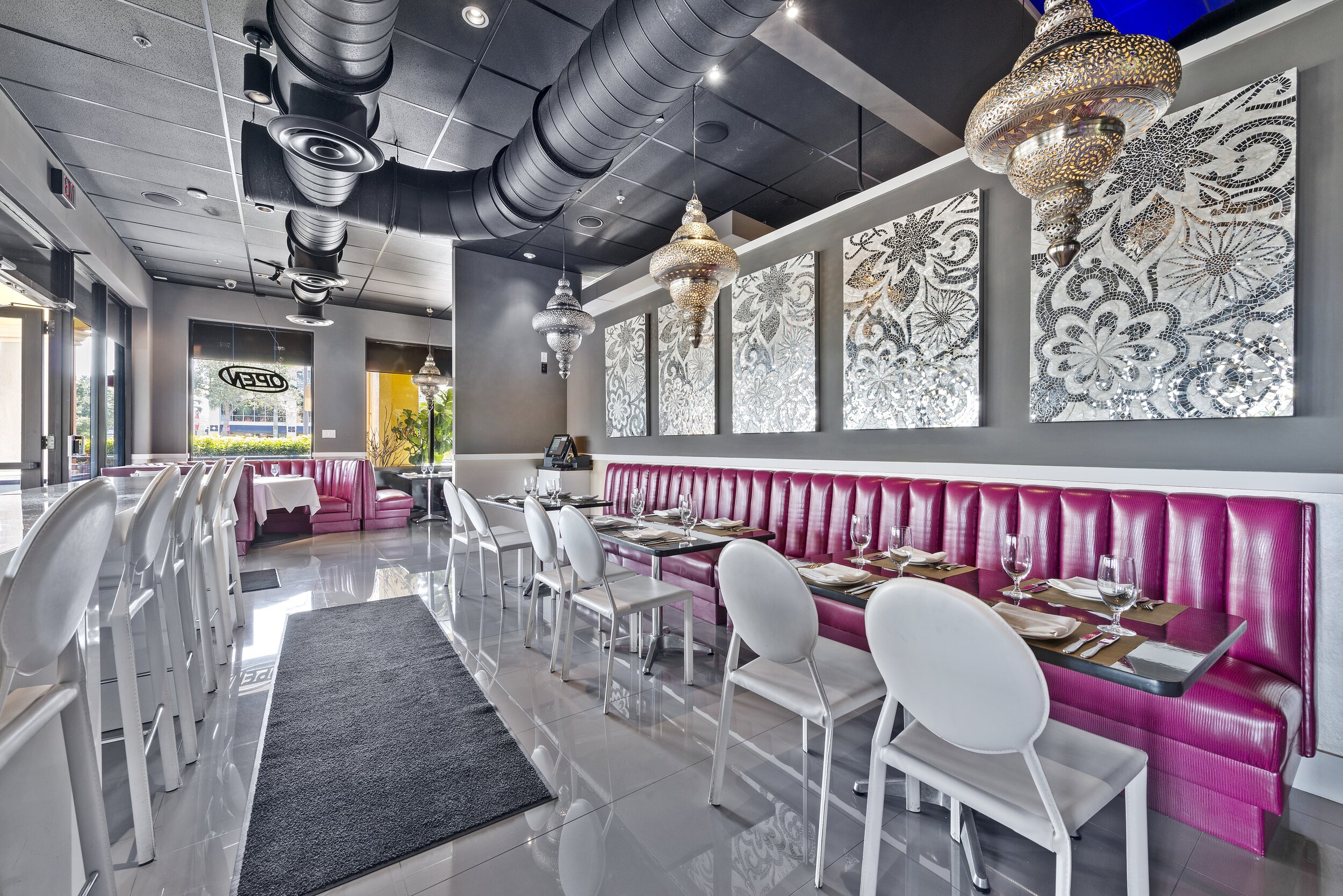
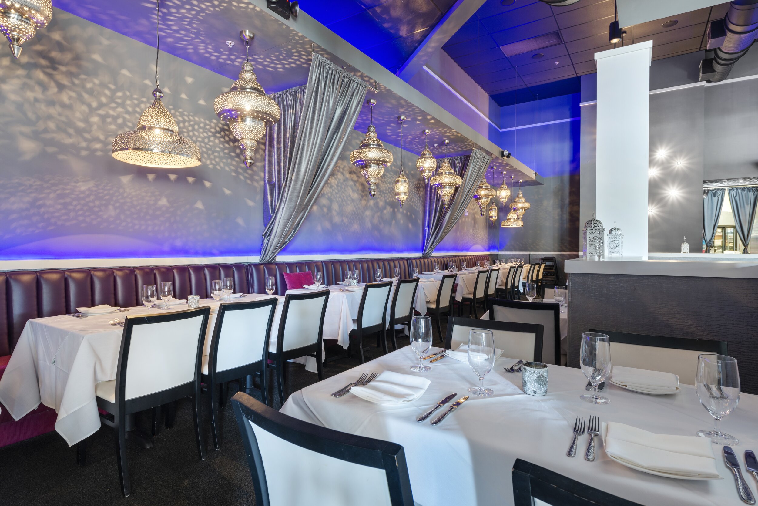
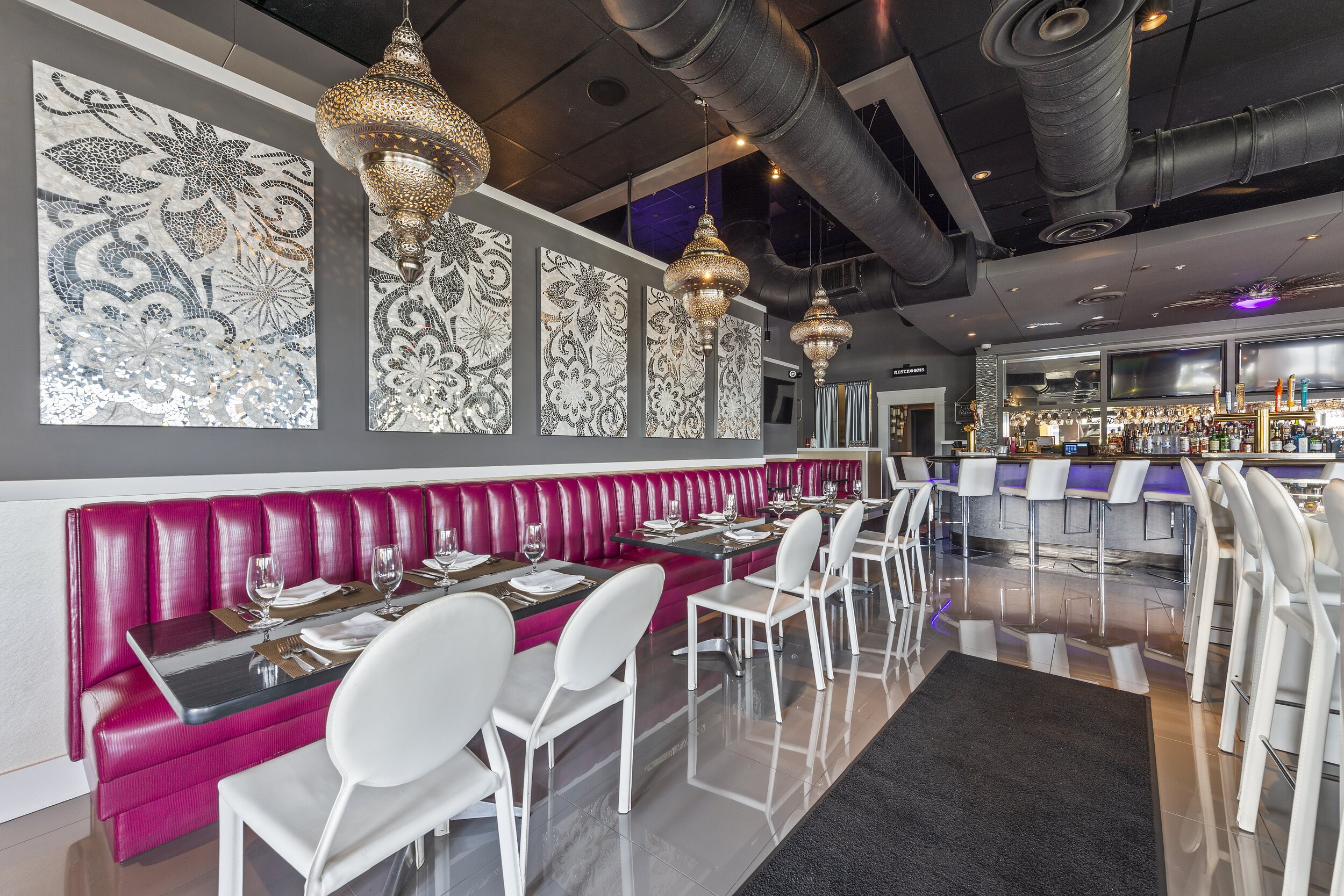
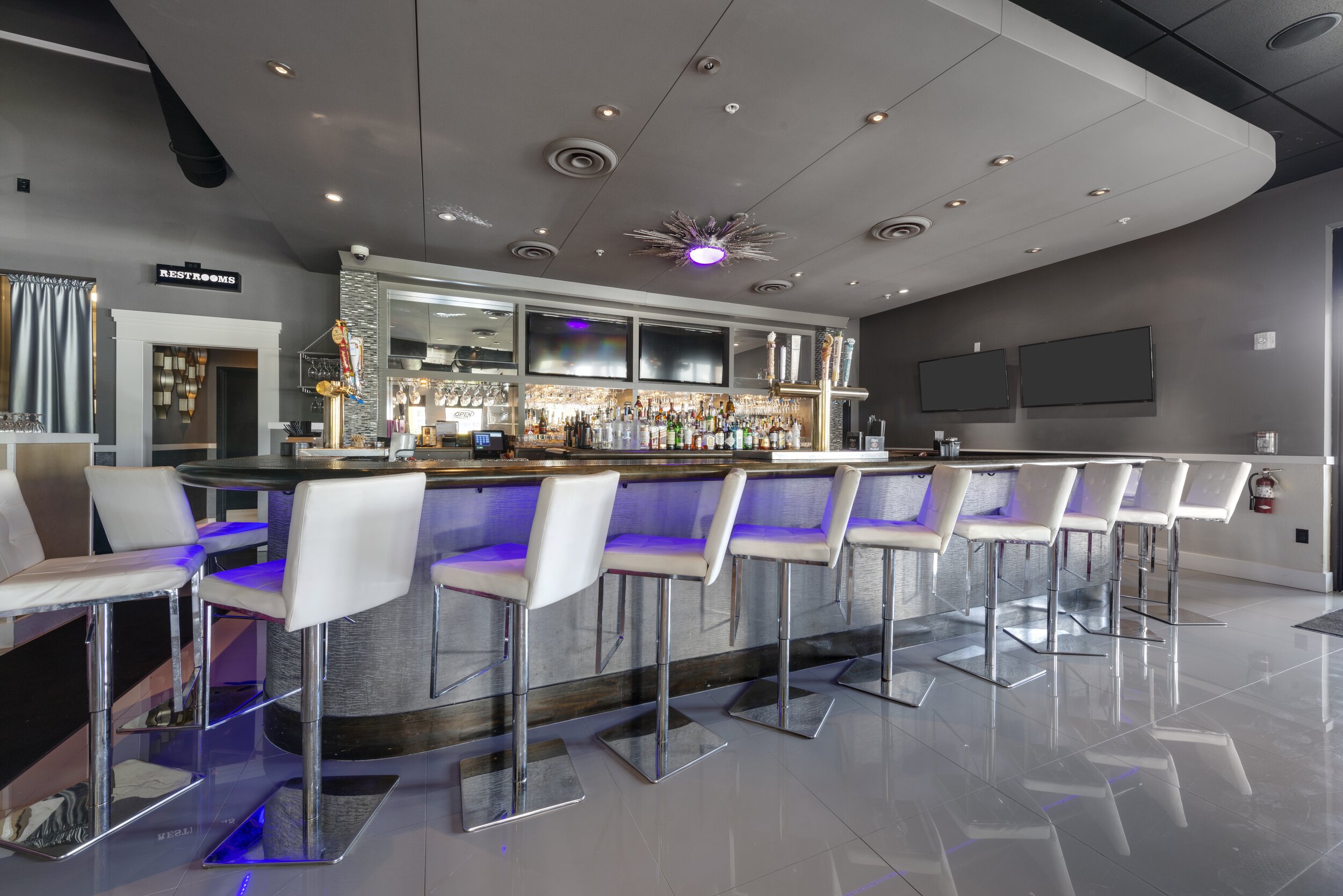
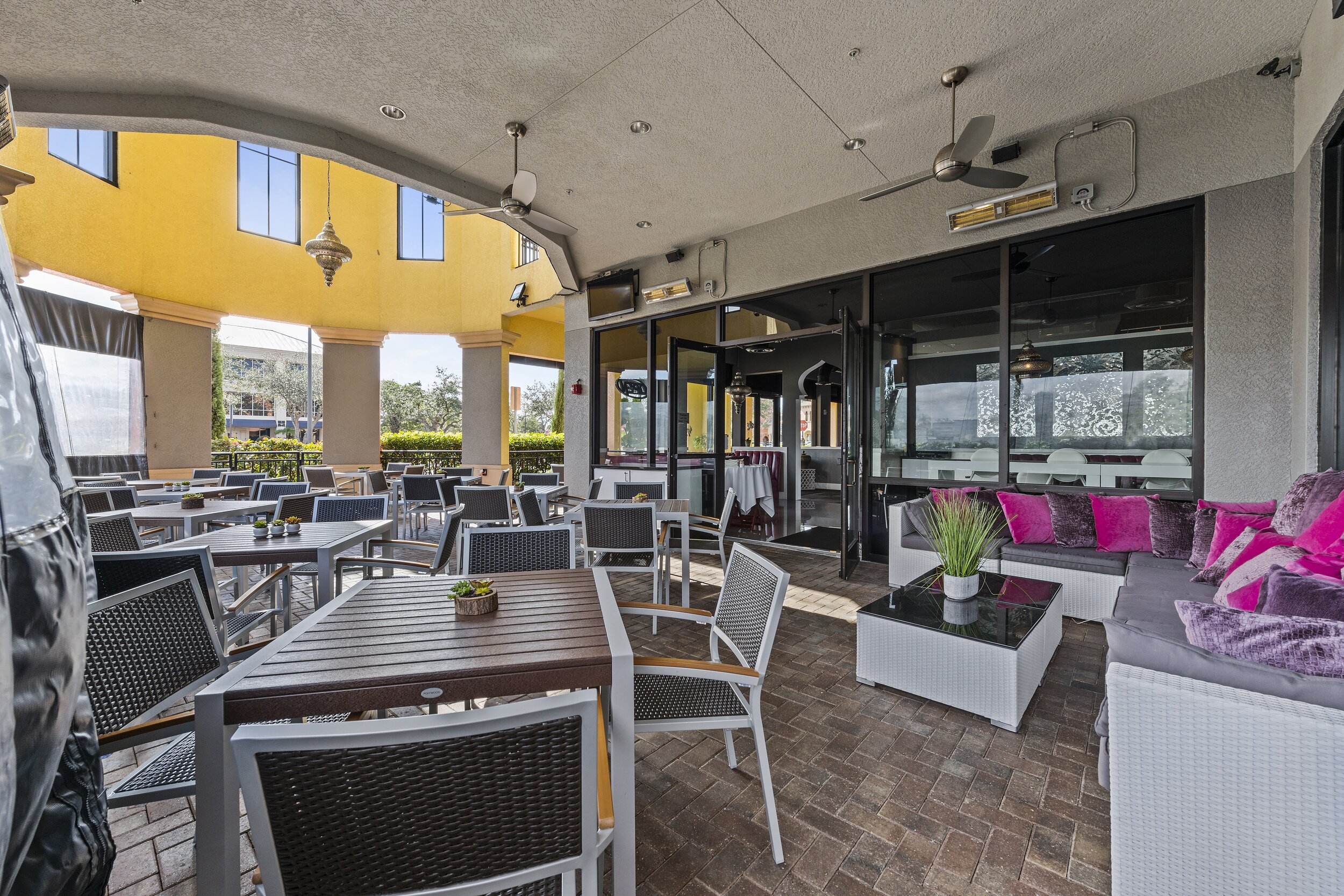
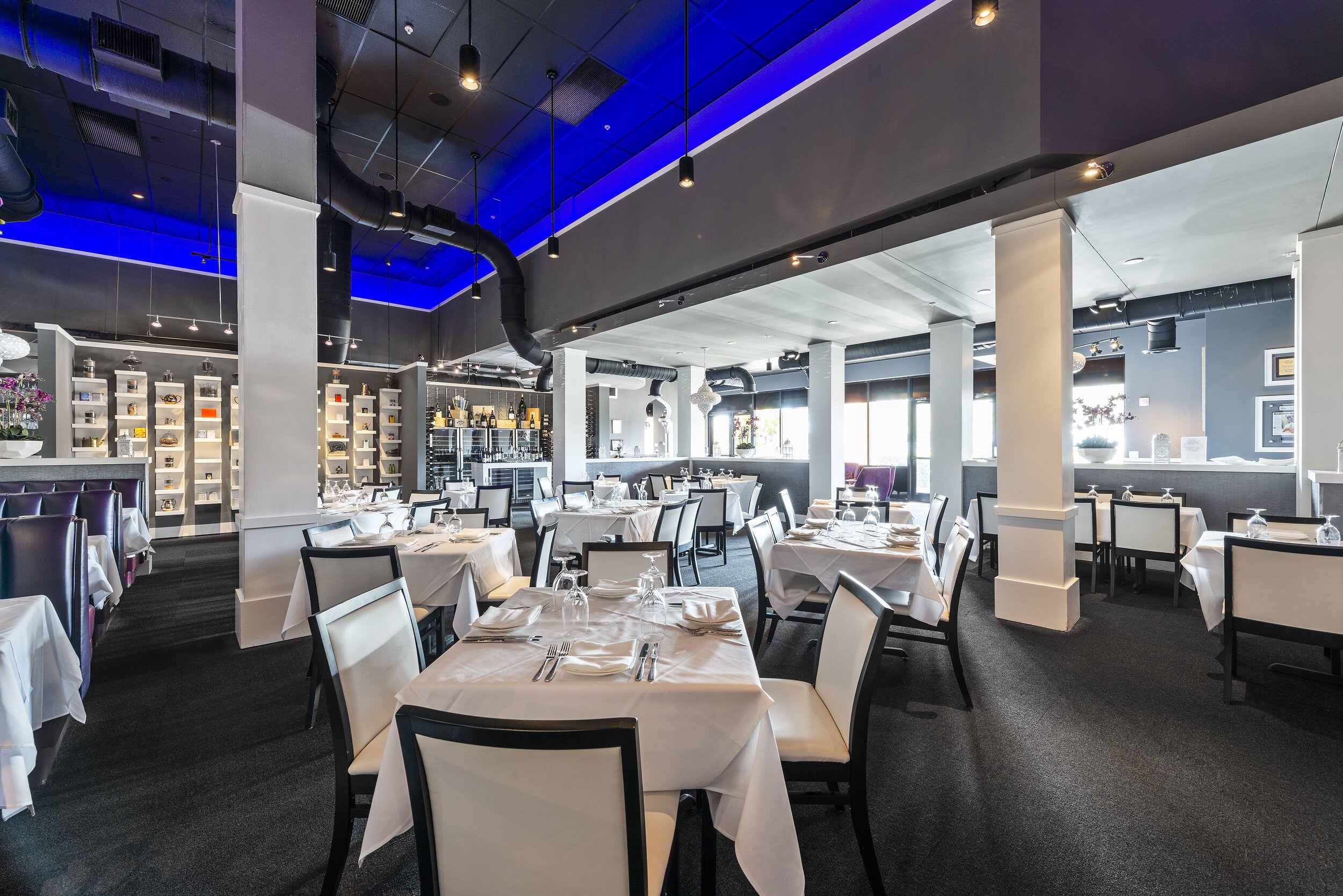
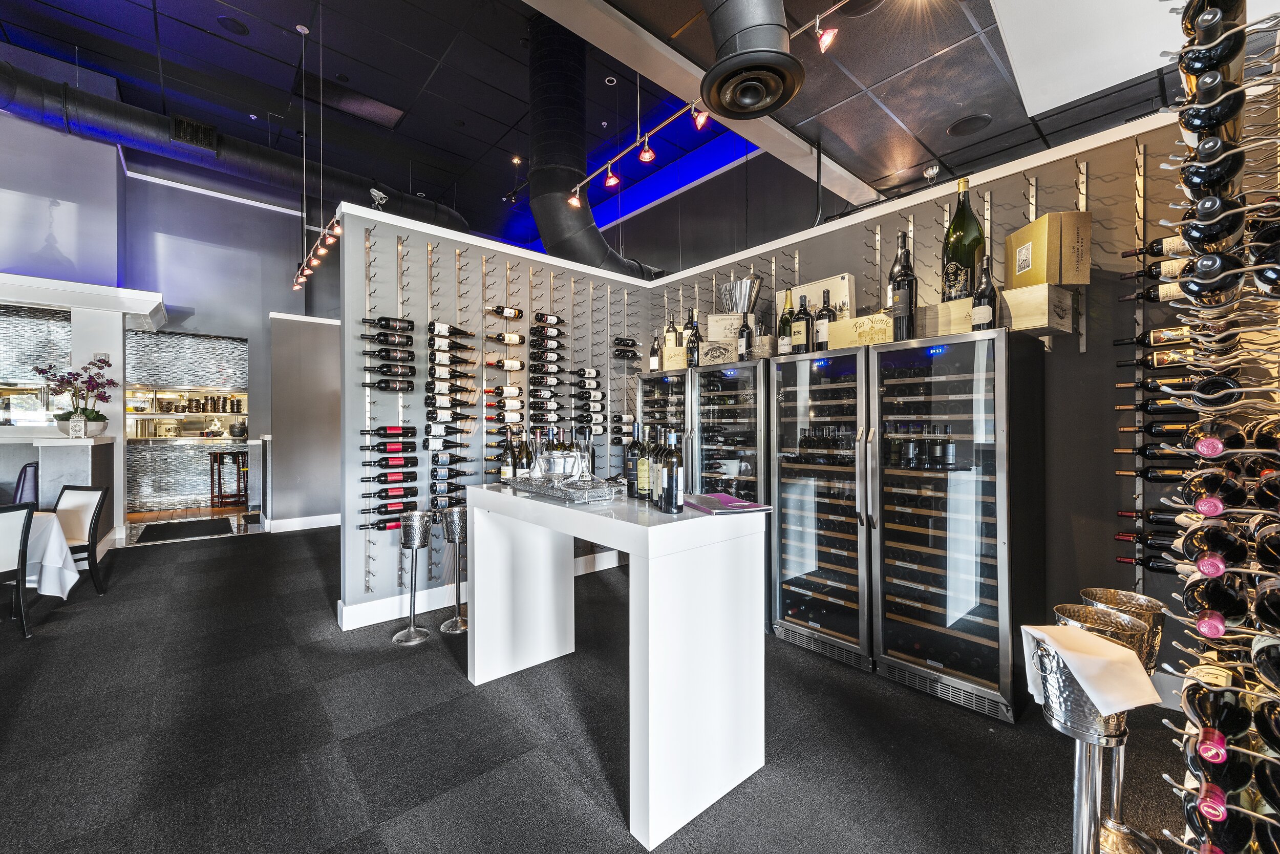
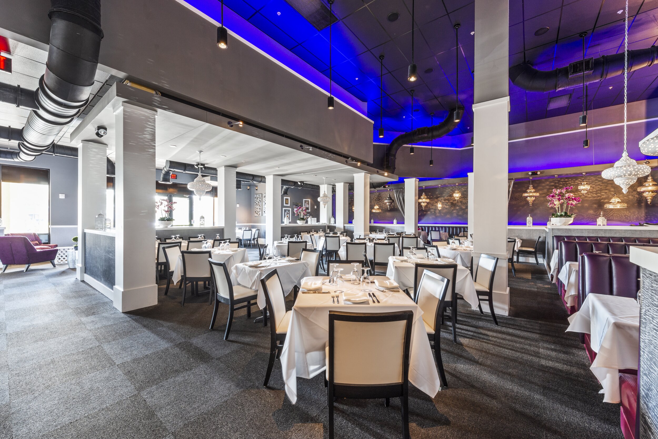
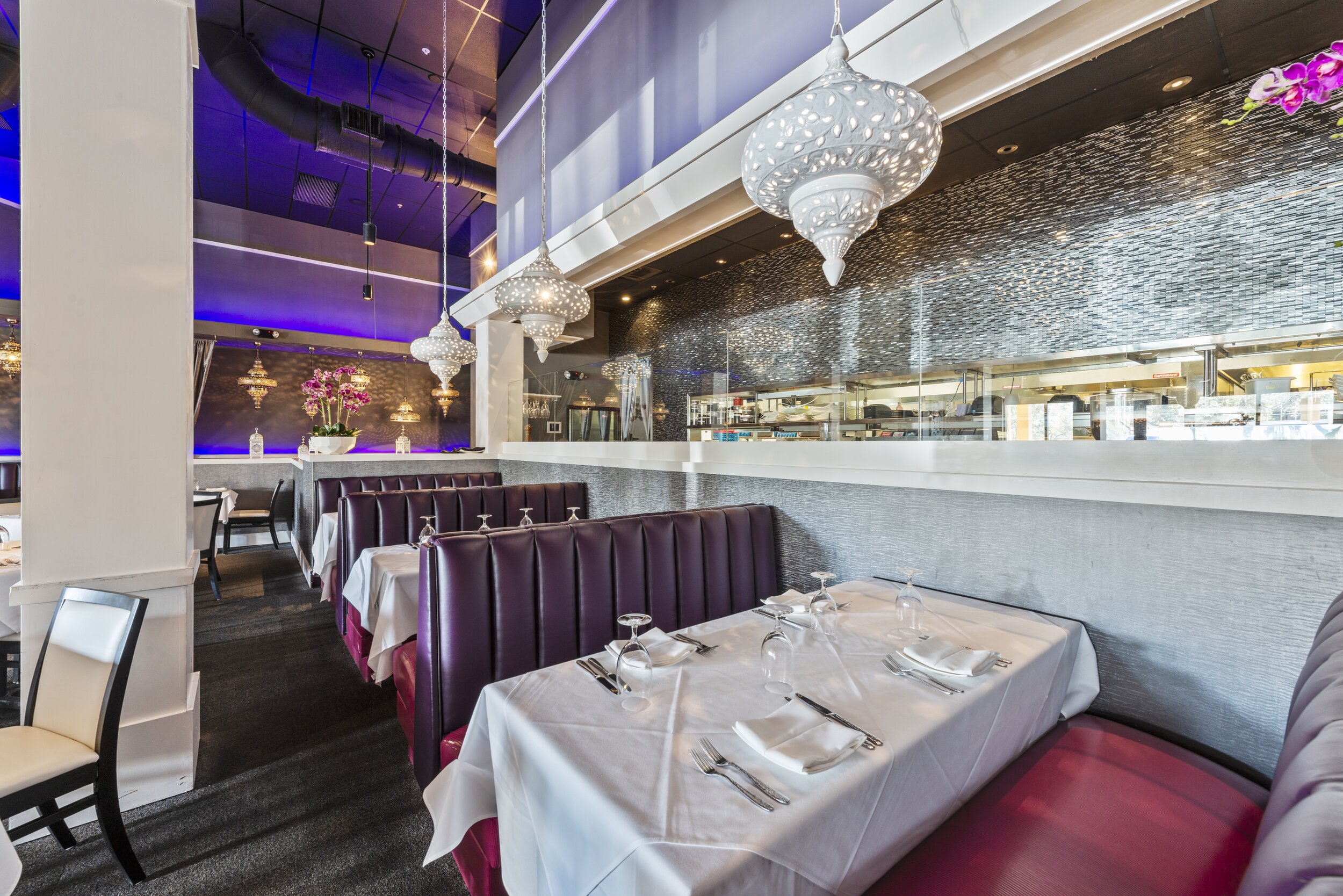
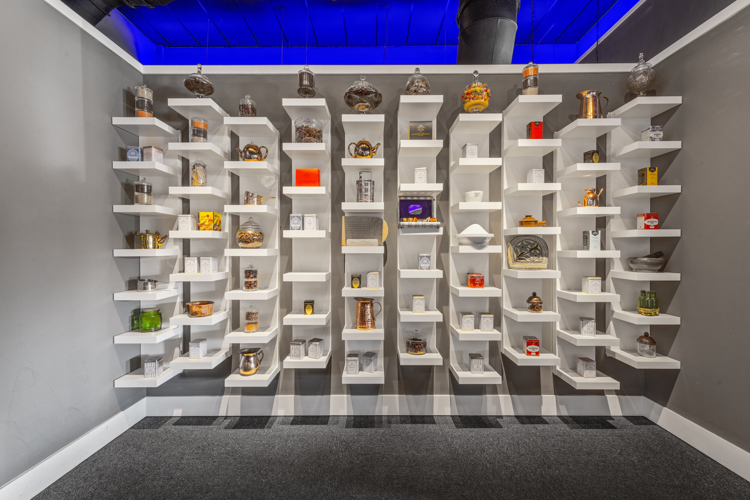
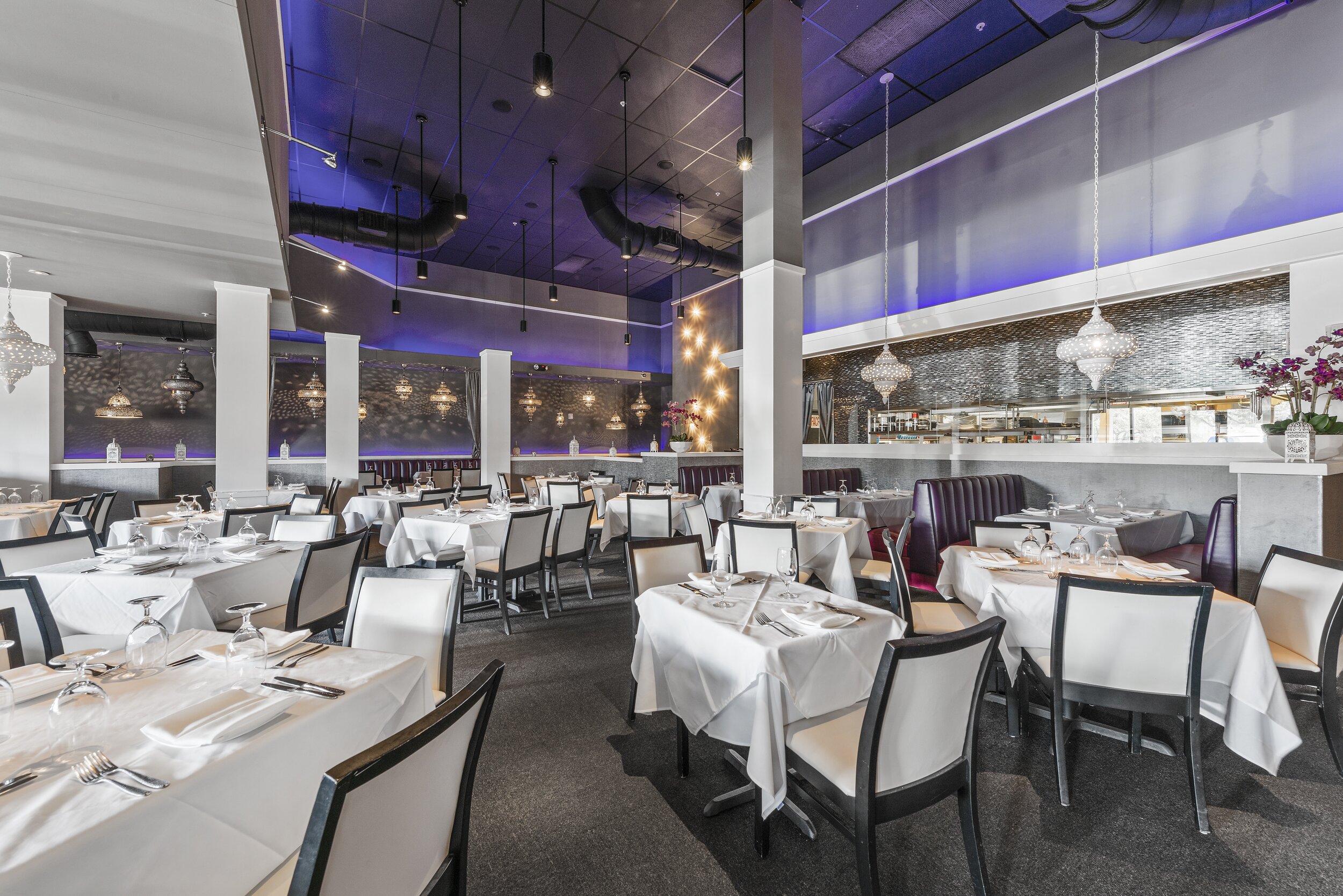
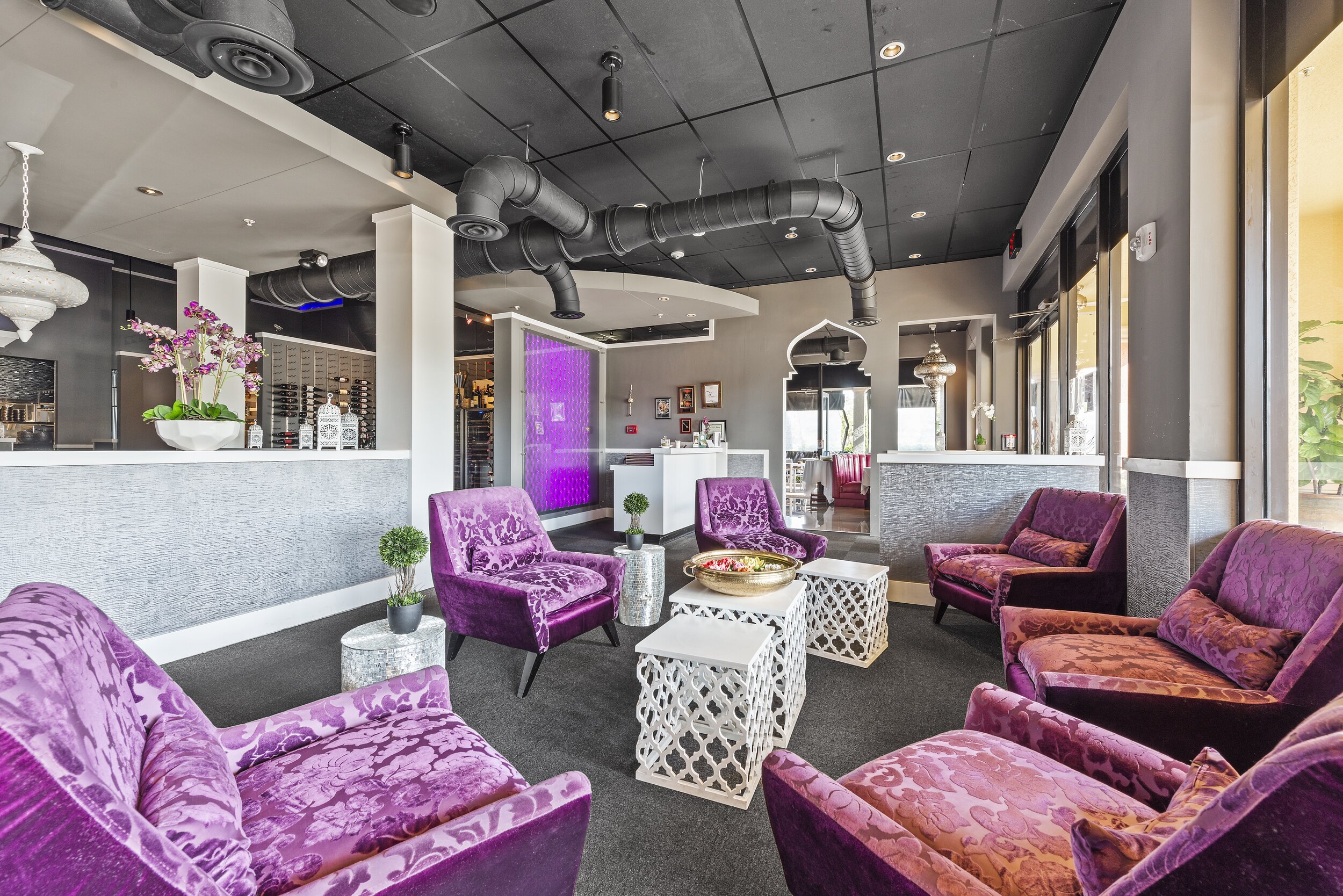
The 21 spices that go into Food Network celebrity chef Asif Ryed’s acclaimed dishes inspired his latest restaurant concept. The design of his 21 Spices Restaurant in Naples, Florida, had to not only live up to his signature dishes but give his guests a visual taste of what’s to be served. Clean whites, luxurious silver metallics, and dazzling mirror tiles are anchored by rich velvet fuchsia textiles and ambient lighting that take diners on a sweet journey through indulgent Bollywood nights. Glamour, luxury, and mystique define the dining experience and leave guests lingering over cocktails and eagerly awaiting the next culinary and sensory surprise.
